Let's talk about ISU logos that feature an actual Cyclone

cyhiphopp

Moderator
Staff member
Jan 9, 2009
33,267
14,536
113
Ankeny
Give me swirly bird or give me death.

While we're at it why don't we just bring back the Dog Bone Uniforms.

12th-annual-buffalo-wild-wings-bowl.jpg
 

cyclones500

Well-Known Member
Jan 29, 2010
36,022
23,553
113
Michigan
basslakebeacon.com
I hope the current logo and color scheme never leaves...it is great. No more stupid twisty butt birds or lame twisters.

I alsolike the I-State logo. It's the most refined branding design in my lifetime as an ISU fan & alum.

There is zero requirement that it must be on the football helmet, by any means. (That's a different topic for another thread).
 

Cycsk

Year-round tailgater
SuperFanatic
SuperFanatic T2
Aug 17, 2009
27,226
15,313
113
There's still an official twirly bird secondary logo that doesn't have any wording.
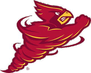
6a00d834515db069e2010536b5e322970c-800wi.gif


This is only one that uses Cy and makes sense to outsiders that we are the Cyclones.
 
Last edited:

Cycsk

Year-round tailgater
SuperFanatic
SuperFanatic T2
Aug 17, 2009
27,226
15,313
113
The current Cy head kindof has a cyclone around it.

head-is.jpg


While this logo has grown on me (especially because of the cyclone in the head feathers), if you ask 100 objective people, I think at least 90 would think this is a logo for a team whose mascot is a Cardinal.
 

Cycsk

Year-round tailgater
SuperFanatic
SuperFanatic T2
Aug 17, 2009
27,226
15,313
113
Personally, I think the I State logo is a great logo for the university. That doesn't mean alternate logos can be explored. For example, look at Michigan--they have the block M, but their helmet has an entirely different design. I would be in favor of keeping the I State logo as the primary, a version of Cy, and adding a cyclone design of some kind for specific applications. I'm currently noodling around with a cyclone helmet design or two...

Agreed. The secondary logos are really not nearly as significant as when we had Cy and a cyclone in our primary logo. I have grown very fond of our I-State logo. I hope we stick with it. As we get more national exposure (from basketball if not football also), I expect it to become better known outside our state.


P.S. I'm at Heathrow Airport getting ready to put on my I-State shirt for the return trip!
 

ruxCYtable

Well-Known Member
SuperFanatic
SuperFanatic T2
Aug 29, 2007
7,137
3,930
113
Colorado
My understanding is the definition of Cyclone is basically any kind of rotating storm. Not just a tornado, could be a hurricane as well. I actually like the current I-State logo but I think it would be cool to superimpose it over the shape of a rotating hurricane (which I guess is sort of like what they did with the newer swirly Cy above.)

Unfortunately when I see a tornado associated with ISU it takes me back to those dark days of the 80s.
 

weR138

Well-Known Member
Feb 20, 2008
12,187
5,138
113
We need some College of Design students/alum or anyone with some creativity to post some new designs in the spirit of this thread. I like the '84 tornado logo but it could use a more modern "twist."

Well, I'm one and I can tell you the '84 tornado is the best logo we've had (ditch the text though). It's easily recognizable as the logo for the only D1 program named after a tornado. No text required. The solid nature of it makes it more flexible across color schemes; it's easily recognizable as cardinal on gold, gold on cardinal, white on cardinal, black on white, etc.

Iowa's tigerhawk is an excellent example of what a logo should be, symbolic and versatile. Now, understand me, I think it looks like a ****ing chicken head but as a logo it works quite well. Bill Snyder knew this which is why KSU ripped it off with the powercat.

Debate all you want about what looks cool but pros know the tornado is the best when it comes to branding.
 

weR138

Well-Known Member
Feb 20, 2008
12,187
5,138
113
My understanding is the definition of Cyclone is basically any kind of rotating storm. Not just a tornado, could be a hurricane as well. I actually like the current I-State logo but I think it would be cool to superimpose it over the shape of a rotating hurricane (which I guess is sort of like what they did with the newer swirly Cy above.)

Unfortunately when I see a tornado associated with ISU it takes me back to those dark days of the 80s.

We were nicknamed after a string of tornadoes that ripped across Iowa in the mid 1890's.
 

ozzie8

Active Member
Apr 30, 2008
614
199
43
Bird in a blender is the worst one. Too 80s and too much going on.

I-State and Walking Cy are best.

The walking Cy, and the cyclone with Iowa State above it from the 80s are my favorites. I also think Cy leaning on the I spinning the basketball is fantastic.
 

twistedredbird

Well-Known Member
Apr 26, 2008
3,371
85
48
53
Midwest
I am in the camp that Cy needs to disappear from our branding. As a mascot fine, but branding is about image to the outside world, and to the outside world Cy is a Redbird, or a Cardinal, and that is not a Cyclone. Personally, I think it is a big fail not to come up with a logo of a cyclone since we are the only one. Plenty of stupid birds out there.
 

colbycheese

Well-Known Member
Jun 11, 2010
1,688
107
63
Kansas
twitter.com
And it looks way too much like Wisconsin's Bucky Badger, Pollard's influence gone awry?


The whole "looks like Bucky" argument is ridiculous. I can (and have before) posted about a dozen examples of other mascots depicted in the exact same pose as the new walking Cy. It was not copied from Bucky. And besides, what else would you have Cy do, sit in a Lazy Boy, attempt to fly with his ridiculously small wings?
 

WalkingCY

Well-Known Member
Sep 26, 2008
6,857
2,473
113
Kansas City
Walking Cy is much better than the 1984 version IMO.

While Walking Cy is my favorite Iowa State logo, the Tornado from '84 is sweet. Both rock.

With that being said, the I-State logo MUST remain the MAIN Iowa State mark. (And it will.) It is traditional looking, it's sharp, and it is very recognizable. Living in KC, the I-State logo is noticed, and understood.

But there's nothing wrong with the Walking Cy (Our Mascot) or the Tornado (who we really are) Logos being the "secondary logos" IMO.
 
Last edited:

Help Support Us

Become a patron