The walking Cy logo might be more inferior than a pizza cutter.Well hell you don't understand the greatness of Pizza cutters, how can we expect you to understand the greatness of walking Cy.
No forums found...
Site Related
Iowa State
College Sports
General - Non ISU
CF Archive
Install the app
What logo would you vote for now?
- Thread starter Cyghhh
- Start date
No forums found...
Site Related
Iowa State
College Sports
General - Non ISU
CF Archive
You are using an out of date browser. It may not display this or other websites correctly.
You should upgrade or use an alternative browser.
You should upgrade or use an alternative browser.
I've been getting some sh*t for this, but how can anyone dislike this logo (Bird in a Blender)?
To me, it sums our history perfectly as formerly the Cardinals and then the Cyclones.
Though the "Iowa State Above a Tornado" is a close second (Is that the "Orrnado"?).
I personally have always disliked the "I-State" logo we have had since 2008, as I think it's boring as f***, but I understand Pollard's reasoning for wanting to keep things "simple" for branding purposes.
Attachments
Last edited:
That was the logo when I was in school and I had a LOT of gear with that logo. I still don’t like it and glad they went with the I-State. When I was back in Iowa recently my mom handed me an old Iowa state hat of mine with that logo that she asked if I wanted to take home. I said, no, you can toss it. That’s how much I don’t like that logo even though it was the one in place for my entire time at ISU.I've been getting some sh*t for this, but how can anyone dislike this logo (Bird in a Blender)?
To me, it sums our history perfectly as formerly the Cardinals and then the Cyclones.
Though the "Iowa State Above a Tornado" is a close second (Is that the "Orrnado"?).
I personally have always disliked the "I-State" logo we have had since 2008, as I think it's boring as f***, but I understand Pollard's reasoning for wanting to keep things "simple" for branding purposes.
I'm not a fan of the "I-State". Do people call is "I-State"? Seems like it was an attempt to change what we are called, but that is me.I've never liked the "I-State" that much.
It's too generic. Like a create-a-team logo. And we're not "I-State" like "K-State."
How we haven't ended up with a clean, classic-looking logo that combines something like the Orrnado (a Cyclone shaped like a "V" from the side) with an "ISU" overlaid on it... I'll never know.
The 90s bird in a blender sort of tried that but, as was the style at the time in the 90s, introduced a trendy color (navy blue) for no reason, forced Cy in there needlessly, and went way too busy.
FWIW, the old Iowa State "cyclone" logo should be attributed to Jim Criner, not Johnny Orr IMO. The department did a rebranding for football when Criner was hired. the logo didn't get to many of the other teams until years later including MBB. Shoot, the 84-85 MBB team was still using a logo from the Donnie Duncan era.

I like this one, and it would be even better if they dropped the color blue from it. Only use Cardinal, gold, black & white.I don't care what anyone says, the "Bird In a Blender" from the Mac era is my favorite.
I’ll never understand the boners people get on that cartoon and those stupid shoes Cy is wearingWalking Cy is overrated garbage.
Give me a tornado and the one from the 80s is by far the best
I would love to see, at least as an alternate. We just need more fun alternates in general. We've got the I-State as a brand, now let's have fun with some other designs already!This is a great thread. Give me isu with the star over the i for the win.
I may be a bit irrational about it, but I banned my dad from entering our house with that on his hat and sweatshirt a few years ago (they come over every weekend). I bought him new ones and said if you want to see your grandkids, you'll kill Blender Cy.I've been getting some sh*t for this, but how can anyone dislike this logo (Bird in a Blender)?
To me, it sums our history perfectly as formerly the Cardinals and then the Cyclones.
Though the "Iowa State Above a Tornado" is a close second (Is that the "Orrnado"?).
I personally have always disliked the "I-State" logo we have had since 2008, as I think it's boring as f***, but I understand Pollard's reasoning for wanting to keep things "simple" for branding purposes.
Visceral hatred for the blue **** toilet swirling Cy logo.
But everybody's entitled to an opinion (even if your's sucks ass).
It’s from the era when they fell in love with isu. It’s kind of like why youre a Barry Manilow fanI’ll never understand the boners people get on that cartoon and those stupid shoes Cy is wearing
Don't blaspheme the Kickin' ChickenI’ll never understand the boners people get on that cartoon and those stupid shoes Cy is wearing
I may be a bit irrational about it, but I banned my dad from entering our house with that on his hat and sweatshirt a few years ago (they come over every weekend). I bought him new ones and said if you want to see your grandkids, you'll kill Blender Cy.
Visceral hatred for the blue **** toilet swirling Cy logo.
But everybody's entitled to an opinion (even if your's sucks ass).
The blue ruined it. Otherwise I'd be all for it. No ******* blue!!
I prefer Neil DiamondIt’s from the era when they fell in love with isu. It’s kind of like why youre a Barry Manilow fan
Why in the @### did ISU put blue in their color scheme? Who's idea was that anyway?
That screams Illinois State.
It's the Canadian version of Iowa State logo.
They were probably stock logos at the time, that were modified for each team.Just curious, who stole from whom? Does anyone know the timing?
View attachment 129565
One site says Louisville used this from 63 to 78.
Louisville Cardinals Logo - Primary Logo - NCAA Division I i-m (NCAA i-m) - Chris Creamer's Sports Logos Page - SportsLogos.Net
Louisville Cardinals Primary Logo on Chris Creamer's Sports Logos Page - SportsLogos.Net. A virtual museum of sports logos, uniforms and historical items. Currently over 40,000 on display for your viewing pleasurewww.sportslogos.net
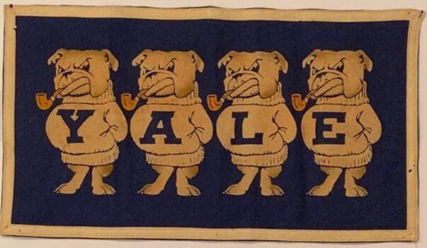
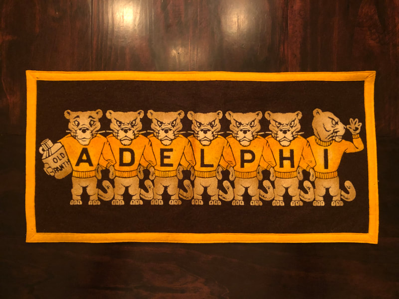
There are some old catalogues from Collegiate Manufacturing Company of Ames, that show some logos as stock images, including the old vintage Hawk logo and several of the old Arthur Evans designs.


Information on Collegiate Manufacturing Company of Ames, IA
Information on Collegiate Mfg. Co., including history, products, and maker's marks
pennantfever.weebly.com

Reproduction of a 1950s "Mascot Banner" by Collegiate of Ames
Collegiate of Ames, Collegiate Manufacturing Company, Ames, Iowa, Mascot Banner, felt banner, lineup banner, pennant, Arthur Evans, Angelus Pacific, Yale, bulldog, pug, Chicago Pennant Co., Chipenco , A Silvet Process, Chromtone.
pennantfactory.weebly.com

Vintage College Banners
These felt banners featuring the mascots were mainly produced by Collegiate Manufacturing and Chicago Pennant Company. Below is a collection I have put together over the years. I am always looking...
vintagecollegebanners.weebly.com
Kagavi | Collegiate Manufacturing Company of Ames
I’m going to reply to my own post. Only because someone else said something about blue being introduced. The hat from above, was f’ing blue with the s$itty logo. Why the hell would I still want that and why the hell did I spend money on that in the first place??That was the logo when I was in school and I had a LOT of gear with that logo. I still don’t like it and glad they went with the I-State. When I was back in Iowa recently my mom handed me an old Iowa state hat of mine with that logo that she asked if I wanted to take home. I said, no, you can toss it. That’s how much I don’t like that logo even though it was the one in place for my entire time at ISU.
I love Whirly Cy, Blender Bird, whatever it's called - agreed, it's a great mixture of the two "mascots"I've been getting some sh*t for this, but how can anyone dislike this logo (Bird in a Blender)?
To me, it sums our history perfectly as formerly the Cardinals and then the Cyclones.
Though the "Iowa State Above a Tornado" is a close second (Is that the "Orrnado"?).
I personally have always disliked the "I-State" logo we have had since 2008, as I think it's boring as f***, but I understand Pollard's reasoning for wanting to keep things "simple" for branding purposes.
I think they should have a few animations to use online & on the video boards of a modern version "walking Cy" (there's a great one floating around on this very forum) turning into "Whirly Cy", like he gets mad or he's running really fast & his lower body/legs turn into the Cyclone
Kinda cheesy, but the kids would eat it up & it sorta gives relevance to both Cy-styles
Whirly Cy should def be on the helmet - he's facing forward with implied forward motion, fist out front, that bird is about to go into battle
This logo and like Washington State, someone make "I S U" in the form of this logo and it would be legendary
I also like this logo. I don't even mind the navy blue in it because it gives it more of a thuderstormy feel. I think the Orrnado artistically looks like something from the 70s as well as being associated with a bad period in Iowa State football. I-State has a good visual punch and is recognized around the country. If it ain't broke, don't fix it.I've been getting some sh*t for this, but how can anyone dislike this logo (Bird in a Blender)?
To me, it sums our history perfectly as formerly the Cardinals and then the Cyclones.
Though the "Iowa State Above a Tornado" is a close second (Is that the "Orrnado"?).
I personally have always disliked the "I-State" logo we have had since 2008, as I think it's boring as f***, but I understand Pollard's reasoning for wanting to keep things "simple" for branding purposes.


