Let's talk about ISU logos that feature an actual Cyclone

  • After Iowa State won the Big 12, a Cyclone made a wonderful offer to We Will that now increases our match. Now all gifts up to $400,000 between now and the Final 4 will be matched. Please consider giving at We Will Collective.
    This notice can be dismissed using the upper right corner X button.

Kagavi

Well-Known Member
Mar 4, 2013
591
1,504
93
California
www.kagavi.com
While I was creating a mock vintage Cyclone logo for the 1920s, I was pondering this... ISU received the Cyclones nickname in 1895 and up until this year has had just two official logos that featured a Cyclone. Of course, we have the 1984 version:

View attachment 21360

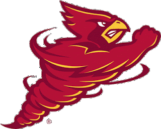
And the swirly bird logo that was replaced by I STATE:

View attachment 21362

It's just a matter of time before ISU comes out with another logo that features an actual cyclone. I know there have been quite a few pseudo-official Cyclone logos. I remember the unique cyclone design for the gymnastics team around 2007:

View attachment 21368

I know there's more out there--share them if you got them!
 

DBQ

Member
Jul 9, 2013
141
9
18
The current Cy head kindof has a cyclone around it.

head-is.jpg
 

cyclone4L

Well-Known Member
Jun 30, 2013
3,931
7,215
113
I would much rather have a brand logo that we have had for years than a new one every few years. Most great teams have logos that have never changed. Alabama, Texas, USC, Miami, Nebraska, Ohio State, Michigan, Florida State, Penn State, and Oklahoma have all stayed the same to represent the tradition that they have had and remember the players who wore that logo.
 

colbycheese

Well-Known Member
Jun 11, 2010
1,688
107
63
Kansas
twitter.com
The current Cy head kindof has a cyclone around it.

head-is.jpg


When the new branding initiative came out a few years ago, I sent an email to the branding office requesting that there be a logo that actually features a cyclone. They said that this logo was intended as the logo to feature a "cyclone". They didn't have any plans or intention to make another logo featuring a tornado in profile like the first one posted by the OP.
 

cydline2cydline

Well-Known Member
Sep 17, 2011
999
346
63
Altoonaville
My favorite tornado logo isn't even one we created. I really like the animated CY-Tornado that they show on ESPN when they talk about Iowa State. Couldn't find an image, gif, or video of it though.
 

MNCyGuy

Well-Known Member
Jan 14, 2009
11,645
551
83
Des Moines
Walking Cy is much better than the 1984 version IMO.

I love walking Cy, but I think he has some of the same issues as the tornado bird, just a bit too detailed to work to work on helmets, etc. The '84 logo, on the other hand, without the Iowa State lettering on top, could have been an iconic helmet silhouette if there had been any semblance of success with it.
 

3TrueFans

Just a Happily Married Man
Sep 10, 2009
59,134
52,892
113
44
Ames
The '84 logo just feels dated, and not dated in a oh that's so retro way, but in a wow that looks old way. I think the lettering is a lot of it though.
 

NickTheGreat

Well-Known Member
SuperFanatic
SuperFanatic T2
Jan 17, 2012
10,436
4,290
113
Central Iowa
I like the 84 Tornado. But I was born in that era, so my first ISU stuff had that on it

Walking Cy is a close second, because some of my stuff was older than 84 . . . :twitcy:
 

Althetuna

Ducky was the best dog.
SuperFanatic
Jul 7, 2012
13,073
11,503
113
Somewhere in the Minneapolis Area
I thought the curent logo could be changed and the "I" could be make into a cyclone with the wall cloud forming the top part of the "I", the cyclone forming the middle part, and the ground and a debris cloud forming the bottom part of the "I".
 

Peter

Well-Known Member
Feb 21, 2010
6,862
12,577
113
Madison, Wisconsin
Unfortunately, we are stuck with an acronym, mascot, and nickname that aren't easy to convert to a logo. The tornado tends to look like a triangular blob and I haven't seen a version of Cy that doesn't look a bit hokey. I think other schools with cardinal mascots have the same problem (see Louisville). The "I" in ISU is also hard to deal with. It's not like Indiana were you can frame it nicely with a "U." I think the only logo I've ever liked is the '85 logo. The font is a pretty old but it could be easily spruced up.
 

Tornado man

Well-Known Member
Sep 16, 2007
11,765
-77
113
61
Ames, IA
I would much rather have a brand logo that we have had for years than a new one every few years. Most great teams have logos that have never changed. Alabama, Texas, USC, Miami, Nebraska, Ohio State , Michigan, Florida State, Penn State, and Oklahoma have all stayed the same to represent the tradition that they have had and remember the players who wore that logo.
Alabama doesn't bother with Crimson Tide, but instead uses their A logo or that elephant; Miami doesn't promote Hurricanes much, just uses their U logo along with the Ibis; I don't see OSU or Michigan promote buckeye nuts or wolverine animals much in their logos either.