I think everyone here would admit that the current Cy logo is less popular than it could be, especially in light of many great vintage versions.
BUT! Each vintage logo had some minor issues, so I created an entirely new logo by taking pieces from each old logo. It fits right in any period of Cyclone history.
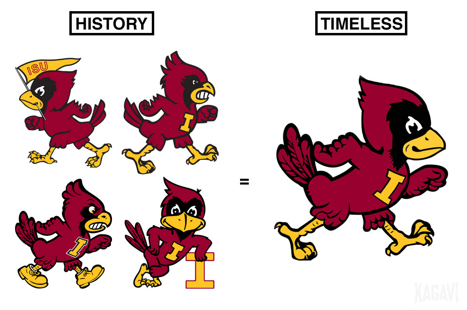
It's part of my new story here: http://www.kagavi.com/a-timeless-legacy/ where I also discuss Jack Trice and the overall branding package.
What say you?
BUT! Each vintage logo had some minor issues, so I created an entirely new logo by taking pieces from each old logo. It fits right in any period of Cyclone history.
It's part of my new story here: http://www.kagavi.com/a-timeless-legacy/ where I also discuss Jack Trice and the overall branding package.
What say you?