I finally did something about the Cy logo

Kagavi

Well-Known Member
Mar 4, 2013
614
1,632
93
California
www.kagavi.com

Yellow pants and yellow jersey? Eww. I fixed it.

DdvJhLtV4AAdJFr.jpg


I think his head is too big.

Same size as Walking Cy. He's a smart bird.
 

jsb

Well-Known Member
SuperFanatic
SuperFanatic T2
Mar 7, 2008
33,353
39,423
113
For an outsider, more than likely they will think Louisville. IMO, the Cy-twister logo is the best because it incorporates 'Cy' and our nickname 'Cyclone'.

The tornado Cy is the ugliest thing ever. It looks terrible on clothes. It looks terrible on courts and fields. It looks terrible on tv.

Our mascot is Cy the cardinal. Our nickname is cyclones. We aren’t the only school with this type of thing. (For example there is no ******* bird called the Jayhawks. Yet Kansas has a bird mascot.) It’s simply not hard to understand.
 

Kagavi

Well-Known Member
Mar 4, 2013
614
1,632
93
California
www.kagavi.com
It's still not my favorite, but I think that looks a lot better.
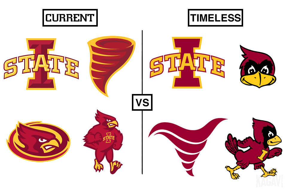
Also, my intent with this piece was to explore what COULD be if designs/logos were chosen with an eye towards being timeless versus simply current.

I mean, which side do you pick, no substitutions allowed? I think the overall fan base would overwhelmingly pick the timeless side.

current-timeless1.jpg
 

Clone Nation

Member
Aug 1, 2018
211
278
18
28
The tornado Cy is the ugliest thing ever. It looks terrible on clothes. It looks terrible on courts and fields. It looks terrible on tv.

Our mascot is Cy the cardinal. Our nickname is cyclones. We aren’t the only school with this type of thing. (For example there is no ******* bird called the Jayhawks. Yet Kansas has a bird mascot.) It’s simply not hard to understand.
Flase, I have a flag of that logo hanging on my wall and it looks fantastic. Change the blue for a black or gold and it would work great. Combining our mascot and nicknames makes the most sense for a logo.
 

isubeatle

Well-Known Member
Aug 9, 2006
1,537
370
83
Des Moines
I think everyone here would admit that the current Cy logo is less popular than it could be, especially in light of many great vintage versions.

BUT! Each vintage logo had some minor issues, so I created an entirely new logo by taking pieces from each old logo. It fits right in any period of Cyclone history.
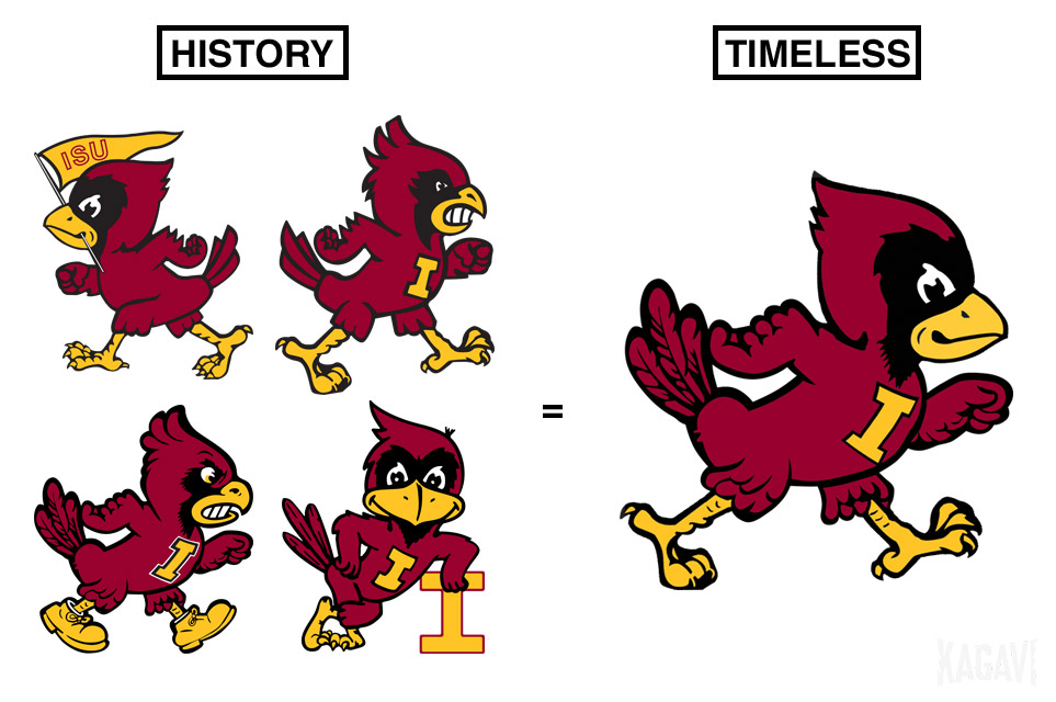
current-timeless3.jpg


It's part of my new story here: http://www.kagavi.com/a-timeless-legacy/ where I also discuss Jack Trice and the overall branding package.

What say you?

The lower left one will always be my fav logo. I do like how you removed the shoes as they have a disney cartoon feel to it. After removing the shoes i personally would leave it as is.

I'm not a fan of the head that is from the upper left that you added. For me it has more of a cone head feel rather than the feathers coming to a point. Lower left has more of a peacock effect with his head feathers that i like.

Also, i'm not a a fan of the eyes looking to the side. Lower left walking Cy is looking forward and has a purpose. These eyes looking to the side gives him sort of a derp i feel. I'm a fan of the logo looking a little more mean or determined then smiling.

Cool project!
 
  • Agree
Reactions: CYCLNST8

jsb

Well-Known Member
SuperFanatic
SuperFanatic T2
Mar 7, 2008
33,353
39,423
113
Also, my intent with this piece was to explore what COULD be if designs/logos were chosen with an eye towards being timeless versus simply current.

I mean, which side do you pick, no substitutions allowed? I think the overall fan base would overwhelmingly pick the timeless side.

current-timeless1.jpg

Timeless is in the eye of the beholder. I very much dislike your version of the I state logo for example. I think the old cyclone is fine but certainly nothing special.

Honestly, I don’t know why everyone gets so worked up. You can find stuff with every past and present logo on here.
 

Redman97

Well-Known Member
Jul 31, 2011
1,324
527
113
Iowa City
Also, my intent with this piece was to explore what COULD be if designs/logos were chosen with an eye towards being timeless versus simply current.

I mean, which side do you pick, no substitutions allowed? I think the overall fan base would overwhelmingly pick the timeless side.

current-timeless1.jpg

Cy's face/expression in the CURRENT column is so bad. He's the simpleton who's just been fooled by Bugs Bunny.
 

jsb

Well-Known Member
SuperFanatic
SuperFanatic T2
Mar 7, 2008
33,353
39,423
113
Flase, I have a flag of that logo hanging on my wall and it looks fantastic. Change the blue for a black or gold and it would work great. Combining our mascot and nicknames makes the most sense for a logo.

It looks terrible. It’s a disaster of a logo and is so dated. If people want to wear shirts with that on it, but the day that thing shows up on s court again will be a sad day.
 

NickTheGreat

Well-Known Member
SuperFanatic
SuperFanatic T2
Jan 17, 2012
10,805
4,774
113
Central Iowa
Also, my intent with this piece was to explore what COULD be if designs/logos were chosen with an eye towards being timeless versus simply current.

I mean, which side do you pick, no substitutions allowed? I think the overall fan base would overwhelmingly pick the timeless side.

current-timeless1.jpg

I like ALL the logos better in the Timeless side on the right.

I really like I-State logo, but the other current ones are stupid. Cy's head is okay, I guess.

The current "walking Cy" reminds me of Wisconsin Badger.
 

Kagavi

Well-Known Member
Mar 4, 2013
614
1,632
93
California
www.kagavi.com
The lower left one will always be my fav logo. I do like how you removed the shoes as they have a disney cartoon feel to it. After removing the shoes i personally would leave it as is.

I'm not a fan of the head that is from the upper left that you added. For me it has more of a cone head feel rather than the feathers coming to a point. Lower left has more of a peacock effect with his head feathers that i like.

Also, i'm not a a fan of the eyes looking to the side. Lower left walking Cy is looking forward and has a purpose. These eyes looking to the side gives him sort of a derp i feel. I'm a fan of the logo looking a little more mean or determined then smiling.

My Timeless Cy is happy to see you and has caught your eye and is smiling at you. He is a nice bird.

For you, I took the '80s Walking Cy and put the '60s feet on him and the updated "I" shape from the current logo.

DkBp59eUUAAr0bg.jpg


Timeless is in the eye of the beholder. I very much dislike your version of the I state logo for example.

I don't like the logo either. I prefer the stencil one, but it needs to be fixed, so I did it here. Do you like that instead?

DkBmwuDV4AAoilx.jpg


That I would buy. Selling these?!

Nope. Not a fan of money.
 

NWICY

Well-Known Member
Sep 2, 2012
35,595
31,729
113
Yellow pants and yellow jersey? Eww. I fixed it.

DdvJhLtV4AAdJFr.jpg


Same size as Walking Cy. He's a smart bird.

That's the bomb FB Cy in a trice uni. Nice job. My favorite of all time is probably leaning Cy, like your new one though also. So do you have an updated version of BB Cy?

As always @Kagavi thanks for the effort you put into these projects and being willing to share them with many who couldn't do them if we wanted to.
 

Kagavi

Well-Known Member
Mar 4, 2013
614
1,632
93
California
www.kagavi.com
The shop on the website doesn’t work.

Sorry, you missed out on the Trice Cy shirts. Congrats to all 118 people who got one.

KIDDING! It's a concept only.

I took the SHOP page down a while ago. Was tired of paying annual fees to Shopify when my projects are more sporadic these days.

Will do something different one of these days, likely will have the SHOP page simply link to a static page on the website where I can update current projects and where I am selling things on other sites, if anything. More of a pop-up feel.
 
  • Informative
Reactions: NWICY