That’s solid!
I-State is solid in flat or stencil form only. It’s embarrassing in bevel form.
That’s solid!
I want the helmet cart with the 70s Cy logo on the side. Driver smoking a huge cigar. And passing student's from front row to back row. Just for starters.
Passing students from front row to back in The Clyde. Now that was some serious action by the time one hit top row.Cyclone Stadium.
Where women come in tube tops and leave in anger
A theme game - Retro-Out!If we do have a retro game, I have enough old gear to clothe half the stadium.
This is 100% the correct answer.Yay! Another logos argument thread!
Block I-State isn't sexy, but it's effective in its simplicity. I vote to keep it as our primary logo for the sake of consistency. Now if only we could get rid of the damned beveling:
View attachment 134346
And these need to be our secondary logos:
View attachment 134347 View attachment 134348 (sorry for the different shades of gold)
We should have a throwback theme for every homecoming. Jack Trice, Dirty 30, Earle Bruce, Troy Davis, Insight Bowl, etc.
If you need the script update it to the new font and tweak the design a little bit to make it more sleek. Just make the blue black.
I can get down with this. But the mob is trying to push as it being the main identity I fear.That masterful piece of logo design has been sneakily appearing around Ames lately. Rocco wears a hat with that logo and you can see it elsewhere. With Campbell also occasionally wearing vintage logos, I think the time is ripe. Why wouldn't we want to remember the good old days? Coach Mac? Fizer? That great game against Nebraska in 1997.
Yes, it is time to bring back the Cynado logo.
Ah, but to be clear, it's still awful. But for the kids these days, it's so awful it's good. No different than some retro logos for the other schools. See: UCF's Citronaut, UCONN's depressed/confused husky, etc. You know you want it. Admit it.
I only mean to bring it back in the context of having a retro helmet once in a while. I'm still surprised ISU hasn't done such a simple thing. It's literally a sticker change. Rotate between the Cynado, walking Cy, and throw in some 1970s and 1980s logos too. Maybe one or two games a year.
Letterman I with cursive arched Cyclones is pretty sharp.Soundoff had isu logos as the knockout segment and current one got knocked out by an overwhelming majority. Anything short of the bugle design would be better.
That masterful piece of logo design has been sneakily appearing around Ames lately. Rocco wears a hat with that logo and you can see it elsewhere. With Campbell also occasionally wearing vintage logos, I think the time is ripe. Why wouldn't we want to remember the good old days? Coach Mac? Fizer? That great game against Nebraska in 1997.
Yes, it is time to bring back the Cynado logo.
Ah, but to be clear, it's still awful. But for the kids these days, it's so awful it's good. No different than some retro logos for the other schools. See: UCF's Citronaut, UCONN's depressed/confused husky, etc. You know you want it. Admit it.
I only mean to bring it back in the context of having a retro helmet once in a while. I'm still surprised ISU hasn't done such a simple thing. It's literally a sticker change. Rotate between the Cynado, walking Cy, and throw in some 1970s and 1980s logos too. Maybe one or two games a year.
Always enjoy when you get the itch to post here.
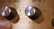
I'm not a design guy, but conceptually, I think we should lean into the "cyclone" theme. More sirens. And not just the weak cranky thing at basketball games. They need to crank that up to 11. And get a hologram of a cyclone to float around Jack Trice Stadium and Hilton Coliseum. Come up with a cyclone hand signal.
Like I said, I don't know what the actual things should be. I just want us to lean into our unique and special cyclone identity.


