Let's talk about ISU logos that feature an actual Cyclone

DSM4Cy

Well-Known Member
SuperFanatic
SuperFanatic T2
Apr 4, 2006
2,366
2,851
113
Altoona, IA
Bring back swirly bird. Loved that Cy.

*not joking

You know, I grew up with it and thought it was great. In looking back, now it seems really ugly. However, I loved the "updated" version in the new colors that they did as a transition. I wish that was still our secondary logo. Personally, it's my favorite ISU logo of all-time - it was like they took the bird-in-a-blender and perfected it!
 

cstrunk

Well-Known Member
Mar 21, 2006
14,267
4,543
113
37
Longview, TX
I can't believe no one has gone straight to MS Paint and posted their creations yet. This isn't the CF I know and cherish. I would but I'm out of town for work.
 

temperflare

Well-Known Member
Jul 9, 2007
7,800
249
63
Bondurant
"Walking Cy"...end discussion.

cnqjqszrpgnfa3xfvl3e.png

I think if we could put Walking Cy in a Jack Trice throwback jersey that would be pretty cool. Of course, I like the logo I have for my avatar better than most.
 
Last edited:

Rods79

Well-Known Member
Nov 27, 2006
3,536
1,220
113
Des Moines
The whole "looks like Bucky" argument is ridiculous. I can (and have before) posted about a dozen examples of other mascots depicted in the exact same pose as the new walking Cy. It was not copied from Bucky. And besides, what else would you have Cy do, sit in a Lazy Boy, attempt to fly with his ridiculously small wings?

Well, even so, "Bully Cy" it is a crappy secondary logo. The updated swirly bird was better, and they could have done something true to concept like that. I suppose "Bully Cy" could still be used on kid's gear...but that logo on anything else just doesn't work. Have you seen the hats? Same with the "Oval Cy"...but that one is growing on me a little.
 

DBQ

Member
Jul 9, 2013
141
9
18
While this logo has grown on me (especially because of the cyclone in the head feathers), if you ask 100 objective people, I think at least 90 would think this is a logo for a team whose mascot is a Cardinal.

Well then it's perfect for us, since our mascot is a cardinal. And there's nothing wrong with having a mascot that's different than the team nickname...the Crimson Tide have an elephant, the Midshipmen have a goat, the Black Knights have a mule, the Hurricanes have some sort of duck, the Aggies have a collie, and the Stanford Cardinal have a frickin' tree. It's not like we're in uncharted waters.

Branding 101 is that when you're trying to establish a brand, you don't change your logo every 5-10 years (unless the brand you're going for is "that school with an identity crisis"). What we've got now is pretty darned good, and we've been having success with it. That is perfect, there should absolutely not be any wholesale changes for a long, long time, if ever.

If I were to make any changes, it would be to simplify things even further. One primary logo (the I-State), one secondary logo (the Cy head without the words above or below it), and that's it. I'd even go so far as to make the primary logo 2D and two-tone (like below), rather than the current version with four colors and beveling to make it look 3D.

avatar1509_4.gif
>
150px-Iowa_State_Cyclones_logo.svg_.png
 
Last edited:

sredman1985

Member
Oct 23, 2006
33
8
8
As I recall when Pollard introduced the I State logo he said recruits would look at the old cardinal-in-the-funnel logo and confuse us with Louisville and other schools with a cardinal mascot. That was poor brand recognition if that's the case. While I like Cy as much as any fan, we are the Cyclones and I feel our onfield/oncourt brand should highlight we're from Iowa and we're the Cyclones. Cy is fine for fan t-shirts and hats, but not for the field. A couple years ago Nissan had a commercial that featured mascots chasing the Heisman Trophy. There was a tornado in the background that no doubt represented Iowa State. That was a much more powerful image than a bird would have been.
 

cyclones500

Well-Known Member
Jan 29, 2010
35,959
23,493
113
Michigan
basslakebeacon.com
Well then it's perfect for us, since our mascot is a cardinal. And there's nothing wrong with having a mascot that's different than the team nickname...the Crimson Tide have an elephant, the Midshipmen have a goat, the Black Knights have a mule, the Hurricanes have some sort of duck, the Aggies have a collie, and the Stanford Cardinal have a frickin' tree. It's not like we're in uncharted waters.

Branding 101 is that when you're trying to establish a brand, you don't change your logo every 5-10 years (unless the brand you're going for is "that school with an identity crisis"). What we've got now is pretty darned good, and we've been having success with it. That is perfect, there should absolutely not be any wholesale changes for a long, long time, if ever.

If I were to make any changes, it would be to simplify things even further. One primary logo (the I-State), one secondary logo (the Cy head without the words above or below it), and that's it. I'd even go so far as to make the primary logo 2D and two-tone (like below), rather than the current version with four colors and beveling to make it look 3D.

avatar1509_4.gif
>
150px-Iowa_State_Cyclones_logo.svg_.png

Excellent point about mascots that don't "fit" with school nicknames, and good examples (I think Miami's is a crane, btw).

I've long liked it when people with little knowledge of ISU will ask, "If it's Cyclones, what's up with the cardinal?" It's a chance to tell a story about the evolution of nickname — I'm glad Iowa State kept the historic bird while becoming something entirely different. (It'd be like a St. Louis fan being asked "What the *** is a Billiken?" And such.)

I don't always think it's necessary to merge the two — when I see the new bird w/ suggested tornado, it's Cy Stuck In A Toilet).

I like your 2-D tweak of I-State, too. Actually, I like that and the official versionfor different reasons.
 

cyclones500

Well-Known Member
Jan 29, 2010
35,959
23,493
113
Michigan
basslakebeacon.com
Well, even so, "Bully Cy" it is a crappy secondary logo. The updated swirly bird was better, and they could have done something true to concept like that. I suppose "Bully Cy" could still be used on kid's gear...but that logo on anything else just doesn't work. Have you seen the hats? Same with the "Oval Cy"...but that one is growing on me a little.

Bully Cy/Barrel-Chest Cy is OK, but I find it unnecessary. There are plenty of classic Cy versions (many cited in this thread) that could've been upgraded. Why reinvent the design-wheel all the time? (that's partly at the root of ISU's sports identity crisis)
 

DBQ

Member
Jul 9, 2013
141
9
18
Bully Cy/Barrel-Chest Cy is OK, but I find it unnecessary. There are plenty of classic Cy versions (many cited in this thread) that could've been upgraded. Why reinvent the design-wheel all the time? (that's partly at the root of ISU's sports identity crisis)

Exactly. It's just more unneeded clutter.

I wouldn't update any of the "classic" logos, either--I'd just leave them as-is and bring them back every now and then for a throwback day or something. Florida does this perfectly, in my opinion...they've got a pretty modern looking gator head as their logo with the same wordmark that they've used for a long time now, but they occasionally bring back a retro look every once in a while (and do it tastefully). See below.

Florida_Gators3.jpg

florida-gators-primary-logo-3-primary.jpg

199d60_68a2f6e3a62a7bc74d08e01bddfd81f9.gif_512

USATSI_2044732-675x380.jpg


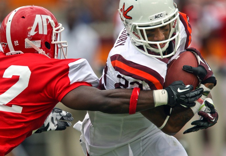
Now in contrast, look at Virginia Tech, who seem to adopt a new logo/look every freaking week...and it looks terrible.

5010777132_7ccace2e48_o.jpg

Coale_D_11FB_ak_1452S.jpg

virginia-tech-bowl-matte-marron-football-helmet-vs-rutgers-30.jpg

whiteoutuniforma.jpg

vt_fb_shoulderstripes_whitehelmet_throwback-e1365017042766-300x281.jpg

vt_fb_2010_throwback-e1365017147199-247x300.jpg

923361000.jpg

Va+Tech+Gobbler.jpg

new-virginia-tech-camo-helmet-570x338.jpg
 

Cycsk

Year-round tailgater
SuperFanatic
SuperFanatic T2
Aug 17, 2009
27,157
15,208
113
I am in the camp that Cy needs to disappear from our branding. As a mascot fine, but branding is about image to the outside world, and to the outside world Cy is a Redbird, or a Cardinal, and that is not a Cyclone. Personally, I think it is a big fail not to come up with a logo of a cyclone since we are the only one. Plenty of stupid birds out there.


Is it just me or do these comments seem odd coming from someone posting as "twistedredbird?"
 

Latest posts

Help Support Us

Become a patron