
No forums found...
Site Related
Iowa State
College Sports
General - Non ISU
CF Archive
Install the app
Better or worse than the Bugle helmet?
- Thread starter JP4CY
- Start date
No forums found...
Site Related
Iowa State
College Sports
General - Non ISU
CF Archive
You are using an out of date browser. It may not display this or other websites correctly.
You should upgrade or use an alternative browser.
You should upgrade or use an alternative browser.

- Jun 20, 2006
- 38,321
- 22,625
- 113
That's a lot better than the Bugle logo.
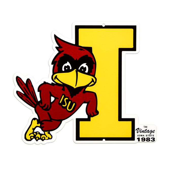
That K-State helmet is the equivalent of putting a vintage walking Cy on a helmet.
Which I imagine would produce uproarious applause on here.
Which I imagine would produce uproarious applause on here.
That's an awesome helmet and should not be mentioned in the same breathe as the bugle helmet.
Or the actual tornado logo on the helmet.That K-State helmet is the equivalent of putting a vintage walking Cy on a helmet.
Which I imagine would produce uproarious applause on here.
I like it as a throwback but overall not a huge fan of the logo. Looks a lot like Tom from Tom and Jerry.
Love these kind of throwbacks. So many college teams - including ISU - have great logos from the past.
Yeah that is pretty cool, the bugle helmet was terrible.
As bad as the bugle was I think the pennant carrying pussycat logo is worse... way worse.
I like the concept though.
I like the concept though.
I also like that. And would welcome walking Cy on a helmet of ours
Looks like that pussycat is barfing up or doing some kind of magic trick where he pulls the flag out of his mouth.As bad as the bugle was I think the pennant carrying pussycat logo is worse... way worse.
I like the concept though.
waaay better and I don't care for K-State one bit. I want the Heisman Cy logo for just one game https://www.sportslogos.net/logos/view/71393771974/Iowa_State_Cyclones/1974/Mascot_Logo
There's no black in the jersey outside of the helmet, they should have went full ISU with just black and white and it would be good.
I'm glad you showed what you were talking about. I would get behind that.waaay better and I don't care for K-State one bit. I want the Heisman Cy logo for just one game https://www.sportslogos.net/logos/view/71393771974/Iowa_State_Cyclones/1974/Mascot_Logo
But for the record that isn't even close to the Heisman pose.
I would also like leaning Cy at some point. Maybe too laid back for a helmet, but damn, that logo is the best.
We have so many good Cy logos and the current one (bucky cy) is the worst of the bunch.
"Jealous we don't have a throwback" should be an option. Bring back the Earl Bruce uniforms!