No forums found...
Site Related
Iowa State
College Sports
General - Non ISU
CF Archive
Install the app
New uniforms?
- Thread starter Thompsonclone
- Start date
No forums found...
Site Related
Iowa State
College Sports
General - Non ISU
CF Archive
You are using an out of date browser. It may not display this or other websites correctly.
You should upgrade or use an alternative browser.
You should upgrade or use an alternative browser.
Absolutely love these. Also like that we only have the hilton magic waistband logo at home. These are simple, to the point, yet stylish and modern enough to keep the players and recruits happy. What a great combination of old and new.
I agree so much with this. Hopefully the football team will follow suit with this thinking for next season.Absolutely love these. Also like that we only have the hilton magic waistband logo at home. These are simple, to the point, yet stylish and modern enough to keep the players and recruits happy. What a great combination of old and new.
For those complaining about the narrow shoulders it’s about movement not looks. The wide shoulders with small armholes on a tight jersey can be restricting. Narrow shoulder straps completely frees the shoulders for unrestricted motion.
A college buddy of mine that’s a college assistant has made comments that players far prefer playing in their practice jerseys to game jerseys. He’s said for awhile game jerseys went the route of fashion and forgot about function.
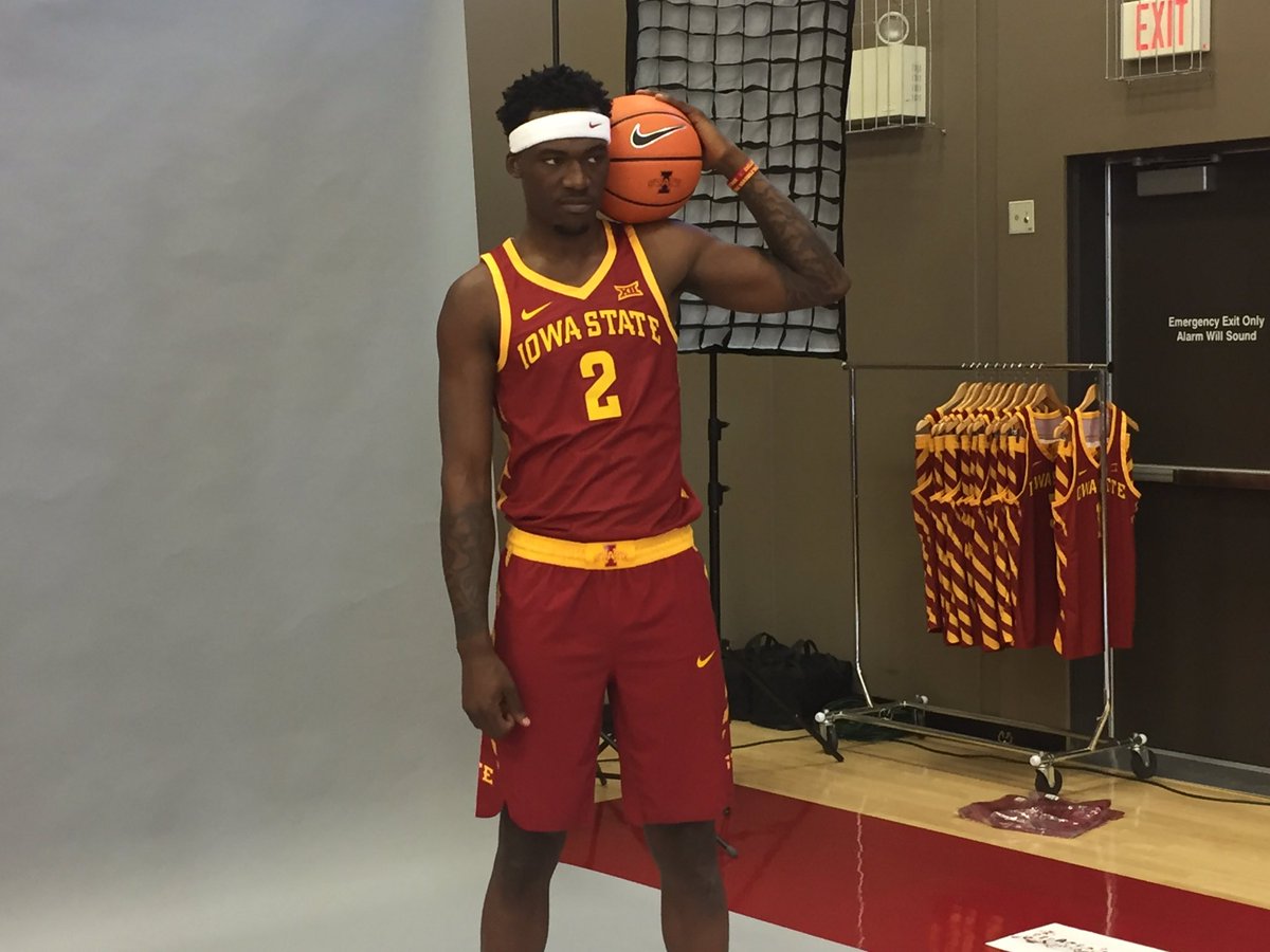
I get trying to get function maximized but I just don’t get that argument. Look at this picture. I just don’t see the improved movement with the smaller shoulders. This is a fashion decision.
Very nice, and they are cardinal and not maroon
That's what I don't get when everyone says our colors are cardinal and are soooo adamant about it. I don't know if any of you have never seen a cardinal or not, but when did cardinals become the burnt maroon USC copy cat color we have now? Yes our colors are cardinal and gold but where do we get off calling our current red, cardinal?
That's what I don't get when everyone says our colors are cardinal and are soooo adamant about it. I don't know if any of you have never seen a cardinal or not, but when did cardinals become the burnt maroon USC copy cat color we have now? Yes our colors are cardinal and gold but where do we get off calling our current red, cardinal?
http://www.brandmarketing.iastate.edu/brand-elements/color-palette/
https://apps-trademark.sws.iastate.edu/forms/athletics/data/708/isu_athletic_identity_usage.pdf
These two links should help at least a little
")
The massively inconsistent reds between the I-State on the side of the shorts and the cardinal patterns elsewhere on the jersey is already annoying me terribly.
Multiple shades of the same basic color makes me want to drink paint thinner.
Multiple shades of the same basic color makes me want to drink paint thinner.
http://www.brandmarketing.iastate.edu/brand-elements/color-palette/
https://apps-trademark.sws.iastate.edu/forms/athletics/data/708/isu_athletic_identity_usage.pdf
These two links should help at least a little
Not really, I still have never seen a burnt maroon cardinal. Frankly the multi shade I State is the problem, in the above link I like the 2 tone plane cardinal and outlined gold IState logo, the 3D with multiple dark maroon shades is the problem. Should be 2 colors Cardinal and Gold and the Cardinal and Gold described, not the shades, Those dark colors and the multiple shades are the problem with all our logos, that's why there is no consistency with our gear. Not to mention we change what we define as cardinal every few years.
I-State logo has two shades of red. The darker red is usually the red of the garment, at least on Nike clothing. It's not inconsistent.The massively inconsistent reds between the I-State on the side of the shorts and the cardinal patterns elsewhere on the jersey is already annoying me terribly.
Multiple shades of the same basic color makes me want to drink paint thinner.
here's my guess at a gold option.
I could dig that. Good work.
That's what I don't get when everyone says our colors are cardinal and are soooo adamant about it. I don't know if any of you have never seen a cardinal or not, but when did cardinals become the burnt maroon USC copy cat color we have now? Yes our colors are cardinal and gold but where do we get off calling our current red, cardinal?
That is not the same color as USC. These jerseys are probably the closest thing to cardinal we've had.
http://www.brandmarketing.iastate.edu/brand-elements/color-palette/
https://apps-trademark.sws.iastate.edu/forms/athletics/data/708/isu_athletic_identity_usage.pdf
These two links should help at least a little
I like the statement on that page regarding colors that should not be used:
"Colors associated with other public institutions, such as the one on the eastern side of the state, should not be used. Even though gold is one of Iowa State's primary colors, use of black and gold together should be avoided. Purple is not within any of Iowa State's color palettes and should never be used."
ohh boy, what'd they say?Hassel and Miller felt the need to comment on twitter
I don’t know what Miller said but Hansel said the uniforms are better than iowa’s. He also said ISU should put hickory park on the uniforms.ohh boy, what'd they say?
That's it, Miller shall now be known as Gretel.I don’t know what Miller said but Hansel said the uniforms are better than iowa’s. He also said ISU should put hickory park on the uniforms.
I just saw Millers. He did the very original "These are making me hungry" prompting a few "I'm lovin it" and ba da ba ba ba'sI don’t know what Miller said but Hansel said the uniforms are better than iowa’s. He also said ISU should put hickory park on the uniforms.
Purple is not within any of Iowa State's color palettes and should never be used."