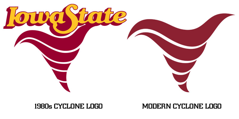
Is it really meant to be a cyclone? I didn't even see it until you said it. And if so, then I really like them. And would like them even more with a gold edge.
Yes, I believe the stripes on the sides are meant to convey a tornado/funnel cloud effect, at least conceptually as does the classic 1980s tornado logo.
Make that thinner and run it up the side of the shorts and jersey and there you have it.
I love the cardinal version of this concept. Bravo there for the design team, the team, and Prohm. The home version is just a little too white/red -- looks like something that Wisconsin or NC State would wear -- and just needs a little more gold in it. Just a little gold "shadow" on the red tornado elements up the side of the jersey would have been enough.
The way the old ones had a little gold edge to the red side stripes was perfect. I wish they would have done something similar for the new ones to bring a little more gold into it.
Like that. Just a little hint.
The gold one looks marvelous, as well.
I hope the football team uses this same gimmick, though in a restrained and classy way, for whatever redesign is coming next year. "Tornado" pants stripes with some pattern or concept to match it on the jersey could be an immediate classic.