My wife bought me an ISU shirt that had this logo on it but the shirt was grey. I never liked the logo but it does look sharp on the grey t-shirt honestly
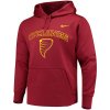
I think on the red sweatshirt it looks pretty good too:

My wife bought me an ISU shirt that had this logo on it but the shirt was grey. I never liked the logo but it does look sharp on the grey t-shirt honestly
I think on the red sweatshirt it looks pretty good too:

The chrome helmets are lame. Look like they belong at a Goodguys show. They're way too mismatched with our great cardinal color.
The 'logo' is not half bad on the t shirts.
") Thanks for posting the video - but I still cannot stand that upside-down emoji poop logo (especially when other CF posters have made FAR BETTER renderings of a great looking Cyclone logo).
Thanks for posting the video - but I still cannot stand that upside-down emoji poop logo (especially when other CF posters have made FAR BETTER renderings of a great looking Cyclone logo).Wasn't sure to like or dislike this.

What we’ve all been waiting for
Wasn't sure to like or dislike this.