Well I think the football helmets would look odd with the Orr Dribbling Cy.
Just my 2 cents

There ya go, @KnappShack

Well I think the football helmets would look odd with the Orr Dribbling Cy.
Just my 2 cents
I am concerned about your flair, Cows.
There is good OSU...
And bad OSU...
My preference for ISU would be to mirror the OKSt model with the alts and jersey/pant striping.
I just hope like hell we don't do what the Minny Yellow Rodents are doing:
https://hyprrelite.com/
There simplistic jerseys/pants are awful.
My preference for ISU would be to mirror the OKSt model with the alts and jersey/pant striping.
I just hope like hell we don't do what the Minny Yellow Rodents are doing:
https://hyprrelite.com/
There simplistic jerseys/pants are awful.

That video is SIIIIIIICK though..My preference for ISU would be to mirror the OKSt model with the alts and jersey/pant striping.
I just hope like hell we don't do what the Minny Yellow Rodents are doing:
https://hyprrelite.com/
There simplistic jerseys/pants are awful.
My preference for ISU would be to mirror the OKSt model with the alts and jersey/pant striping.
I just hope like hell we don't do what the Minny Yellow Rodents are doing:
https://hyprrelite.com/
There simplistic jerseys/pants are awful.
Helping how? I hate adding a lot of black to uniforms when it's not part of your color scheme. But since Campbell and the kids obviously have huge boners for black swag, I say let them indulge themselves every once in a while if they keep winning football games.
Land Shark is correct in that the '80s Cyclone first originated with the football team and Roger Gade, who worked for Iowa State for nearly two decades, (well after Criner left) and remains a lifetime member of the Cyclone Letterwinners Club.
That era was much more casual with logo usage than today. There were many different logos floating around, but only one logo had both the school name and nickname, hence the '80s Cyclone was put in use as the school logo for about a decade. Some of it made its way over to the basketball program. Just look at the jacket Hornacek is holding here:

In some of my previous stories, I chose to frame it as the Orr Cyclone, given that Johnny Orr was the most prominent face of ISU athletics at that time, and the Cyclone logo was the most prominent school logo at that time. While Johnny did mostly use Cy, it was the only Cyclone logo during Johnny's time at Iowa State. This cannot be disputed.
Sure, the football team was mediocre, aligning completely with ISU's historical record, but as Pollard explained earlier this year regarding the bugle logo, game results (aka Texas) don't have any bearing on the logo quality.
You know what else happened during the decade of the 1980s Cyclone?
Johnny Orr and Barry Stevens originated Hilton Magic
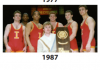
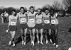
The 1987 wrestling team won the national championship
The 1989 cross country team won the national championship
Even with all of that wonderful history, the 1980s Cyclone is undeniably dated. Thus a forum member (IG: Friendan.Design) redesigned the entire Cyclone to be less stilted and modern. It's the best of both worlds--it retains the iconic concept of the 1980s logo and successes without explicitly being attached to Criner.
When I think of the 1980s, I think of Hilton Magic and national championships.
Embrace Heritage.
Embrace the Orr Cyclone.

My preference for ISU would be to mirror the OKSt model with the alts and jersey/pant striping.
I just hope like hell we don't do what the Minny Yellow Rodents are doing:
https://hyprrelite.com/
There simplistic jerseys/pants are awful.
/cdn.vox-cdn.com/uploads/chorus_asset/file/7989383/1647502.0.jpg)
/cdn.vox-cdn.com/uploads/chorus_asset/file/7989379/6337470.0.jpg)
The bird in a blender was an attempt on a "modern" take, but it was overly complicated and added blue, which is pretty much universally hated now.
Always find it interesting how few people wore team gear in the 80s/90s. You go to a game now, and everyone is just a couple tweaks from being the mascot. It certainly looks better on TV nowadays. I was young, and maybe it's the nostalgia, but sports were much more casual back then.
I'm pretty sure I referred to it as the Orr Cyclone because of your posts, so that explains it. I didn't know Johnny disliked it though. No matter, it is still defining of that era of Cyclone sports and as you said, ISU athletes won titles under it.
To me it feels like a Classic Big 8 style logo. Something you could look at and immediately make the connection to the ISU Cyclones. The bird in a blender was an attempt on a "modern" take, but it was overly complicated and added blue, which is pretty much universally hated now.
Like anything else, at some point someone realized they could sell team shirts and make money, a lot of money.Always find it interesting how few people wore team gear in the 80s/90s. You go to a game now, and everyone is just a couple tweaks from being the mascot. It certainly looks better on TV nowadays. I was young, and maybe it's the nostalgia, but sports were much more casual back then.
It wouldn't surprise me if Orr hated that logo because it was introduced shortly after Criner was hired. Associating this logo with anyone besides Criner seems very wrong to me.
It should be noted that the singlets the wrestling team wore as national champions in 1987 and the cross country team wore in 1989 and 1994 did not have this logo present like they do today.
As an athlete in the period, I don't think I had one department issued shirt, or sweats with that logo on it in 4 years.
To be clear- I have zero issue with this version and it is 100x better than the bugle. Just no Iowa State script and we are fine