That "circle A" is almost identical to the US Third Army patch, pretty dope.
I think it's safe to say all the best graphics and logo work stopped with the Orrnado. I don't see anything after 1985 worth a ****.
Love the rebrand as the "Orrnado"!!!

That "circle A" is almost identical to the US Third Army patch, pretty dope.
I think it's safe to say all the best graphics and logo work stopped with the Orrnado. I don't see anything after 1985 worth a ****.
As soon as I saw it, I thought they were trying to make it look similar to the CircleCy logo. I'm glad you have confirmed those suspicions in a way. It makes sense to create a consistent brand identity across all the logos, otherwise they would have 3 logos that all clash with each other. Unfortunately, because that logo is garbage in the first place, we have essentially double downed on garbage.
One other thing that I don't think people have considered is how easy it is to make helmet stickers of each logo. The new logo is easy to produce with the clean edges, and easy to slap on any color helmet. With the Orr logo, you would need to make multiple stickers, depending on the color of the helmet. If this had anything to do with the decision, I see it as cheap. Overall disappointed but I kinda understand why they did it.
A better choice would have been to replace the circle cy with walking cy. Go full vintage logos. My two cents...
Other than golfing sweaters and polos- Orr rarely used this logo so attaching it to his program is a stretch. (see previous post).Wrote a thing about the new Cyclone logo and how ISU can properly honor its heritage through design.
Does the new logo fit the bill? Really want to see the reaction of you good people here to the story. Let's discuss!
Some teaser images from the story:
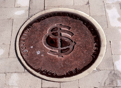
That would look so beautiful on an oldtime-styled softball uniform!The later interlocking ISU logo (1930-1941) can still be found on some old manhole/steam tunnel covers around campus:
http://archive.inside.iastate.edu/2008/1024/alumni.shtml
I always thought that this one looked like Cy was being flushed down the toilet.This masterpiece.

Same here and sorry, calling Kagavi's design the Orr logo is wrong. IIRC, was never used with the MBB program. Hated that logo back when Criner was coach, in part, due to the design, in part due to the regrettable move from Cardinal to Red when Criner took over and in part due to its association with an awful period of ISU FB that included probation, a hated FB HC, and a terrible on the field product.nice write up. the yellow storm logo doesn't look "complete" enough for me compared to the new logo. the new one is growing on me.
Same here and sorry, calling Kagavi's design the Orr logo is wrong. IIRC, was never used with the MBB program. Hated that logo back when Criner was coach, in part, due to the design, in part due to the regrettable move from Cardinal to Red when Criner took over and in part due to its association with an awful period of ISU FB that included probation, a hated FB HC, and a terrible on the field product.
So you hate the coach? And last I checked, Cardinal is the correct color, not Red, and the majority of sane fans have optimism for the program's future. The Criner era was a cluster from Day 1 and Campbell's era has not been despite last Thursday's result.How's that any different than today? Might as well look good as we take OU's **** in the ass
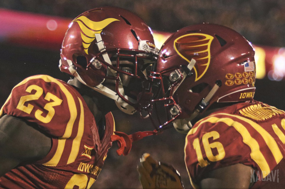
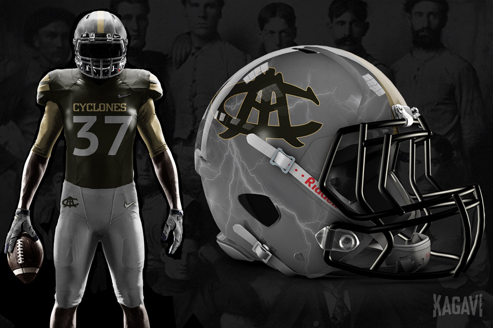
Just had to bump this. What shows the power of a Cyclone more than lightning. That was an incredible background image. Definitely what would set the logo above and beyond all else.I absolutely love the lightning on the gray helmet, but what is that symbol?
And it is also uterus shaped. I am not a fan of either. We can do so much better. Let's not live in the past. Kagavi did a nice job and i think he could create an original masterpiece to survive a century.
Appreciate the effort but the top edges reduce the resemblance to a bugle by quite a bit. I would keep them.
Also, love the idea of helmet stickers related to Trice and Kagavi comes up with great stuff usually but I think it is only OK. The design seems very basic with a complex story background IMO and you'd have to sit someone down for a 10 minute convo to explain East Tech, scarab, rebirth, etc and get a response of "Oh ok, well it is still just a T in an oval." If the coaches ran with it, I'm not starting a hate thread about it but if we've learned something from this secondary logo situation, if someone has misgivings, it may be best for all if someone speaks up.
That is the primary logo of "Iowa Agriculture College and Model Farm" (1894) .....
Something about Cy looking up instead of forward is what bothers me about this logo.I'm the only person in the state that actually really digs the circle cy logo.
The new "Bugle" logo looks like a modified version of "What is red and goes 100 mph? Cy in a blender."


Except the bottom logo is pretty awesome.
