Just keep it simple. Look at the good logos. Flat. No shading. No bad attempts at depth. Why do they make it so hard?

No forums found...
Site Related
Iowa State
College Sports
General - Non ISU
CF Archive
Install the app
About the new logo, Johnny Orr, & Jack Trice
- Thread starter Kagavi
- Start date
No forums found...
Site Related
Iowa State
College Sports
General - Non ISU
CF Archive
You are using an out of date browser. It may not display this or other websites correctly.
You should upgrade or use an alternative browser.
You should upgrade or use an alternative browser.
That is the primary logo of "Iowa Agriculture College and Model Farm" (1894) which was the official university name between 1858 and 1898.Am I missing something? What is the logo in the second image supposed to be? I don't think I've ever seen anything like that before and am having difficulty deciphering it.
http://www.sportslogos.net/logos/view/71327541894/Iowa_State_Cyclones/1894/Primary_Logo
Thank you! That was driving me crazy!That is the primary logo of "Iowa Agriculture College and Model Farm" (1894) which was the official university name between 1858 and 1898.
http://www.sportslogos.net/logos/view/71327541894/Iowa_State_Cyclones/1894/Primary_Logo
Excuse this extremely poor work in paint, but if you clip the top edges of the Orr logo just a little bit I still think you preserve the original design but update it a bit.
View attachment 50434
I think you might be on to something here. The Orr logo is 100x better than the new one we have, but I think at the top of the tornado it shouldn't be quite so wide, as you are saying here.
Not by a lot, just trim it a bit IMO at the top.
But yes, Kagavi's mock up is awesome! How much would you have charged the AD to come up with this Kagavi? I imagine JP could have saved a few hundred thousand bucks and done WAY better.
I'd bet this weeks pay check that Pollard is too stubborn to give up his sacred I-State brand, and admit that the new Cyclone is garbage.
I would also feel pretty good about betting this thing isn't going away. If we paid Nike to make this POS then there surely is no way Pollard is going to not use it. He's too much of a penny pincher to let that happen. The right answer in that situation is to tell NIke, sorry try again.
I would also feel pretty good about betting this thing isn't going away. If we paid Nike to make this POS then there surely is no way Pollard is going to not use it. He's too much of a penny pincher to let that happen. The right answer in that situation is to tell NIke, sorry try again.
Am I missing something? What is the logo in the second image supposed to be? I don't think I've ever seen anything like that before and am having difficulty deciphering it.
i'm just going to leave this here for anyone who has questions about iowa state's identity over the years. gotta catch 'em all!
Attachments

ISWYDT...i'm just going to leave this here for anyone who has questions about iowa state's identity over the years. gotta catch 'em all!
My only real complaint is @Kagavi is giving in to this gray nonsense. 
the solution is simple. if the "updated" logo is not copyrighted why don't you go make some shirts and sell them.
I'm surprised you haven't received a phone call from licensing for suggesting this.
This was really frustrating to read. Sounds like we were close to doing the right thing and someone managed to screw it up.
I understand the sentiment here, I really do, but I think the AD should be applauded for trying something different. Rigidly adhering to only the I-STATE logo was just not going to work out in the long run. Not every new idea can be a winner, but would love to see more things.
How can we get you on the AD marketing payroll??
I'll settle for them acknowledging Jack Trice's number.
please do not try to compare the Criner era to any other. That was a bad time where ISU football really was damaged in ways that took a couple decades to fix.
This kind of thinking is why I wrote the post.
Jim Walden was coach for eight years after Criner and despite an unsupportive administration, he still finished with a cumulative winning percentage of .339, which pretty much is the same as the current I-State logo. I don't think anyone would blame Criner's actions in 1986 for Walden's 0-10 season in 1994.
I believe that the grey we have been using lately is too dark.
Absolutely agree. Light gray is way to go.
Is @Kagavi planning to release the Orr logo on shirts/t-shirts? So much better.
the solution is simple. if the "updated" logo is not copyrighted why don't you go make some shirts and sell them.
Legally it's considered a derivative of an existing trademark and as such, Iowa State essentially owns the designs already.
The design seems very basic with a complex story background IMO and you'd have to sit someone down for a 10 minute convo to explain East Tech, scarab, rebirth, etc and get a response of "Oh ok, well it is still just a T in an oval."
I don't disagree. It's immediately a T in an oval, standing for Trice. If people want to know more about the backstory, then you can say it's inspired by the old ISC Circular A logo and the East Tech high school scarab logo, both from Jack's era. I wanted a nod to his high school days, since those were the days he was truly able to show what he could do without tragedy.
Just keep it simple. Look at the good logos. Flat. No shading. No bad attempts at depth. Why do they make it so hard?
^^ YES! Just keep it simpler, all these three colors and shading/bevels make logos look like minor league sports logos. He's got some of both on the portfolio:
http://joebosack.com/portfolio/
Think of the USC Trojan, Texas Longhorn, even the old old Chief Illiniwek silhouette - flat, 2 colors. Much easier to put on a hat, helmet, golf polo - big or small, whatever.
If we paid Nike to make this POS then there surely is no way Pollard is going to not use it. He's too much of a penny pincher to let that happen. The right answer in that situation is to tell NIke, sorry try again.
Wasn't Nike. In the story, I mentioned it was Joe Bosack & Co., the same agency that designed the Cy Head logo that all of you love so much.
Loved this article and the creative suggestions. Not real sure about the retroAC unis.
That's the beauty of an expanded throwback and "faux"-back program. One time and done. Love them? Great, buy the game-worn jersey. Hate them? Won't ever see them again.
My only real complaint is @Kagavi is giving in to this gray nonsense.
I don't support it as a "school color" but as an accompanying neutral color that ties to the stone color of historical buildings on campus, IAC's original colors, Jack Trice's jersey, and the actual color of a tornado.
I'm surprised you haven't received a phone call from licensing for suggesting this.
Just gonna sit this comment out.
That is the primary logo of "Iowa Agriculture College and Model Farm" (1894) which was the official university name between 1858 and 1898.
http://www.sportslogos.net/logos/view/71327541894/Iowa_State_Cyclones/1894/Primary_Logo
Thank you! That was driving me crazy!
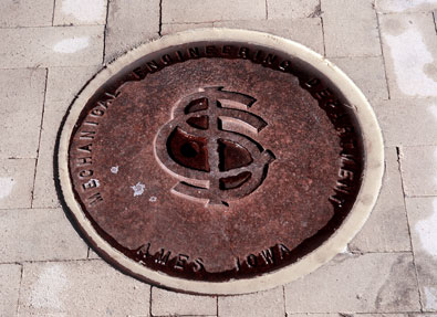
The later interlocking ISU logo (1930-1941) can still be found on some old manhole/steam tunnel covers around campus:
http://archive.inside.iastate.edu/2008/1024/alumni.shtml
The avatar choices on this page 3 of this thread are telling of the opinions of this self-selecting-review group...
Mine is a picture of a young and handsome Jim Walden and I'm not banging the drum for the script Cyclones
That "circle A" is almost identical to the US Third Army patch, pretty dope.i'm just going to leave this here for anyone who has questions about iowa state's identity over the years. gotta catch 'em all!
I think it's safe to say all the best graphics and logo work stopped with the Orrnado. I don't see anything after 1985 worth a ****.