
No forums found...
Site Related
Iowa State
College Sports
General - Non ISU
CF Archive
Install the app
New Court Design for Hilton
- Thread starter roundball
- Start date
No forums found...
Site Related
Iowa State
College Sports
General - Non ISU
CF Archive
You are using an out of date browser. It may not display this or other websites correctly.
You should upgrade or use an alternative browser.
You should upgrade or use an alternative browser.
like this?
Close
Previous
That looks pretty good to me. Wouldn't mind seeing the Big 12 logo in the lanes. I also thought having "James H. Hilton Coliseum" at center court was kind of a classy touch in some of the other designs, but that would probably start looking a little busy.
You know who has an AWFUL looking court? Kansas. Their court legitimately looks like it was designed in MS Paint.
You know who has an AWFUL looking court? Kansas. Their court legitimately looks like it was designed in MS Paint.
Agreed.
It is terrible
Agreed.
It is terrible
Maybe it's silly, but I just expect a historic program like KU to have a classy, easy-on-the-eyes court. Instead they have that absurdly large Jayhawk at midcourt and Allen Fieldhouse written in a font size I'm assuming was chosen so senior citizens could easily read it on TV.
Close
Previous
I like this one; even better without the signature and little Cy's. Like the Cy's but like it clean. Maybe just lose the sig and Cy's would look better.
like this?
Close
Previous
Agreed. That's awesome. Not sure about the freethrow jump circle hash marks. I don't know that many do that any longer.
And the protected area under the basket may need to be yellow (is now) and brighter to help the officials - particularlly when KU comes to town. Or maybe even illuminate the entire restricted area.

#2 by OP is nice.
Putting anything other than "I-State" logo in Center court is stupid. That new Cy face is okay (and I mean just okay) on shirts or hats, but the blender Cy was better and walking Cy the best of all. Still none of them belong on the court.
I've always loved the idea of the outline of the state of Iowa around the "I-State" logo at midcourt.
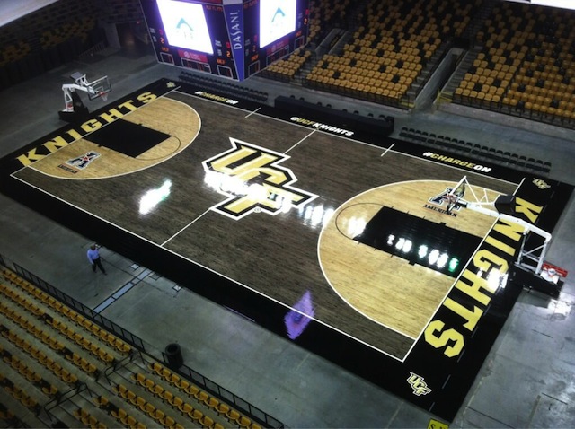
I can't see the designs, but as long as they don't look like UCF's blacktop court I'm sure they are good.
I can't see the designs, but as long as they don't look like UCF's blacktop court I'm sure they are good.
I had to go look that up. That's effin weird man!
like this?
Close
Previous
Yeah, this! Outline of the state...perfect.
This is what I like. Few changes that I think might add to it. If you would be willing to do them that would be awesome.like this?
Close
Previous
- Change State borders to gold/yellow
- 3pt and other lines should be cardinal/red
- Arc in lane should be gold/yellow
- No half circle
- Big 12 Logo
- Hilton Magic by scorers table
- Lighter stain inside 3 pt line similar to NCAA courts.
3. I don't like the shape of Iowa on the court
Was this a Fran quote?
Maybe in this whole court design, we can embed one of these just off the main floor in front of Fred's bench:
It would be a nice little tribute and would give announcers something to talk for years if they get tired of talking about Fred's championships.
It's nice but then how is he supposed to remember them.Was this a Fran quote?
Maybe in this whole court design, we can embed one of these just off the main floor in front of Fred's bench:

It would be a nice little tribute and would give announcers something to talk for years if they get tired of talking about Fred's championships.
It would be neat but wouldn't be used as Fred keeps all of the plays somewhere as he does them in a notebook type thing I believe.
It's nice but then how is he supposed to remember them.
It would be neat but wouldn't be used as Fred keeps all of the plays somewhere as he does them in a notebook type thing I believe.
I wasn't really expecting it to be functional. That's why I said tribute
like this?
Close
Previous
I don't think I'm a fan of just having the outline of the state. It looks a little too much like a neon bar sign this way. I'd prefer a solid "filled-in" version.
Guessing if a new floor is put in anytime soon DuPont will want their logo on there as well. Pioneer has their logo on NDSU floor now as well. http://www.gobison.com/news/2014/3/16/MBB_0316142216.aspx