
No forums found...
Site Related
Iowa State
College Sports
General - Non ISU
CF Archive
Install the app
New Court Design for Hilton
- Thread starter roundball
- Start date
No forums found...
Site Related
Iowa State
College Sports
General - Non ISU
CF Archive
You are using an out of date browser. It may not display this or other websites correctly.
You should upgrade or use an alternative browser.
You should upgrade or use an alternative browser.
you said next to the I in iowa state
I can't even see the picture. That might be what he meant.
I can't even see the picture. That might be what he meant.
Sorry BDK, meant I can't see it.
Things he mentioned:
All red paint will be a slightly darker red.
There will be a bit of a retro/clean look.
No more paint in the lane. The red lanes will just be outlines.
I like that the red will be darker. Interesting that the lanes won't be filled in, I don't think anybody in this thread has done that in their designs. Personally I would like to see the state of Iowa shape along with the I-State logo at center court but I'd like it to be very subtle. So much so that you might not even notice it at first glance. I also like incorporating Hilton Magic somewhere but if they are going for a clean/retro look I don't think that will happen.
I like that the red will be darker. Interesting that the lanes won't be filled in, I don't think anybody in this thread has done that in their designs. Personally I would like to see the state of Iowa shape along with the I-State logo at center court but I'd like it to be very subtle. So much so that you might not even notice it at first glance. I also like incorporating Hilton Magic somewhere but if they are going for a clean/retro look I don't think that will happen.
Put Hilton Magic on one of the baselines.
I like the retro look for basketball courts. I think our basketball court looked good in the early to mid 90s.
I hate over-sized logos on basketball courts. Prefer small centered logos. I do like the conference logo just below the free throw line. Not sure how that would play with an unpainted lane. I assume it would be all red paint for the lines. I like light wood color instead of a medium/dark stain, but not white either.
I hate over-sized logos on basketball courts. Prefer small centered logos. I do like the conference logo just below the free throw line. Not sure how that would play with an unpainted lane. I assume it would be all red paint for the lines. I like light wood color instead of a medium/dark stain, but not white either.
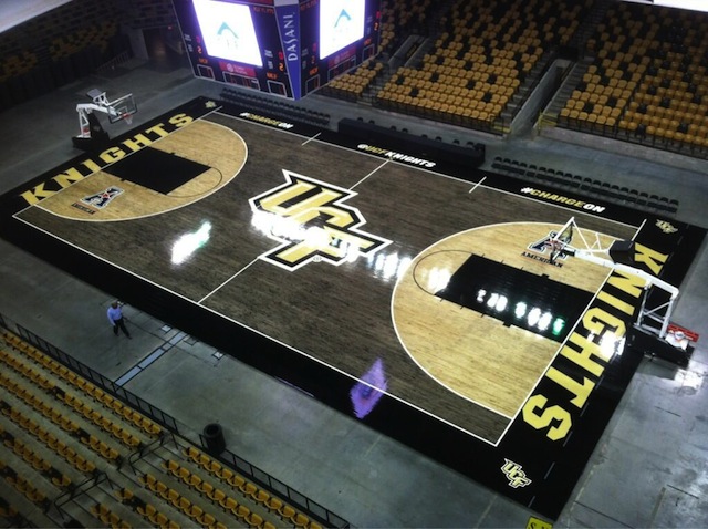
I actually like this...
But you old fogey's need to realize, looking cool is actually a big deal to young people. Something to get more pumped up about, new jerseys, cool court designs, everything.
Looking cool is overrated, and that court above is awful. There's something to be said for timeless, classic style; not flash-in-the-pan, whatever is "in" at the moment. I'd like to see less changes in the court, uniforms, logos, etc. Too many changes are why we're stuck with so many different ISU logos on everything.
Honestly, I'd be just fine if they kept the court the same as it is, but I wouldn't be opposed to making the red paint darker.
Red paint definitely needs to be darker.Honestly, I'd be just fine if they kept the court the same as it is, but I wouldn't be opposed to making the red paint darker.
Would probably just keep it the way it is. And I would let Hoiberg decide when he wants to add "Coach Hoiberg Court" Kind of how Duke has it on their court. (In other words once the NBA is completely removed as a possibility)

I didn't see this anywhere, but I like it, especially with the new XII logo. [video=youtube;rsgN4oBOSmg]https://www.youtube.com/watch?v=rsgN4oBOSmg[/video]
My vote is second from the top with the wood stained shape of Iowa. Those are actually very good for using MS Paint and I'm a designer by trade. At screen resolution I wouldn't have even known they were just MS Paint and figured you did them with illustrator vectors.
At first the Iowa outline made the court a little busy. But now, I kind have grown fond of it and as our BB gains recognition maybe we can educate the world that we are not these two:


Last edited: