Stupid logo hate thread

cyclone87

Well-Known Member
Apr 6, 2011
3,318
1,540
113
Ames, IA
It honestly looks like the CycloneFanatic logo...but messed up.

There's no motion to it, it honestly looks like a child drew what they thought a tornado looks like. IMO, it needs more of a curve or a tail. I'm not a weather guy, so I've got no idea what I'm trying to say.

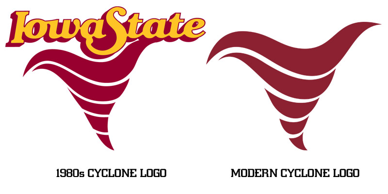
Ehh, tornados come in different shapes, sizes, orientation depending on strength and vertical wind profile. They can even rotate clockwise instead of counterclockwise in rare instances.
 

CyCloned

Well-Known Member
Oct 18, 2006
13,602
6,968
113
Robins, Iowa
Any of these...

Adding-Jack4.jpg

c4eebed4a82cab3c333f951cf2ccf9df--ames-iowa-iowa-state-cyclones.jpg

3e8db05ef630d6846c4a7f75ed612eaa--iowa-state-cyclones-sport-logos.jpg

Still like the 1980's one the best. Maybe they could change the Iowa State to the I State if they want to use that.
 

67CY

Well-Known Member
Apr 13, 2006
4,508
3,193
113
I'd think that going for it on 4th down at the opponent's 33 yd line and converting the play would have more effect on team identity than a new helmet sticker and 12 different uniform combinations. Or maybe making an offensive adjustment to take some pressure off the QB. Or maybe winning a game against a P5 school that's practically given to you on a platter. But these days we are conditioned to focus on the window dressing. So it goes...I'm too old school I guess...
Maybe that’s the plan, keep everyone focused on uniform and logo changes rather than what’s actually happening on the field and with the program. I am also too old school and about to the point where it doesn’t matter what they do. One more embarrassing idea doesn’t matter
 

TakeCover

Active Member
Mar 26, 2012
239
162
43
Des Moines, IA
here are isolated versions of my redesign concept if anyone wants to print them off and put them under peoples' windshield wipers or something.

but seriously, what a missed opportunity.

I have been using these bad boys as desktop wallpapers/phone backgrounds/fantasy team logos/you-name-it since whenever you first posted them. So clean.
 
Last edited:
  • Agree
Reactions: CYCLNST8

Mtowncyclone13

Well-Known Member
Oct 10, 2012
20,023
9,769
113
grundy center
i don't mind the attempt at it. as others have said, it looks bad on a red helmet. we should not have a red logo on a red helmet no matter what the decal is.

I suspect this logo will look good on white and grey (or gold) helmets. it's the first draft guys, they can use this as a base design to incorporate an entire helmet design using this logo which might look pretty neat.

what might be neat is whirly stripes on the helmet to look like bands in a tornado - kind of the like the bengals but better... if that makes sense?
 
  • Agree
Reactions: BBHMagic

Cyke

Well-Known Member
Jun 22, 2011
563
702
93
Des Moines, IA
As a young ISU Alum and professional graphic designer who has worked for multiple Big 12 athletic departments, this logo is absolutely awful. Very poorly designed. Very little character. No tie to old or current logos; just a turd of a logo. It lacks a unique shape and lacks depth. I agree that trying new things is great for recruiting and I love uniforms, helmets, etc; but when building brand unity and brand continuity, you don't just throw out a new secondary logo that hasn't been market tested. Very poor move in my professional opinion.
 

Sigmapolis

Minister of Economy
SuperFanatic
SuperFanatic T2
Aug 10, 2011
26,916
41,601
113
Waukee
i don't mind the attempt at it. as others have said, it looks bad on a red helmet. we should not have a red logo on a red helmet no matter what the decal is.

I suspect this logo will look good on white and grey (or gold) helmets. it's the first draft guys, they can use this as a base design to incorporate an entire helmet design using this logo which might look pretty neat.

what might be neat is whirly stripes on the helmet to look like bands in a tornado - kind of the like the bengals but better... if that makes sense?

It is just kind of blocky and "blah."

Nothing about the shape screams tornado.

The colors hidden inside of it do not giveth enough contrast.

It just looks like a blob with a yellow outline.
 

Antihawk240

Well-Known Member
May 17, 2012
915
1,055
93
A) why are we outsourcing a design, we have a college of design. It's pretty simple: It's like my marketing department at work. I toss the responsibility to the youngest hippest coolest employee. In this case, tell the College of Design to find their best student, interview them to to see if they can socially survive outside of a textbook. Tell them to make it look cool, give them 3 days to work on it. Have department head check in from time to time to see if they need any guidance.

B) My 13 year old pointed this out last night. In an end all mascot war it is fairly certain the Cyclones would match up with the Hurricanes in the national championship. Should we not have the most fierce terrifying unbelievably intimidating logo in the history of college sports?
 

heitclone

Well-Known Member
Jun 21, 2009
16,617
14,403
113
45
Way up there
I like the idea of the tornado logo but this one just looks like a cartoon or something on a little kids toy. My hope is it looks better on a different colored helmet. So is this going to be a permanent deal? Like its the official secondary logo? I wouldn't expect items to sell much with this logo on it. It'd go right in the pile of the navy blue debacle we tried in the late 90's and then lit on fire.
 
  • Agree
Reactions: CYCLNST8

jbhtexas

Well-Known Member
Oct 20, 2006
14,321
4,370
113
Arlington, TX
There are. There are many far more relevant things. At no point have I stated otherwise. If you find logo discussions trite, this thread isn't for you.

I don't find logo discussions trite. My questions are more behind the philosophy of this move, rather than about the logo itself. Why is this being done now? How is this helping ISU's football identity? To me, nothing in the timing of the reveal or the logo itself are going to do anything positive for ISU's identity. Perhaps this is not the right place for that discussion.
 

Latest posts

Help Support Us

Become a patron