New Court Design for Hilton

CYCLNST8

Well-Known Member
Jul 19, 2008
10,909
12,410
113
Urbandale
www.gimikk.com
I don't think I'm a fan of just having the outline of the state. It looks a little too much like a neon bar sign this way. I'd prefer a solid "filled-in" version.

Yeah, I'm a fan of the shaded one as well. Unfortunately, none of the designs will have unanimous backing. Unlike the rejection of the original Iowa Corn Trophy.
 

ISpyCy

Well-Known Member
Sep 17, 2011
4,234
2,074
113
40
Harlan, IA/Lincoln, NE
like this?Close
BABy2O1CMAEwfhz.jpg:large
Previous
What would this look like if the state shape were filled in WITH the border? Also, the "Deep in the corn" court would probably look better if the corn were scaled back and not taking up so much of the court. Just my opinion. Great work thus far!
 

ZachsterPoke

Well-Known Member
Jan 4, 2010
1,147
120
63
I don't think I'm a fan of just having the outline of the state. It looks a little too much like a neon bar sign this way. I'd prefer a solid "filled-in" version.
While I agree with the idea of having something that looks filled in, I don't think we could use a school color, as that would blend with the borders of either the I or the STATE. Maybe just a darker wood stain?
 
Last edited:

abe2010

Well-Known Member
Jan 14, 2009
1,435
106
63
Story City, IA
Yeah, I'm a fan of the shaded one as well. Unfortunately, none of the designs will have unanimous backing. Unlike the rejection of the original Iowa Corn Trophy.

other than the announcement of hot tubs in the SEZ we may never see such a united CF again
 

Dryburn

Well-Known Member
Apr 3, 2006
10,029
516
113
Somewhere in the U.S.
There was an image once of CY standing with hands on hips, over an outline of the state of Iowa that I always thought would look good on the center of the court.
 

Cyke

Well-Known Member
Jun 22, 2011
563
702
93
Des Moines, IA
It's funny that this has been brought up.
I recently just spoke to one of ISU's graphic designers and he told me they're in the middle of redesigning the court. It will be redesigned by next season.

Things he mentioned:
All red paint will be a slightly darker red.
There will be a bit of a retro/clean look.
No more paint in the lane. The red lanes will just be outlines.

he didn't touch on the center court logo.
 

cyowa

Well-Known Member
Apr 18, 2006
702
276
63
I really like number 2. I have often thought that ISU should feature the logo with an outline of the state of Iowa. I just thought that that was a natural, and thought ISU should be The First in the state to do that before another school does --- if you get my drift.
 
  • Like
Reactions: WalkingCY

CoKane

Well-Known Member
Oct 26, 2013
18,166
11,778
113
Cedar Rapids
Could we remove the ISU logo, and instead get pictures of a guy ******* on the Hawkeye Logo, shiting on the UNI logo, and barfing on the Drake logo :jimlad:.
 

cyclones500

Well-Known Member
Jan 29, 2010
35,919
23,442
113
Michigan
basslakebeacon.com
Was this a Fran quote?


Maybe in this whole court design, we can embed one of these just off the main floor in front of Fred's bench:

6a00d83451616069e201538e3d4e36970b-350wi

It would be a nice little tribute and would give announcers something to talk for years if they get tired of talking about Fred's championships.

I'd like to see a school use an actual court design that looked like an old-school coach's chalkboard.

(It would work only for green-and-white teams, probably).
 

ISUCyclones2015

Doesn't wipe standing up
SuperFanatic
SuperFanatic T2
Dec 19, 2010
13,979
9,497
113
Chicago, IL
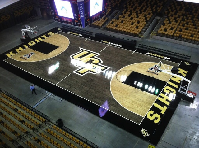
ucfcourt.jpg


I actually like this...

But you old fogey's need to realize, looking cool is actually a big deal to young people. Something to get more pumped up about, new jerseys, cool court designs, everything.
 

CysRage

Well-Known Member
Oct 18, 2009
13,116
8,101
113
It's funny that this has been brought up.
I recently just spoke to one of ISU's graphic designers and he told me they're in the middle of redesigning the court. It will be redesigned by next season.

Things he mentioned:
All red paint will be a slightly darker red.
There will be a bit of a retro/clean look.
No more paint in the lane. The red lanes will just be outlines.

he didn't touch on the center court logo.
It wouldn't surprise me since they have to have the new Big 12 logo on the floor starting next year anyways, you might as well redesign the floor in the process. I'm pretty excited to see what they end up doing then!
 

jdoggivjc

Well-Known Member
Sep 27, 2006
59,528
21,043
113
Macomb, MI
Pretty partial to this one. Not sure why. See avatar.

2 or 3 or this one. Or just put the new XII logo on our existing court. And I don't like Orr's signature on the floor - that belongs to Hoiberg after he takes us to the promised land. Yeah, yeah, I know, people would say that Hoiberg would say that it belongs to Orr, but first that's him being humble, and second Orr would say that he's been honored enough and that it belongs to Hoiberg.
 

CysRage

Well-Known Member
Oct 18, 2009
13,116
8,101
113
like this?

Close
BABy2O1CMAEwfhz.jpg:large


Previous
This one FTW if ISU still has Pioneer sponsoring the floor! If not, then instead of the Pioneer logos, put James H. Hilton Coliseum across the bottom while still inbounds. Also add the new Big 12 logos under the freethrow line then its perfect!