Could you do this one with a gold facemask......

These are all awesome, and so fun to look at. Thanks for indulging me!


Could you do this one with a gold facemask......
These are all awesome, and so fun to look at. Thanks for indulging me!
That kid was every ISU fan during the Kansas State games the last 10 years before last year.
What combo is the team wearing on Saturday?
What combo is the team wearing on Saturday?
In all seriousness though....WTF?KSU fans don't get to comment on anybody's uniforms, helmets, or logos...

I’ve spent considerable time in Ames and Manhattan. KSTATE chicks are hotter and it’s not even close.
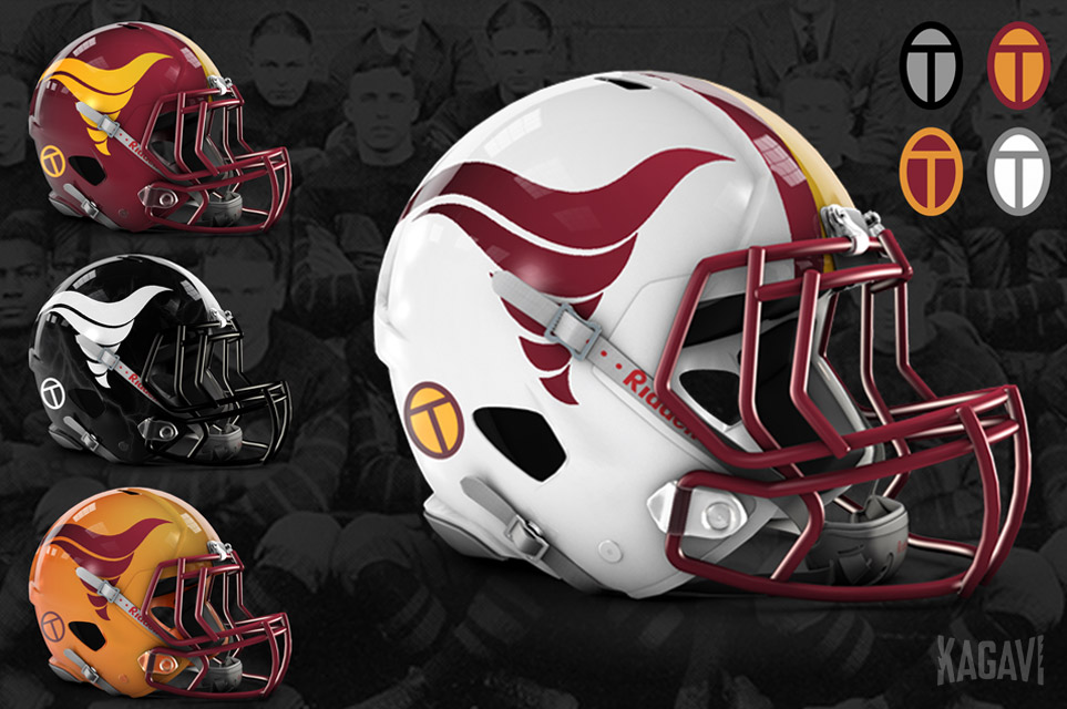
Something I noticed in your helmet logo design is that the Orr/Criner Tornado had a more forward leaning "agressive" looking slant to it. I really like this little tweak to it. Something just that simple really updates it and makes it look a little more modern.
Is it possible to just post an image of that logo alone, with how it looks with that slight change?
I just think it looks a little better than the more straight up version, almost giving movement to the tornado.
Or is it just an optical illusion on the different helmet styles and lines, and how they are positioned?


YES, that is exactly what I was talking about! That little tweak in slant. LOVE IT. The little updates that have been done like this really should be sent to Pollard to show how its different enough to distinguish it from what he calls the dark times in ISU football, but still classic enough and simple and still directly related to that retro logo.
Something I noticed in your helmet logo design is that the Orr/Criner Tornado had a more forward leaning "agressive" looking slant to it. I really like this little tweak to it. Something just that simple really updates it and makes it look a little more modern.
Is it possible to just post an image of that logo alone, with how it looks with that slight change?
I just think it looks a little better than the more straight up version, almost giving movement to the tornado.
Or is it just an optical illusion on the different helmet styles and lines, and how they are positioned?