Iowa State Uniform Discussions (update: new basketball unis)

t-noah

Well-Known Member
Feb 2, 2007
18,316
11,940
113
If you have time do you think you could take that picture of Noel in C/W/W from the promo today and inverse the colors of the numbers? I'm curious how the gold would look wrapped in cardinal and I think it would look awesome with the gold pants.
I'm not finding a good pic of Jaylin in the c/w/w set. It's either a side view or he has the helmet off in the pic.

I'll do it in the next few days in 1D, but I don't think I want to spend the time doing it in 3D (takes me longer) and I don't think yellow numbers on white jersey would work or stand out well enough to see from a distance.
 
  • Friendly
Reactions: BWRhasnoAC

t-noah

Well-Known Member
Feb 2, 2007
18,316
11,940
113
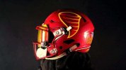
Oh great…. the helmets don’t match the jerseys again! I swear this cardinal is brighter.
Agree. I'm hoping it's just a lighting thing, but...

I'm not confident in this. If the cardinal jersey is too bright now, that is a huge fail and it's not just on Nike, it's on the ISU admin & coaches/support staff for letting it happen.

Like I said before, Let's wait and see some more pics later before we get our pitchforks out. Ghrr...
 
  • Agree
Reactions: clonedude and 67CY

t-noah

Well-Known Member
Feb 2, 2007
18,316
11,940
113
I doubt Campbell cares either way. He often wears gear that doesn’t have the I State on it.
If Campbell sported the upside down poo emoji in black & silver, I don't think I would be too surprised.
 
Last edited:

jdoggivjc

Well-Known Member
Sep 27, 2006
60,119
21,866
113
Macomb, MI
Was hoping for a stripe on the pants but I like these more than our previous threads.

As much as it would be nice to have stripes on pants, here’s the problem: it affects the ability to mix and match, especially with the black jersey. We don’t strictly do “blackout” with the black jersey; we sometimes do B/B/W or even W/B/W. If you put stripes on the white pants (and they seem to be the default pants) you either have to double up on white pants or eliminate potential combos from the black jersey.
 

t-noah

Well-Known Member
Feb 2, 2007
18,316
11,940
113
As much as it would be nice to have stripes on pants, here’s the problem: it affects the ability to mix and match, especially with the black jersey. We don’t strictly do “blackout” with the black jersey; we sometimes do B/B/W or even W/B/W. If you put stripes on the white pants (and they seem to be the default pants) you either have to double up on white pants or eliminate potential combos from the black jersey.
Very true.

Remember a year or 2 back, we did a w/b/w or a b/b/w, and sported the white pants with the black swoosh and black I-State.

It was weird 'cause we only used those pants like one time. They had to have bought a whole set of those pants. OR, the equipment department seamstresses were working overtime.
 

t-noah

Well-Known Member
Feb 2, 2007
18,316
11,940
113
Agree. I'm hoping it's just a lighting thing, but...

I'm not confident in this.
If it WAS just a lighting thing, how did this reveal get released? The cardinal and gold stage stripe (Cardinal anyway) is so much darker than the new cardinal jersey. So is Becht's helmet.

I would think the photo-editing folks would have fixed a lighting issue before release. But they didn't. What does that say? I'll be quiet now.
 
  • Like
Reactions: Cloned4Life

Cloned4Life

Well-Known Member
Mar 5, 2006
2,834
2,197
113
If it WAS just a lighting thing, how did this reveal get released? The cardinal and gold stage stripe (Cardinal anyway) is so much darker than the new cardinal jersey. So is Becht's helmet.

I would think the photo-editing folks would have fixed a lighting issue before release. But they didn't. What does that say? I'll be quiet now.
Fair.

I’m going from “whelmed” to disappointed on these. Maybe they’ll look better live.

A lighter shade of Cardinal simply = generic red.

Combined with generic yellow = McDonald’s.

We had come such a long way from the McDonald’s look of the early/mid 00’s :confused:
 

Billups06

Well-Known Member
SuperFanatic
SuperFanatic T2
Apr 18, 2006
1,295
1,177
113
If it WAS just a lighting thing, how did this reveal get released? The cardinal and gold stage stripe (Cardinal anyway) is so much darker than the new cardinal jersey. So is Becht's helmet.

I would think the photo-editing folks would have fixed a lighting issue before release. But they didn't. What does that say? I'll be quiet now.
The cardinal helmets and jerseys appear to be fine in the other photos of Rocco. Would imagine it’s lighting.

Our helmets often appeared darker then our previous jerseys, based on lighting:

72061539007-ap-23363731111698.jpg
 

t-noah

Well-Known Member
Feb 2, 2007
18,316
11,940
113
The cardinal helmets and jerseys appear to be fine in the other photos of Rocco. Would imagine it’s lighting.

Our helmets often appeared darker then our previous jerseys, based on lighting:

Hope so.

But my question still stands. Why would they release this reveal without a slight photo-editing correction? Are they just trying to make us crazy?

And succeeding.
 

t-noah

Well-Known Member
Feb 2, 2007
18,316
11,940
113
The cardinal helmets and jerseys appear to be fine in the other photos of Rocco. Would imagine it’s lighting.

Our helmets often appeared darker then our previous jerseys, based on lighting:

72061539007-ap-23363731111698.jpg
And your link here, the helmet and jersey are very similar in color, the helmet being darker, yes, which is OK. Being a little darker with the helmet is much better than it being lighter.

However, the helmet in today's reveal is much darker, and the jersey noticeably brighter. Why would they release it that way?
 

Billups06

Well-Known Member
SuperFanatic
SuperFanatic T2
Apr 18, 2006
1,295
1,177
113
And your link here, the helmet and jersey are very similar in color, the helmet being darker, yes, which is OK. Being a little darker with the helmet is much better than it being lighter.

However, the helmet in today's reveal is much darker, and the jersey noticeably brighter. Why would they release it that way?
I don’t think the new uni’s are all that different from the helmet.


cycloneML

Well-Known Member
Mar 5, 2008
5,090
2,060
113
Fair.

I’m going from “whelmed” to disappointed on these. Maybe they’ll look better live.

A lighter shade of Cardinal simply = generic red.

Combined with generic yellow = McDonald’s.

We had come such a long way from the McDonald’s look of the early/mid 00’s :confused:
I’m with you. I’m now at the apathy stage
 

Latest posts

Help Support Us

Become a patron