About the new logo, Johnny Orr, & Jack Trice

clonedude

Well-Known Member
Apr 16, 2006
33,014
29,245
113
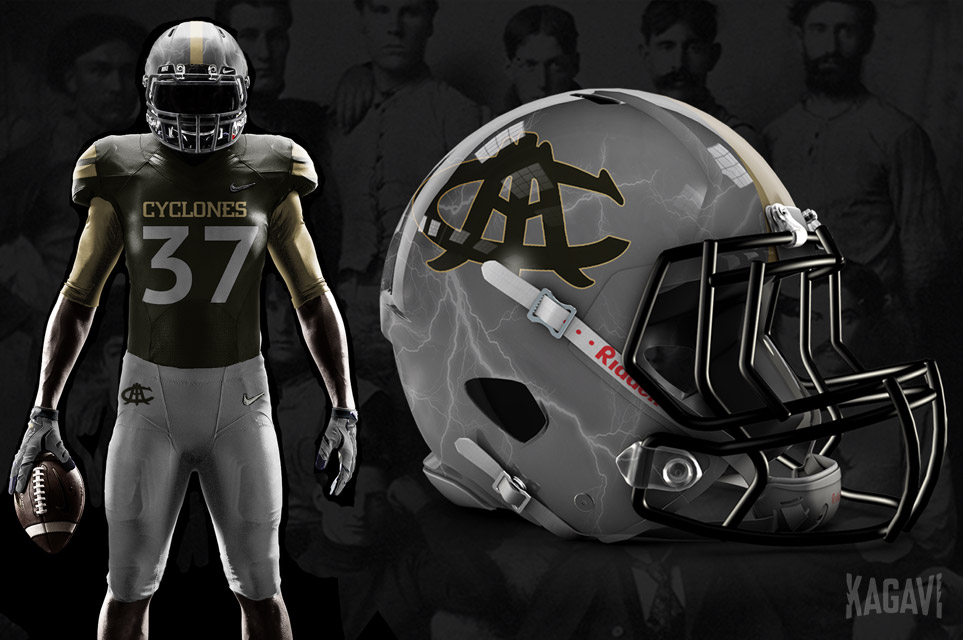
Agree completely with whoever said that if we're going to do gray, then it needs to be quite a bit lighter.

First, it would look more like storm clouds to me, and second, then you could read the players numbers and names a LOT better. Would just be a much sharper look IMO.
 
  • Agree
Reactions: Sparkplug and k123

BWRhasnoAC

Well-Known Member
SuperFanatic
SuperFanatic T2
Apr 10, 2013
30,011
27,719
113
Dez Moy Nez
Wasn't Nike. In the story, I mentioned it was Joe Bosack & Co., the same agency that designed the Cy Head logo that all of you love so much.


That's the beauty of an expanded throwback and "faux"-back program. One time and done. Love them? Great, buy the game-worn jersey. Hate them? Won't ever see them again.


I don't support it as a "school color" but as an accompanying neutral color that ties to the stone color of historical buildings on campus, IAC's original colors, Jack Trice's jersey, and the actual color of a tornado.


Just gonna sit this comment out.
Cy head logo? I don't particularly care for any of our logos, and honestly our colors look like McDonalds. I'm just here so I don't get fined.
 

Kagavi

Well-Known Member
Mar 4, 2013
608
1,610
93
California
www.kagavi.com
The later interlocking ISU logo (1930-1941) can still be found on some old manhole/steam tunnel covers around campus:
http://archive.inside.iastate.edu/2008/1024/alumni.shtml
manhole.jpg

Even more cool when you realize that the logo is actually from the very early 1900s and those manhole covers may have been created around 1904. That's why its on the Trice Pendleton blanket tag

Cy head logo? I don't particularly care for any of our logos, and honestly our colors look like McDonalds. I'm just here so I don't get fined.

This masterpiece.

logo_-iowa-state-university-cyclones-cy-head-ellipse.png
 

VeloClone

Well-Known Member
Jan 19, 2010
48,335
39,102
113
Brooklyn Park, MN
This masterpiece.

logo_-iowa-state-university-cyclones-cy-head-ellipse.png

Figures it would be the same group. The only way I "like" that is that it isn't the full body "Bucky Cy" that is absolutely terrible. If I "like" it because it isn't quite something I really dislike then I guess I am guilty. If someone gets me something with "Bucky Cy" on it I will be immediately returning it and I never return gifts that fit. I'm confident I will do the same with the new cyclone. On the other hand, I still have an original jacket with the old school cyclone on it from the '80s.
 
  • Agree
Reactions: SolarGarlic

CloneConer

Active Member
Apr 15, 2016
101
128
28
Even more cool when you realize that the logo is actually from the very early 1900s and those manhole covers may have been created around 1904. That's why its on the Trice Pendleton blanket tag


This masterpiece.

logo_-iowa-state-university-cyclones-cy-head-ellipse.png
As soon as I saw it, I thought they were trying to make it look similar to the CircleCy logo. I'm glad you have confirmed those suspicions in a way. It makes sense to create a consistent brand identity across all the logos, otherwise they would have 3 logos that all clash with each other. Unfortunately, because that logo is garbage in the first place, we have essentially double downed on garbage.

One other thing that I don't think people have considered is how easy it is to make helmet stickers of each logo. The new logo is easy to produce with the clean edges, and easy to slap on any color helmet. With the Orr logo, you would need to make multiple stickers, depending on the color of the helmet. If this had anything to do with the decision, I see it as cheap. Overall disappointed but I kinda understand why they did it.

A better choice would have been to replace the circle cy with walking cy. Go full vintage logos. My two cents...
 

Land Shark

Well-Known Member
Apr 6, 2006
787
1,156
93
I am glad people are starting to refer to it as the Orr logo, not the Criner or Walden one. It deserves the good memories of Hilton Magic far more than some regrettable football.

Because it is Criner's logo. See below

"Criner hired equipment manager Roger Gade and the two of them gave ISU fans a thrill by introducing new helmets. Cade and Criner first changed the color combination that had served the Cy's for years. Noting that a cardinal was a bird that was not actually colored Cardinal but rather, red, Criner had Cade prepare bright red helmets to more closely mimic the bird's true color and any contrast utilized a Green Bay gold. However, during the '83 season, the team's official helmet shell color was Green Bay gold with a true red one-inch center stripe, and on each side, they supplied an interesting new logo. To contrast with the Green Bay gold helmet, the new logo consisted of red cursive "Iowa State" lettering and a red cyclone funnel was connected to and was placed beneath the word State. To set-off this new headgear, a red mask was added as the final highlighting touch"
 

Land Shark

Well-Known Member
Apr 6, 2006
787
1,156
93
Johnny"s teams always used the Cy dribbling a basketball logo- never used the CrinerClone on any uniforms. (which I like compared to the emoji) . cy.png
 
Last edited:

DhaCheann

Well-Known Member
Mar 31, 2012
770
645
113
Denver, CO

Cycsk

Year-round tailgater
SuperFanatic
SuperFanatic T2
Aug 17, 2009
28,373
17,290
113
That is the primary logo of "Iowa Agriculture College and Model Farm" (1894) which was the official university name between 1858 and 1898.

http://www.sportslogos.net/logos/view/71327541894/Iowa_State_Cyclones/1894/Primary_Logo


Doesn't the AAC of the original logo represent Ames Agricultural College (not Iowa Agricultural College)? And didn't the football team originally wear "A's" for their varsity letters?

P.S. Thanks again Josh for the t-shirt with the AAC logo. That is always good for a conversation, even with old-time ISU fans.
 

Cycsk

Year-round tailgater
SuperFanatic
SuperFanatic T2
Aug 17, 2009
28,373
17,290
113
I'm not sure what this says about my ability to enter into design conversations, but I didn't even notice the new logo on the helmets until 2am Friday morning when I was watching the replay! And we sit in the front row of the upper deck! For the record, I have trouble reading jersey numbers too. Maybe it is mostly a me problem.
 
  • Agree
Reactions: Mtowncyclone13

Cyclones01

Well-Known Member
SuperFanatic
SuperFanatic T2
May 23, 2008
2,347
1,199
113
Urbandale
@Kagavi - in your opinion, is it at all realistic that the AD would Ctrl-Z the current design and go with the clearly better design that you came up with awhile ago? Seems like a situation where they may want to avoid egg on their face and would stubbornly cling to a bad decision.

I was pumped to hear that we had a tornado logo, expecting that the AD had run with your design, only to be extremely disappointed when I actually saw it. On one hand, I'm glad they've finally acknowledged the need for a nickname logo, but... COME ON! It's two steps forward, one step back.

If the reason you wrote about is true, that they thought it would remind people of losing football... I have no words. Losing football reminds people of losing football. Stop losing and thats a non-issue.

They really need to stop using this design firm.....
 
  • Like
Reactions: cynile

Nelcyn

Well-Known Member
Nov 29, 2012
733
713
93
Colorado
Great read. Hate the new cartoonish logo.
My only concern with the Orr tornado logo is that the general shape looks sort of like the Texa$ Longhorn logo on their helmets.
And it is also uterus shaped. I am not a fan of either. We can do so much better. Let's not live in the past. Kagavi did a nice job and i think he could create an original masterpiece to survive a century.
 

Latest posts

Help Support Us

Become a patron