CAMPBELL: Complete uniform/image overhaul coming

Sigmapolis

Minister of Economy
SuperFanatic
SuperFanatic T2
Aug 10, 2011
26,960
41,681
113
Waukee
Respectfully, there is not one person in America who confuses us with those schools and if they do- they know nothing about intercollegiate athletics and that opinion does not count. If you hate that logo- I am cool with you saying that but to say we are confused with those schools in absolutely untrue IMO. I have been stopped in Boston, Wash. DC and in LAX and every single time, someone mentioned how they love Cyclone Basketball. The logo is known and I would hate to throw away the most visibility that this school has ever had w/ a logo just to scratch an itch that we need to use a tornado on a helmet. (which is cool if we do).

Nobody is confusing us with any other school anywhere except in grade schools in Idaho perhaps

I don't know about you, but living in DC I get the...

"I-State? Are you from Illinois?" (when wearing Iowa State gear)

"I'm from Iowa." "Oh, you're from Ohio? That's neat." ...all the damn time
 

Land Shark

Well-Known Member
Apr 6, 2006
789
1,158
93
I don't know about you, but living in DC I get the...

"I-State? Are you from Illinois?" (when wearing Iowa State gear)

"I'm from Iowa." "Oh, you're from Ohio? That's neat." ...all the damn time
Never but I don't live in DC either so my opportunities are usually at Reagan, the arena or at the Sheraton
 

jdoggivjc

Well-Known Member
Sep 27, 2006
61,630
23,889
113
Macomb, MI
I was just at the Leid Rec Center tonight for the volleyball camp. On the wall they have depictions of Cy from 1965, 1983, 1997, and the current "Badger" CY. The '90's and current versions of CY are bright red and yellow. The 60's thru 80's Cy are DEEP Cardinal and dark Yellow Gold. I would say "Gopher" gold is probably closer to correct for our true shade of gold. Before anyone says "well now we're just going to look like UM Gophers"......their red is more blue in it making it purplish. Our Cardinal is a deep true red, we just need to darken it up from where we are now.

Tolstoy

There's an official term for Minnesota's red: it's called "marroon".
 

jdoggivjc

Well-Known Member
Sep 27, 2006
61,630
23,889
113
Macomb, MI
I don't know about you, but living in DC I get the...

"I-State? Are you from Illinois?" (when wearing Iowa State gear)

"I'm from Iowa." "Oh, you're from Ohio? That's neat." ...all the damn time

I have lived in Michigan for 6 years and have literally had only one person not know the I-State logo referred to Iowa State, and that was an ******* Walmart Wolverine trying to pick a fight with what he thought was an Ohio State fan.

Your problem is you live in Washington, D.C., where literally next to nobody gives a rat's ass about college sports.
 

jdoggivjc

Well-Known Member
Sep 27, 2006
61,630
23,889
113
Macomb, MI
I wish we would have modernized this concept, rather than "I-State" out of nowhere.

2603_iowa_state_cyclones-alternate-1975.png


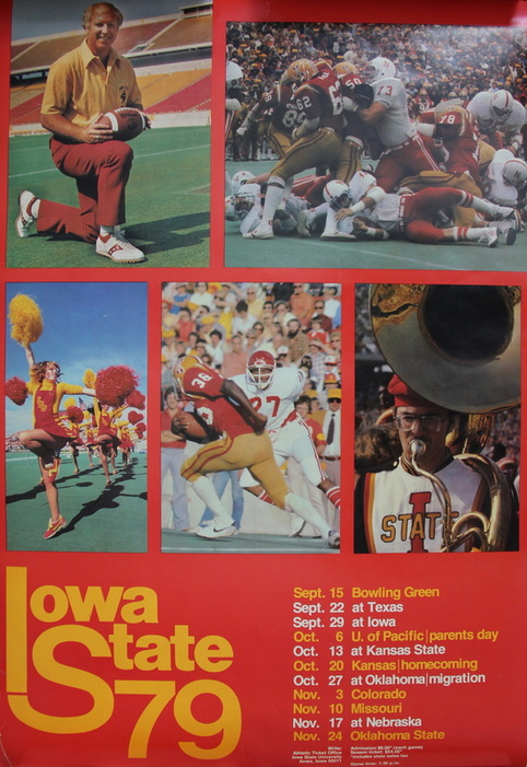
We are not I-State -- we are ISU. The "State" is weirdly prominent and frowning. This was what Bruce and the team wore to the Peach Bowl, too.

Having the block "I" and the ISU at the same time is perfect.

That with updated colors, a sharper font, and a gold outline instead of a cardinal or white one would be killer. Anybody want to mock that one up?

I did something like it once for helmets...

gJvAX4j.png


My MS Paint skills are limited, however.

Add in the 80s tornado and the walking Cy for our nickname and mascot logos and we'd have been set for the next century. Alas, we have what we have.

Someone on this site used to use this ISU logo modified to the current "Cyclone" font, both the gigantic "I" and the "ISU", as their site avatar. It was a fantastic logo
 
  • Winner
Reactions: Sigmapolis

Sigmapolis

Minister of Economy
SuperFanatic
SuperFanatic T2
Aug 10, 2011
26,960
41,681
113
Waukee
Someone on this site used to use this ISU logo modified to the current "Cyclone" font, both the gigantic "I" and the "ISU", as their site avatar. It was a fantastic logo

$5 more on my Patron for whoever finds this. :D
 

ComCY

Well-Known Member
Oct 31, 2016
1,538
2,150
113


Looks like they fooled us all; the big changes were multi-colored visors on the helmets.

:jimlad:?
 
  • Like
Reactions: tejasclone

CycloneWanderer

Well-Known Member
Nov 4, 2007
8,337
5,687
113
Wandering
I don't know about you, but living in DC I get the...

"I-State? Are you from Illinois?" (when wearing Iowa State gear)

"I'm from Iowa." "Oh, you're from Ohio? That's neat." ...all the damn time

I travel a decent amount around the southeast and people recognize the I-State logo more than anything else. I bet you that most people outside the midwest would not recognize the blender-bird or just the cyclone logo.

As a side note, I hate the vertical ISU inside the letter I. We aren't Iowa Iowa State; there is no purpose for the second "I" in the logo. If you must put ISU inside of a shape, just put it inside the freaking outline of the state. It'd look equally tacky to me but at least it would make sense.
 

Kagavi

Well-Known Member
Mar 4, 2013
614
1,632
93
California
www.kagavi.com
Someone on this site used to use this ISU logo modified to the current "Cyclone" font, both the gigantic "I" and the "ISU", as their site avatar. It was a fantastic logo

Never saw that, but I had the same idea last fall when doing the Cyclone Soup series over at WRNL. See it on the helmet here:

Cyclone-Soup-Helmet5.jpg


As a side note, I hate the vertical ISU inside the letter I. We aren't Iowa Iowa State; there is no purpose for the second "I" in the logo.

However, that design is cool, yet nags at me too, so I made this variation the following week to eliminate the redundant "I":

Cyclone-Soup-Helmet6.jpg
 

SimpsonCyclone

Well-Known Member
Jul 20, 2011
1,104
2,092
113
Iowa
Respectfully, there is not one person in America who confuses us with those schools ( I know you did not exactly say that) and if they do- they know nothing about intercollegiate athletics and that opinion does not count. If you hate that logo- I am cool with you saying that but to say we are confused with those schools in absolutely untrue IMO. I have been stopped in Boston, Wash. DC and in LAX and every single time, someone mentioned how they love Cyclone Basketball. The logo is known and I would hate to throw away the most visibility that this school has ever had w/ a logo just to scratch an itch that we need to use a tornado on a helmet. (which is cool if we do).I don't like the tornado look and I doubt our players and recruits care about the logo as much as they care that they get variety in uniform packages.

Nobody is confusing us with any other school anywhere except in grade schools in Idaho perhaps

I never said that we get confused with those schools... I am saying that neither "ISU" nor "I-State" is unique to us, in any way. I did say though that the cyclone mascot is unique to us and that it is a loss to not use it more effectively.

People recognize "I-State" and our basketball team, because our basketball team has been a national brand the past 6 years. It is in no way because of our logo make people think, "I-State? Oh that must be IOWA state.."

If we had any logo it would be more recognized now because of our success nationally with basketball. It's just too bad that the recognition came with a terrible logo..
 
  • Dislike
Reactions: Yellow Snow

jdoggivjc

Well-Known Member
Sep 27, 2006
61,630
23,889
113
Macomb, MI
I never said that we get confused with those schools... I am saying that neither "ISU" nor "I-State" is unique to us, in any way. I did say though that the cyclone mascot is unique to us and that it is a loss to not use it more effectively.

People recognize "I-State" and our basketball team, because our basketball team has been a national brand the past 6 years. It is in no way because of our logo make people think, "I-State? Oh that must be IOWA state.."

If we had any logo it would be more recognized now because of our success nationally with basketball. It's just too bad that the recognition came with a terrible logo..

Except for the fact that nationally when people who know anything about college sports look at the I-State logo they immediately identify it with Iowa State, it means the logo is working. Who cares if that's due to the success Iowa State has had in basketball in the 2010s. Do you really think the Duke logo would be nearly as recognizable if it wasn't for their 30 years of basketball dominance? It certainly isn't their football team that's making that logo recognizable.

As far as the I-State logo being "terrible", you are in an extreme minority in that opinion. Do people think the logo could be better (eliminating bevels, especially on uniforms, stenciling the logo, reversing the colors)? Of course. Do people want additional "character" logos like a cardinal logo or a tornado logo or - gasp - the whirlybird logo, in addition to the I-State logo? Of course (especially if it means the elimination of the "Bucky Cy" logo - which IS a terrible logo). But do most people want to eliminate the I-State logo? Hardly - especially since ISU has actually created a nationally-recognizable identity over the last decade with that logo.
 

VeloClone

Well-Known Member
Jan 19, 2010
48,488
39,297
113
Brooklyn Park, MN
**** "real" gold. That **** stained, hard-to-match, overrated color can blow me. If you hate McDonalds, that's fine. McDonalds wouldn't want you anyways because you're a ****. Mustard is the ****. Jack Trice wore "yellow." Earl Bruce's squads wore "yellow." Hoiberg & Johnny were all up in that "yellow" ****. That's all I need to know. Own it.

:eek:
 
  • Like
Reactions: CYCLNST8

t-noah

Well-Known Member
Feb 2, 2007
19,780
13,416
113
I was exactly here not too Cy Uniforms 2017  s1a - y r r.jpg long ago. Then I started to realize that too much white, and too many accents, doesn't look so good, especially with different combinations. I'll play around w/ it some more, and post later.
 
  • Like
Reactions: CYCLNST8

bringmagicback

Well-Known Member
Dec 3, 2009
7,858
1,113
83
CF Resident Dog Lover
Never saw that, but I had the same idea last fall when doing the Cyclone Soup series over at WRNL. See it on the helmet here:

Cyclone-Soup-Helmet5.jpg


However, that design is cool, yet nags at me too, so I made this variation the following week to eliminate the redundant "I":

Cyclone-Soup-Helmet6.jpg


I know its not your doing, but I absolutely hate that style of facemask.
 
  • Agree
Reactions: SC Cy

t-noah

Well-Known Member
Feb 2, 2007
19,780
13,416
113
Never saw that, but I had the same idea last fall when doing the Cyclone Soup series over at WRNL. See it on the helmet here:

Cyclone-Soup-Helmet5.jpg


However, that design is cool, yet nags at me too, so I made this variation the following week to eliminate the redundant "I":

Cyclone-Soup-Helmet6.jpg
Kagavi, you really need to get hired by the Athletic Dept. You've always got great ideas!

With that said, Our primary I-State logo is here to stay. I like this though. Get em with some of your other ideas, haha.
 
  • Agree
Reactions: Cycsk

bringmagicback

Well-Known Member
Dec 3, 2009
7,858
1,113
83
CF Resident Dog Lover
Kagavi, you really need to get hired by the Athletic Dept. You've always got great ideas!

With that said, Our primary I-State logo is here to stay. I like this though. Get em with some of your other ideas, haha.
I agree with the primary logo not changing but we will use multiple helmet logos. In CMC time at toledo they used at least 12 different logos and like 5 diff helmet colors.
 

Latest posts

Help Support Us

Become a patron