Stupid logo hate thread

CYCLNST8

Well-Known Member
Jul 19, 2008
10,909
12,410
113
Urbandale
www.gimikk.com
Using it in the Sound the Sirens text is kinda neat I suppose.

DK6WDF3W0AE1S0q.jpg

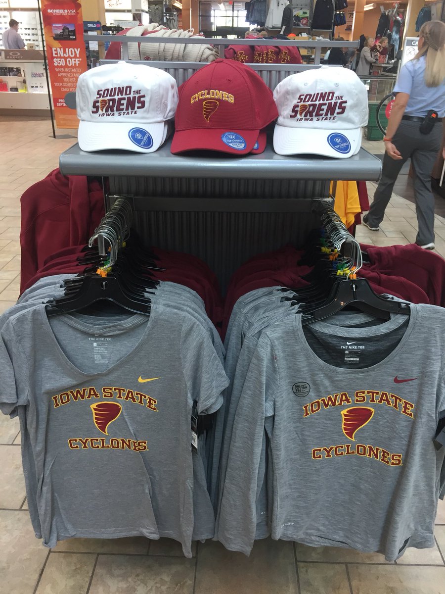
Don't anyone dare buy this ****. Leave it on the rack to rot.
 

Jeffrey Scott

Well-Known Member
Sep 28, 2017
268
295
63
70
So, we are messing around with this secondary logo because we think it's going to help recruiting and the players like this sort of thing. Folks, we are also working in the court of public opinion and trying to "raise the standard" for Iowa State athletics. From what I've read on this forum, this didn't make the cut from some of the most loyal supporters. I realize we are a limited sample but the reaction to this is stinging. Do the players like this, and will a high school athlete in Ohio, Michigan, Illinois or other parts of the country have a clue about what this says, or care?

A logo should inspire and excite. Did this thing accomplish the kind of inspiration and excitement that was hoped for?
 
  • Agree
Reactions: khardbored

jsb

Well-Known Member
SuperFanatic
SuperFanatic T2
Mar 7, 2008
30,462
33,156
113
I don't really give a **** about it. It doesn't look horrible on the t-shirts. But whatever. I like the I-State logo.

I'll point out that last night Chris said that only the old people would hate it. So apparently you are all old?
 

CYCLNST8

Well-Known Member
Jul 19, 2008
10,909
12,410
113
Urbandale
www.gimikk.com
I don't really give a **** about it. It doesn't look horrible on the t-shirts. But whatever. I like the I-State logo.

I'll point out that last night Chris said that only the old people would hate it. So apparently you are all old?

Plenty of "old people" here were ecstatic about the white helmets and stencil logo.

You don't have to be older than 5 to know this new logo is a piece of ****.
 

Rogue52

Well-Known Member
SuperFanatic
SuperFanatic T2
Oct 20, 2006
8,861
3,425
113
Cedar Rapids, IA
When I first saw the tweet from ISU Athletics yesterday, I was excited for the reintroduction of a "cyclone" mark. Something didn't seem quite right with it pictured on a helmet. I agree that the logo looks better on merchandise than it did on the cardinal helmet last night. I'm not 100% sold on any of it though.

I will say that I think some of you are giving too much credit to the "revised" 1980s mark. I love that mark too, but only in a retro sort of way -- not something that will appear in any official capacity. I agree that the mark should be closer to the 1980s version than what was introduced yesterday but just matching the color scheme is not enough. I think the 1980s mark needs a little bit more adjustments to modernize it than just changing the color scheme.
 

jbhtexas

Well-Known Member
Oct 20, 2006
14,136
4,094
113
Arlington, TX
Perhaps it is a new motivational tool:

Some cocky opponent's linebacker: Hey ISU, your new logo looks like poo...I'm serious. It literally looks like upside down poo!

ISU Offense: Oh Yeah?? We'll show you what poo likes when we run the crap out of you!! (however, it might take us awhile to get around to a running play).

Just got the email from ISU Athletics about merchandise with the new logo...
 

dmdom

Well-Known Member
Oct 28, 2014
727
594
93
I blame last nights loss on the new logo. The players were embarassed to be seen on national TV with that awful logo. The fans were in shock and couldn't commit to rallying the team. The officials were completely befuddled by our complete mismatched cartoonish uniforms. It took the focus off them, so they had to make and/or not make some ridiculous calls to regain the attention. It was the perfect storm to take what started as energetic full of potential to make great strides forward evening into a lackluster turd.
There is a certain amount of any sport thats mental. I doubt this new logo had a warrior invincible confident type impact on anyone, much less the team. Much like uncanny ability of Sweet Caroline to take any positive momentum we had and crush it. It was easy to see the impact on the field. The players sang along and then played passive after that point. There is a reason Hayen Fry painted tbe visitor locker room pink. Examples of subliminal elements NOT conducive to winning play. This new logo was a negative factor last night.
 

KnappShack

Well-Known Member
May 26, 2008
20,304
26,186
113
Parts Unknown
I don't really give a **** about it. It doesn't look horrible on the t-shirts. But whatever. I like the I-State logo.

I'll point out that last night Chris said that only the old people would hate it. So apparently you are all old?

I'm going to start using that. If you don't like something it's because you must be "old".

You don't like the smell of dog ****? Peesh. You must be old
 
  • Agree
  • Funny
Reactions: cynile and 67CY

CyGuy5

Well-Known Member
Dec 4, 2013
6,402
8,285
113
Kansas City
Not going to lie it looks a little better on shirts and hats, but it looked terrible last night. Still looks like a bugle, though
 

AuH2O

Well-Known Member
Sep 7, 2013
11,175
17,074
113
Sad thing is, Joe Bosak's other work really isn't bad. He designed the Colorado Avalanche logo along with the 2018 Final Four logo. Just a complete flop on this one. Its almost as if he didn't even bother to use the old logo as inspiration
The Avalanche logo is awful cartoon garbage as well. This guy is terrible and should feel terrible.

Two rules for helmet logos
#1 make something that looks good in monochrome and is easily distinguishable from a distance
#2 Always follow rule #1.
 

Help Support Us

Become a patron