Ranking Big 12 uniforms ...

cyclones500

Well-Known Member
Jan 29, 2010
38,579
26,514
113
Michigan
basslakebeacon.com
That critic appears to dislike addition of black when it doesn't work, and hates gray. Good for him.

The usual USC/McDonald's crap about ISU uniforms. I can't wait to see if there's a major redesign next year and neither of those aspects are as "noticeable," because you know, when your colors are cardinal and gold, there's going to be some association. Someone on CF said once, does Wyoming get compared to UPS?

Best excerpt of the list (re: Texas): "I do have one concern. In recent years, Texas has been trying to work some black into the rotation. Stop it. Stop it right now. I know you've been feeling some peer pressure to add a new color, but ignore it. You're perfect just the way you are."
 

laminak

Well-Known Member
Jun 13, 2010
6,698
10,363
113
Marion
That critic appears to dislike addition of black when it doesn't work, and hates gray. Good for him.

The usual USC/McDonald's crap about ISU uniforms. I can't wait to see if there's a major redesign next year and neither of those aspects are as "noticeable," because you know, when your colors are cardinal and gold, there's going to be some association. Someone on CF said once, does Wyoming get compared to UPS?

Best excerpt of the list (re: Texas): "I do have one concern. In recent years, Texas has been trying to work some black into the rotation. Stop it. Stop it right now. I know you've been feeling some peer pressure to add a new color, but ignore it. You're perfect just the way you are."

At least this reviewer brought up USC and admitted their bias. Most reviewers will skip that point, slam ISU's colors, and later praise USC's.
 

CyCrazy

Well-Known Member
Dec 17, 2008
26,962
15,092
113
Ames
Not sure how anyone could rate them that high, the purple and silver combo is awful. I wouldn't even put them near the top half, and I'm not saying that to troll surly..

I actually don't mind them, they are not ahead of UT, OU, or WVU. WVU loses some major points for the number style they are using now.
 

TheJackWePack5

Well-Known Member
Oct 2, 2011
11,495
11,353
113
Ankeny, IA.
Not sure how anyone could rate them that high, the purple and silver combo is awful. I wouldn't even put them near the top half, and I'm not saying that to troll surly..
Agreed. That link quotes that he likes the silver, but I think the silver pants are awful. It would help a lot if they were matte grey, IMO.
 

surly

Well-Known Member
May 16, 2013
9,690
4,088
113
reservation lake, mn
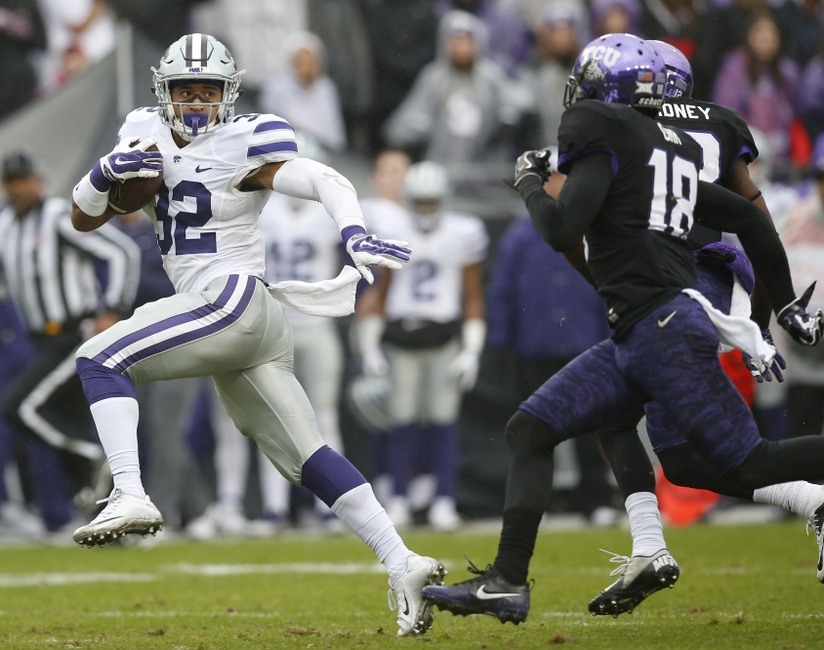
As I've said before, it's all in the eye of the beholder. I've seen K-State ranked from #8 to #1. All subjective. But I like them because they are simple, traditional, clean, with no gimmicks and a great logo helmet.
9719614-ncaa-football-kansas-state-texas-christian.jpg


Last edited:

cyclones500

Well-Known Member
Jan 29, 2010
38,579
26,514
113
Michigan
basslakebeacon.com
As I've said before, it's all in the eye of the beholder. I've seen K-State ranked from #8 to #1. All subjective. But I like them because they are simple, traditional, clean, with no gimmicks and a great logo helmet.
9719614-ncaa-football-kansas-state-texas-christian.jpg


It does a clean, classic look, I've long thought that. I've noted my non-committal to the logo, but the overall design still works --- with WVa's most basic design, I prefer it to K-State, but probably more my preference of colors than anything. And KSU hasn't bent much toward too much alternative stuff, and nothing wrong with having options, still it's good that some schools do it much less often.
 
  • Winner
Reactions: surly

Beyerball

Well-Known Member
SuperFanatic
SuperFanatic T2
Jun 18, 2013
7,468
6,805
113
Texas
I've discussed this in the uniforms thread...see McDonalds..its not just me. We are not Red and Yellow!!! We are Cardinal and GOLDGOLDGOLDGOLDGOLDGOLD.
 

surly

Well-Known Member
May 16, 2013
9,690
4,088
113
reservation lake, mn
It does a clean, classic look, I've long thought that. I've noted my non-committal to the logo, but the overall design still works --- with WVa's most basic design, I prefer it to K-State, but probably more my preference of colors than anything. And KSU hasn't bent much toward too much alternative stuff, and nothing wrong with having options, still it's good that some schools do it much less often.
WVU has a great color scheme and logo, the flying W, but their font is as bad as Ku and TCU.
 
Last edited: