No forums found...
Site Related
Iowa State
College Sports
General - Non ISU
CF Archive
Install the app
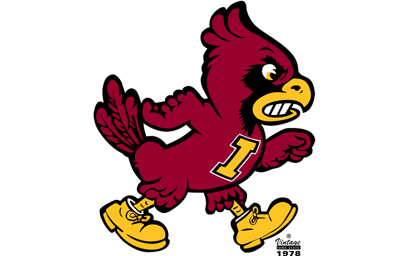
new 'walking cy' logo concept
- Thread starter amestoplease
- Start date
No forums found...
Site Related
Iowa State
College Sports
General - Non ISU
CF Archive
You are using an out of date browser. It may not display this or other websites correctly.
You should upgrade or use an alternative browser.
You should upgrade or use an alternative browser.
Off hand I couldn't identify the differences exactly, maybe do a side by side?
Either way, I think it looks pretty good. I'm generally a fan of these though.
Either way, I think it looks pretty good. I'm generally a fan of these though.
Wow, this is one of the best Cy concepts to get shared here! Really well done!there are a lot of things that i love about the old 'walking cy' logos and some things that i don't. i wanted to combine some old elements with some updated ideas to create a new-old version of a mascot mark. here's what i came up with:
View attachment 112811
Good lord. Why??I liked the boots
[edit] Are you the concept artist for the original design? Birds don't need boots. They have talons. At least give Cy a pair of cleats or Air Jordans.
Nothing would bring that old bird into the year 2023 quite like a tattoo sleeve.
Can you put the I State on the chest? We don't have a logo with just an "I".there are a lot of things that i love about the old 'walking cy' logos and some things that i don't. i wanted to combine some old elements with some updated ideas to create a new-old version of a mascot mark. here's what i came up with:
View attachment 112811
Wrestling still uses the I logo. It's one of my favorite singles too.Can you put the I State on the chest? We don't have a logo with just an "I".
there are a lot of things that i love about the old 'walking cy' logos and some things that i don't. i wanted to combine some old elements with some updated ideas to create a new-old version of a mascot mark. here's what i came up with:
View attachment 112811
Strong effort.
I'd add in the Iron Sheik's controversial footwear from 1985 to complete the look.
But really. This ain't bad
The one on the right is so ******* awful, who let that happen?
Because the boots are for kicking ass. That's why its called the Kickin' Chicken.Good lord. Why??
[edit] Are you the concept artist for the original design? Birds don't need boots. They have talons. At least give Cy a pair of cleats or Air Jordans.
Has somebody ever talked to Pollard about the current Cy logo and how that monstrosity ever got approved?
This proposal definitely beats that one!The one on the right is so ******* awful, who let that happen?
Lol, that was the logo on the first Cyclone hat I ever bought. I love everything about it.
After spending a minute studying your concept, I really like the refinements you made on the previous versions of Walking Cy while bringing in some elements from Bird-in-a-blender Cy.there are a lot of things that i love about the old 'walking cy' logos and some things that i don't. i wanted to combine some old elements with some updated ideas to create a new-old version of a mascot mark. here's what i came up with:
View attachment 112811
First, reducing some of the finer details and noise of the feathers, particularly in the tail, arms, and the black of the face makes it a much cleaner look. This is a logo that can read well when smaller, or viewed from a distance, which is one of the issues that plagues the older versions of Cy, especially whirly-bird Cy.
Second, I like that you went more arm, and less wing while still keeping feather details. The fists/hands on the Walking Cy blend in with the wings, while the feathers on the arms of the Bird-in-a-blender Cy look more like motion lines than actual feathers.
Third, you managed to keep is distinct from the Louisville and Arizona (NFL) Cardinal logos.
One nitpick I do have is the feet: because of the way they are angled/rotated they somehow look like they are backwards. To my eye it look like the left/front foot should be on the back leg, and the right/back foot should be on the front leg, if that makes sense.
Also, I would be curious to see a head only version of this. That could be neat for a helmet logo.


