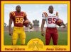
i want these againSee this. It's about time we had some consistency in our uniforms. The current set (even though it does look very similar to USC) is a solid tribute to the unis of the 70's. I like them, it's a shame the I State logo doesn't show up well on our helmets.

No forums found...
Site Related
Iowa State
College Sports
General - Non ISU
CF Archive
Install the app
New Illini Unis
- Thread starter TOFB4ISU
- Start date
No forums found...
Site Related
Iowa State
College Sports
General - Non ISU
CF Archive
You are using an out of date browser. It may not display this or other websites correctly.
You should upgrade or use an alternative browser.
You should upgrade or use an alternative browser.

why can iowa state get new unis. our unis are boring and basic
i want these again
You think our current uniforms are boring and basic, but prefer the monochrome red uniforms from the early 2000s that have no trim other than a letter I pattern around the collar?
the most basic uniforms everYou think our current uniforms are boring and basic, but prefer the monochrome red uniforms from the early 2000s that have no trim other than a letter I pattern around the collar?
Attachments
How to introduce your team's new uniforms in three easy steps:
Step one: Take photos of paid actor wearing uniform in darkest background possible.
Step two: Photoshop the **** out of photos with every effect, lens flare and filter known to man. Remember the more fake lightning bolts and smoke the better. And don't forget to black out the face!
Step three: Call local media and team together. Have players introduce new uniforms to team by stepping into team meeting room wearing every conceivable combination of the new uniforms. Make sure they make several dooshy poses to convey the total awesomeness of new uniforms.
They tried to make a big splash with a reveal in the Krannert Center (their CY Stephens).
B O R I N G (and a tad gay)
View attachment 26286
Thanks for showing everyone that you're a homophobe. So boring that they revealed em at Niketown in Chicago too. Has anything Iowa State related ever been sold there?
They tried to make a big splash with a reveal in the Krannert Center (their CY Stephens).
B O R I N G (and a tad gay)
View attachment 26286
I've typically follow the mantra of "Simpler is Better"... and I totally think it works here. I actually like them.
See this. It's about time we had some consistency in our uniforms. The current set (even though it does look very similar to USC) is a solid tribute to the unis of the 70's. I like them, it's a shame the I State logo doesn't show up well on our helmets.
If you click on your link and go back through the history of ISU football jerseys, boy did we screw up going from 1982 to 1983.
That is when our cardinal changed to bright red, and the gold changed to mustard bright yellow. Ugghh. What administration allowed that change? Terrible.
Honestly though, the Jack Trice throwbacks we wore last year our my favorite jerseys in that entire list. And the ones that poor Seneca Wallace had to wear while he was here had to be the worst IMO. The change to bright red and yellow instead of cardinal and gold was bad enough, but when we then added navy blue to the bright red and yellow, that had to take the cake for being the dumbest move ever.
the most basic uniforms ever
We don't even wear the red pants on the road anymore.
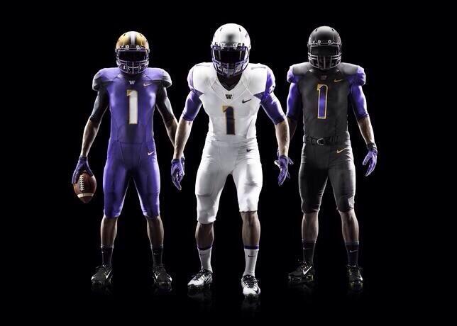
Those are pretty damn cool, although I think I'd rather see different pant colors with different jerseys. Is there a team that actually has that style of uniform?View attachment 26305 can we get these
View attachment 26305 can we get these
so we can have Texas a&m rip offs? People already complain enough about the false claim of our USC looking jerseys
Trice Jersey was awesome, just need to figure out the number on the shoulder with the ncaa.
The Trice jerseys were much more awesome in theory and internet lore and "we need to go with this" than they turned out to be on gameday. The real thing ended up being quite disappointing.