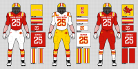
Overall pleased w the white lid + script cyclones logo. But man, cardinal and gold stripes on both helmet and pants would make this approach perfection.
Last edited:
Tell him it's not on a gold (yellow) shell. Doesn't count.
If we're gonna bring back a gold (yellow) helmet, we should bring these babies back:
View attachment 138364
Those uniforms were associated with winning.
I love those unis. Classic.we did bring those back once... and I think we beat Iowa in them.
I've seen someone draw that "old" logo in the "new" font... and it actually looks surprisingly good.
Tell him it's not on a gold (yellow) shell. Doesn't count.
If we're gonna bring back a gold (yellow) helmet, we should bring these babies back:
View attachment 138364
Those uniforms were associated with winning.

Damn I’d love to see G/C/C.View attachment 138481
Made this a long time ago - 70s-ish inspired with modern marks - kinda cheesy - not sure what my thought was with the socks stripes - but, the arching Cyclones mark on the helmet def did not work...
Those pants are hideous!Are mid-thigh shorts now acceptable college football uniform wear?
(The rule that all players must wear knee pads that actually cover the knee still exists)
The men’s white throwbacks are absolutely fantastic. Like, borderline perfect.Maybe discussed in another thread: The “throw back” WBB unis worn today are bad, hope this was a one time deal. The MBB “throw backs” aren’t much better but not embarrassingly bad like WBB’s.
I am fine with the gold alts but the white alts should have been modeled off the Hoiberg unis which were far better (with Dribbling Cy) than than the plain Jane version worn for a couple of seasons by mediocre teams prior to Fred’s arrival. They really missed the mark by strangely using those instead of the Hoiberg unis.The men’s white throwbacks are absolutely fantastic. Like, borderline perfect.
The women’s version also look good, although the yellow accents wouldn’t be my first (or 2nd) choice.
But yeah, the men’s white alts (along with the gold alts) are f***ing great.
WOW! I didn't know the mens' team got a white throwback too - they both look awesome! I wouldn't change a thing on either - the gold piping on the womens' uni looks great; nice effort to differentiate them a bit for each team - the football team should def be jealous of the b-ball teams...The men’s white throwbacks are absolutely fantastic. Like, borderline perfect.
The women’s version also look good, although the yellow accents wouldn’t be my first (or 2nd) choice.
But yeah, the men’s white alts (along with the gold alts) are f***ing great.
The red pants are too much but better than their cartoonish black unis against usI think KU's unis are sharp - not sure if I'd pair the red pants with the blue jersey, but I DEFINITELY wouldn't do it with red socks!
You & me both, friend. You & me both.Damn I’d love to see G/C/C.
The red pants are growing on me, but they needed either blue (preferably), or white socks - the red sock were a mistake - the red pants areThe red pants are too much but better than their cartoonish black unis against us
White pants with a little red trim would be lights out for them
Agree, it was better than the black outfit, also agree the red pants for the CU game was a fail.The red pants are too much but better than their cartoonish black unis against us
White pants with a little red trim would be lights out for them
I wouldn't mind that, once in a while. At least would like to see it in-game to get a better sense.Damn I’d love to see G/C/C.
Yeah, it'll be black. With the script logo. I believe they let the seniors decide for their final home game so...So is it going to be black uniforms again this week? I'm not the biggest all Cardinal look fan but I'd prefer that over black at this point.

