Iowa State Uniform Discussions (update: new basketball unis)

byebye

Well-Known Member
Jul 4, 2021
641
845
93
So stripes = McDonald's?

I agree that the early McCarney jerseys are severely underrated. Blue accents were understated and the white numbers were classic. Doxson looked like a badass.

View attachment 129701 View attachment 129702
Troy Davis v2.png
(this is based on another concept I saw long ago - wouldn't be my first choice, but I wouldn't be disappointed either... I started with the "tertiary" blue from the 90's, but ended up darkening it quite a bit)
 
  • Like
Reactions: Cloned4Life

SolarGarlic

Well-Known Member
Jan 18, 2016
6,306
9,612
113
Completely disagree on much of what you have here. Rhoads execution was great. Absolutely nothing McDonald’s about them at all. Colors matched USC, which was great and correct. The latest jerseys we revealed a month ago look very McDonald’s. The white actually makes it MORE McDonald’s, particularly the shoulder stripes on the white road jerseys. Very cringe bright red and bright yellow.

And no, the latest iteration was not “too tight”. There are factually baggier, even the lineman. Go look at Year 1 and how perfectly form-fitting (tight) they were. Since then, lots of bagginess and bunched up parts of the jerseys, on the arms, the back, etc. They don’t “fit” as well, because it was factually a slight tweak in the template.

PS. Who doesn’t freaking love Cardinal and Gold? F***ing fantastic combo, very proud that we have these awesome colors as a Cyclone fan.
I think we can agree the most recent jerseys don't fit right. The shoulders get baggy because the fit on the torso is too tight and it slides up.
 

SolarGarlic

Well-Known Member
Jan 18, 2016
6,306
9,612
113
In multiple ways these would have transitioned very well to the I State and elimination of blue revamp. Punching Cy on the pants was actually a nice touch. the offset curvy ISU on the chest was kinda bad. A centered logo (like the Purdy era I State) or script Cyclones would have worked well there.
The curvy ISU would just be the Big 12 logo now , and then add the Trice logo on the other side. The font style on the numbers is perfection and would've been great on the new uniforms.
 

theshadow

Well-Known Member
Apr 19, 2006
19,947
19,588
113
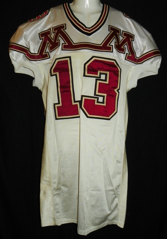
The Gophers are getting new uniforms:


Never forget:

1470727_orig.jpg
7203888_orig.jpg
 

theshadow

Well-Known Member
Apr 19, 2006
19,947
19,588
113
I think a lot of colleges must have been tripping balls in the 90s when it came to uniform design. Not only those weird “double M” Gopher jerseys, but remember these awesome Hawkeye duds?

The brand name (Apex) belied the designs.

This was actually an Apex jersey, but they replaced the logo after Apex went belly up:

95wicy.jpg
 

BWRhasnoAC

Well-Known Member
SuperFanatic
SuperFanatic T2
Apr 10, 2013
29,961
27,645
113
Dez Moy Nez
Nike must not have as many child sweatshops anymore and cutting budget to make up the difference.
 

cykadelic2

Well-Known Member
Jun 10, 2006
3,959
1,711
113
Nike must not have as many child sweatshops anymore and cutting budget to make up the difference.
Yeah, and that is a challenge with potential new MBB unis as well. The new Nike ones from last season on other teams looked generic as hell. ISU might as well keep their existing ones if the new options are limited and look bad.