This is just another reason why just using a letter as your logo is stupid. Last I checked there are only 26 of them and there are a hell of a lot more schools than that.
You can do it if the letter is something really unique like Miami or Oregon and you treat it very special.
Our letter mark is very "COLLEGE!!!!!" which does server a purpose. I look at it kind of like a fresh start after whrilybird hard to read logo era.
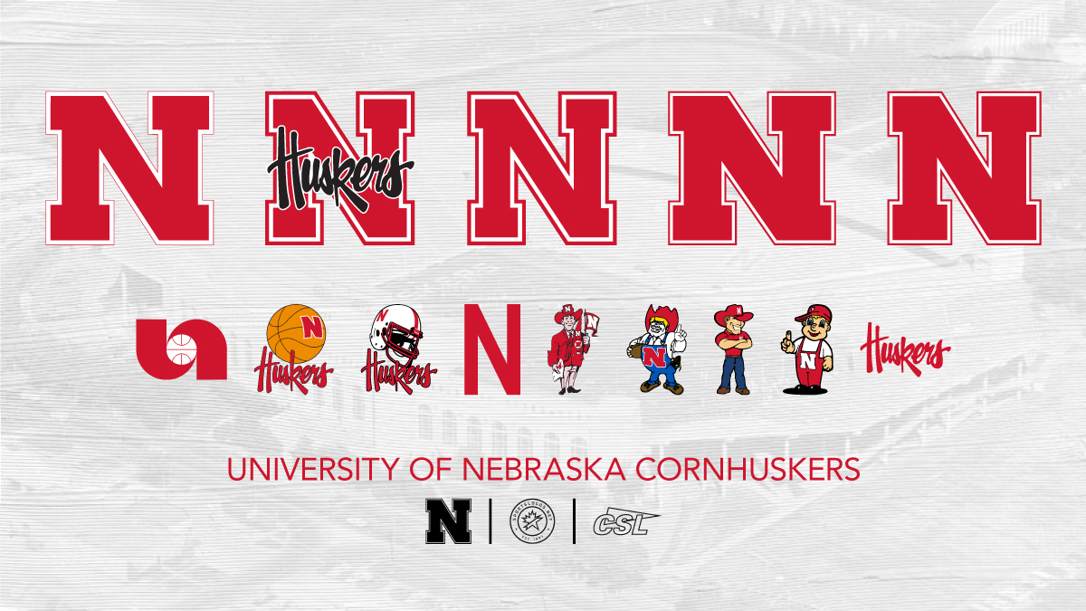
Then you have a team like Ohio State/Michigan who have a super boring block letter but they're really consistent with it and they're a huge brand so it works. There was a time that "N" for Nebraska worked the same way but now that they have absolutely no national brand at all it's pretty ineffective. 100% of Nebraska's logo history is absolutely awful once you're a quarter century removed from their success on the field. ISU has never had anything as bad as their brush script 80s looking "huskers" text.
I mean this is horrifically bad as their official brand guide, and they are proud of it all: