Hey, E'Twaun Moore and Jason Williams wore 55")
My favorite player of all time. Modeled my entire game off of him.


Follow along with the video below to see how to install our site as a web app on your home screen.
Note: This feature may not be available in some browsers.
Hey, E'Twaun Moore and Jason Williams wore 55
I still go back on youtube and watch his highlights. Super fun player.My favorite player of all time. Modeled my entire game off of him.
Those first two are yikes I hope they don't go with that.The legislature has done what legislatures do best -- setup a blue ribbon design commission to study the issue and present recommendations.
There are plenty of concepts out there. Making the minimal change of removing the stars-and-bars and keeping the rest unchanged would be an option...

Something like either of those.
I personally think they should do something more ambitious...

• Create a unifying design.
• Build on the Laurin Stennis-created theme of history (colors and 20 “stars”), hospitality (magnolia flower blossom), and hope (flying swallow).
• Use the colors of the current flag and build on them (with royal, specifically).
• Visually drive home the fact that our state was named after the fifth-largest river in the world — “the great river” — which made our state famous and is something all Mississippians can be proud of.
Not look like the Missouri flag (which the Mississippi Bicentennial flag from 2017 resembled).
• Appear unique and distinct compared to other American state flags.
• Have a free-flowing, strong symbol for hope (the swallow) coming out of the past and flying upward and onward for a better social landscape of the state moving forward.
The first couple still look a lot like the Confederate States of America flag (not the battle flag). I think it is a reach, but I could see some making the comparison and them getting a lot of pressure about it.The legislature has done what legislatures do best -- setup a blue ribbon design commission to study the issue and present recommendations.
There are plenty of concepts out there. Making the minimal change of removing the stars-and-bars and keeping the rest unchanged would be an option...
Something like either of those.
I personally think they should do something more ambitious...
• Create a unifying design.
• Build on the Laurin Stennis-created theme of history (colors and 20 “stars”), hospitality (magnolia flower blossom), and hope (flying swallow).
• Use the colors of the current flag and build on them (with royal, specifically).
• Visually drive home the fact that our state was named after the fifth-largest river in the world — “the great river” — which made our state famous and is something all Mississippians can be proud of.
Not look like the Missouri flag (which the Mississippi Bicentennial flag from 2017 resembled).
• Appear unique and distinct compared to other American state flags.
• Have a free-flowing, strong symbol for hope (the swallow) coming out of the past and flying upward and onward for a better social landscape of the state moving forward.
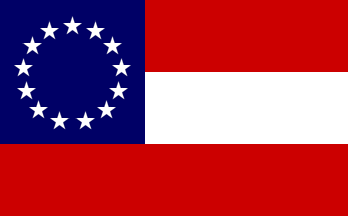
That first couple still look a lot like the Confederate States of America flag (not the battle flag). I think it is a reach, but I could see some making the comparison and them getting a lot of pressure about it.
CSA flag:
Then again, how many people actually know what the various CSA flags even looked like. I bet you could fly one of them in most places and never have anyone even know what you are flying.
Interesting. I have always heard "Stars and Bars" refer to the CSA flag, not the Beauregard Battle Flag. Generally I hear that one simply called the Confederate Battle Flag or Confederate Flag.Yeah, the stars-and-bars has become (as you point out, quite anachronistically) the "unofficial official" flag of the Confederacy in the popular consciousness, even if its actual applications were limited during the 1860s to certain army formations.
We are just used to the idea of a singular, unified flag emblem in our modem world, like the stars-and-stripes or the Union Jack, but such a system did not really develop internationally until around 1900 and during the Great War.
The stars-and-bars is certainly a more unique and memorable design than the "these kind of look like Texas" designs you quoted, so I think that is why it won out culturally. It sticks in the mind's eye way more that the Confederate national flag.
I went browsing through concepts last night some more.
I really liked this one...

-- keeps the navy/white/red colors
-- uses the magnolia in the upper-left corner, a symbol of the state
-- represents the Mississippi River down the middle
-- generally simple and clean design, but unique relative to other state flags
You could put Iowa’s state flag in front of me and it would take me a bit to figure out what I’m looking at
Even with it saying Iowa on it?
That would help. I can't picture it in my mind right now.
I really liked this one...

Reminds me of the Iowa High School Girls Athletic Union logo.
To be fair, according to Mr. Hinson himself, flag design was an important consideration for him leaving Ole Miss. I am going to pretend the superior nature of Iowa's flag in terms of design, symbolism, and iconography played a role in his decision.
Iowa's flag is based on France's flag, which is red for fraternité, white for égalité, and blue for liberté. I stand by those way more than I would the old MS flag.
")
Which has always reminded me of the Pepsi logo.Reminds me of the Iowa High School Girls Athletic Union logo.
HmmmmThe first couple still look a lot like the Confederate States of America flag (not the battle flag). I think it is a reach, but I could see some making the comparison and them getting a lot of pressure about it.
CSA flag:
Then again, how many people actually know what the various CSA flags even looked like. I bet you could fly one of them in most places and never have anyone even know what you are flying.

Hmmmm

