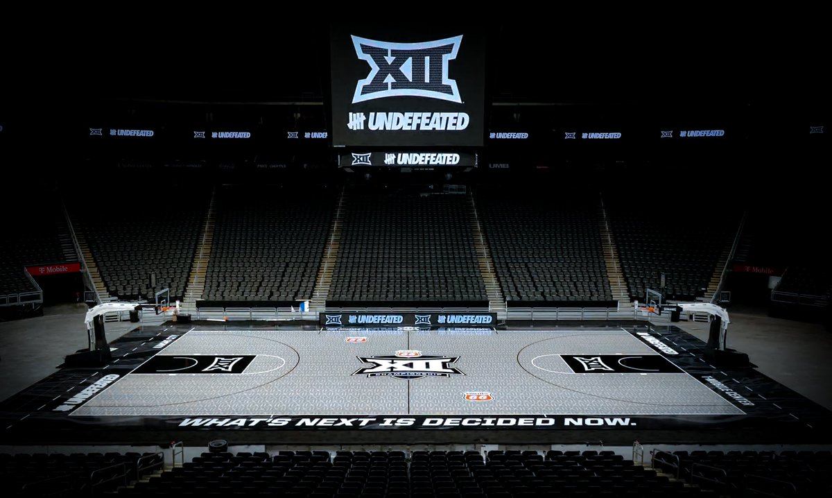
A new look for Kansas City (MBB/WBB)

theshadow

Well-Known Member
Apr 19, 2006
19,807
19,493
113

Gk5b9gSXcAA6oW4


  • Like
Reactions: CyByrd

swclone11

Well-Known Member
Feb 17, 2024
633
1,100
93
IMO despite using red for a long time, the Big 12 isn't strongly associated with any colors, so they can basically do what they want on a court. Not a big deal to me.
 

CoachHines3

Well-Known Member
SuperFanatic
SuperFanatic T2
Oct 29, 2019
9,562
19,513
113
The Big 12 has been using their black logo for quite sometime now.

Cool new refresh for the floor
 
  • Agree
Reactions: Cyclonsin

Nor'MidWester

Well-Known Member
Sep 25, 2016
1,772
2,570
113
I see Yormark is trying to do another fashion brand thing with this "Undefeated" brand lol.

Anyways not sure how I feel about the new court but if we wear our gold unis they'll really pop that's for sure.
 
  • Agree
Reactions: Acer88

Ms3r4ISU

Me: Mea culpa. Also me: Sine cura sis.
Staff member
Bookie
SuperFanatic
SuperFanatic T2
May 7, 2008
12,808
8,380
113
Ames
Agreed, watching a women's game now and made the comment that it's a bit much and needs to be more subtle.
I said if it wasn’t for the lights shining on it, it looks kinda like a patterned carpet. Who were they trying to impress anyway?
 

NWICY

Well-Known Member
Sep 2, 2012
34,773
30,857
113
I see Yormark is trying to do another fashion brand thing with this "Undefeated" brand lol.

Anyways not sure how I feel about the new court but if we wear our gold unis they'll really pop that's for sure.
Wear the ugly anthracite ones and we'll blend in with the court.
 
  • Like
Reactions: CycloneDaddy