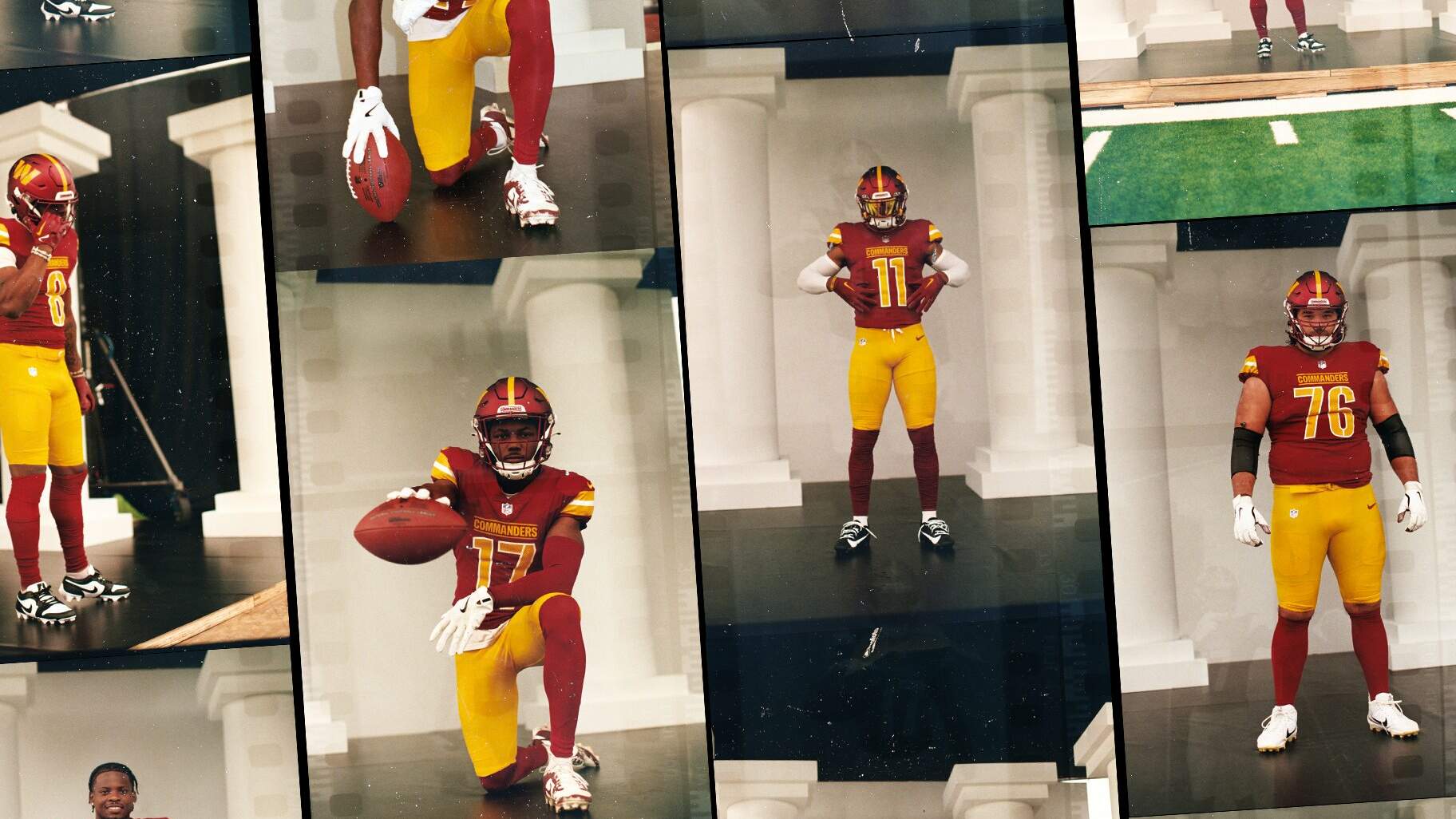
I am generally cool with the new tops on their own. I think the issues with the redesign lie with the lack of accents on the pants and the various uniform combinations.oh yeah, it looks great. I think I'm a fan of the 3 stripe look better, but i'm just being nitpicky at this point.
No forums found...
Site Related
Iowa State
College Sports
General - Non ISU
CF Archive
Install the app
Iowa State Uniform Discussions (update: new basketball unis)
- Thread starter CyTwins
- Start date
No forums found...
Site Related
Iowa State
College Sports
General - Non ISU
CF Archive
You are using an out of date browser. It may not display this or other websites correctly.
You should upgrade or use an alternative browser.
You should upgrade or use an alternative browser.

Best News of the Day: Commanders Bringing Back Gold Pants! | Uni Watch
After years of fans clamoring for a gold pants option, Washington has delivered!
yeah, I definitely like the 3 stripe better. This is what our stripes should've looked like imo
Best News of the Day: Commanders Bringing Back Gold Pants! | Uni Watch
After years of fans clamoring for a gold pants option, Washington has delivered!uni-watch.com
Saw on twitter - up close photo looks one shade, any photos with bright lights look way different
The white stripes should have been smaller accent stripes with larger "gold" stripes. That's what I woulda did anyways.
W C W may be the BEST combo. I personally HATE all Cardinal.
All Cardinal would be better if they had some pant stripesW C W may be the BEST combo. I personally HATE all Cardinal.
It makes absolutely no sense to have “white” stripes and lettering on the top and NOT having stripes on the pants or helmet. So stupid.All Cardinal would be better if they had some pant stripes
Agree, hopefully they don't go all Cardinal for any game. That would be an awful look. Another awful look would be white jerseys with black pants. The other C/W and B/W combos are fine with me.It makes absolutely no sense to have “white” stripes and lettering on the top and NOT having stripes on the pants or helmet. So stupid.
Nike just said "Everyone gets shoulder stripes in 2024, except TCU. They get nothing"
Purdue's new uniforms:
Everybody is going plain or boring because they're leaving room for sponsor patches that are inevitably coming this year or next. Have to leave some real estate for that big annoying patch...
No shoulder or pants stripes for Virginia Tech. I'm usually in the "classic" camp in regards to uniforms but I can admit these are pretty boring.
Wow, a few years ago, when I didn't know what I was doing (still don't but), I played around with two different colors on the jersey numbers. Looks like Va Tech actually did it.
Yep those look great. Cool numbers!Wow, a few years ago, when I didn't know what I was doing (still don't but), I played around with two different colors on the jersey numbers. Looks like Va Tech actually did it.
Just a screenshot from a video - but the red looks like it matches the helmet at media days
Looks like a pretty dark cardinal to me.
Yeah, that is definitely Cardinal as it should be, not red.
Compare the red of the Cy plushy on the locker shelf with the cardinal of the helmet and the jersey. Looks like a notable contrast there.
OK, from these recent pics, it seems like the cardinal remains unchanged. That's good!Weird lighting I know, the helmet definitely looks darker.
Now all they have to do is work on their angles and lighting, whenever they do their pics or reveals. Looking back on some of them, they were not great.
We'll have to wait and see.Agree, hopefully they don't go all Cardinal for any game. That would be an awful look. Another awful look would be white jerseys with black pants. The other C/W and B/W combos are fine with me.
Putting stripes on the cardinal helmet or pant is not always a "slam dunk, that would look great!" look. It would change the look drastically, and that's fine. Some of you would like that. I might too.
But a c/c/c look with the new jerseys, and the same no-stripe helmet and pant might be just fine. It's definitely cleaner than stripes. It might not be that bad at all, if they wear some white accessories, gloves, towel, socks, etc. Will they? Who knows.
Like I said, we'll just have to wait and see what they do I don't have great confidence that they have someone who coordinates their combos very well.
I'm glad we are not trying to copy the Commanders.
Best News of the Day: Commanders Bringing Back Gold Pants! | Uni Watch
After years of fans clamoring for a gold pants option, Washington has delivered!uni-watch.com


