A friend and I got into a debate about who has the best/worst helmets in football right now. We of course talked about tradition and color layouts, but never could fully agree. It would be cool to see what others think is the best or worst. Hopefully this topic has not been covered in the past already. If it has, I apologize:angry6wn:

No forums found...
Site Related
Iowa State
College Sports
General - Non ISU
CF Archive
Install the app
Best/Worst Football Helmets?
- Thread starter BEACHBUM
- Start date
No forums found...
Site Related
Iowa State
College Sports
General - Non ISU
CF Archive
You are using an out of date browser. It may not display this or other websites correctly.
You should upgrade or use an alternative browser.
You should upgrade or use an alternative browser.
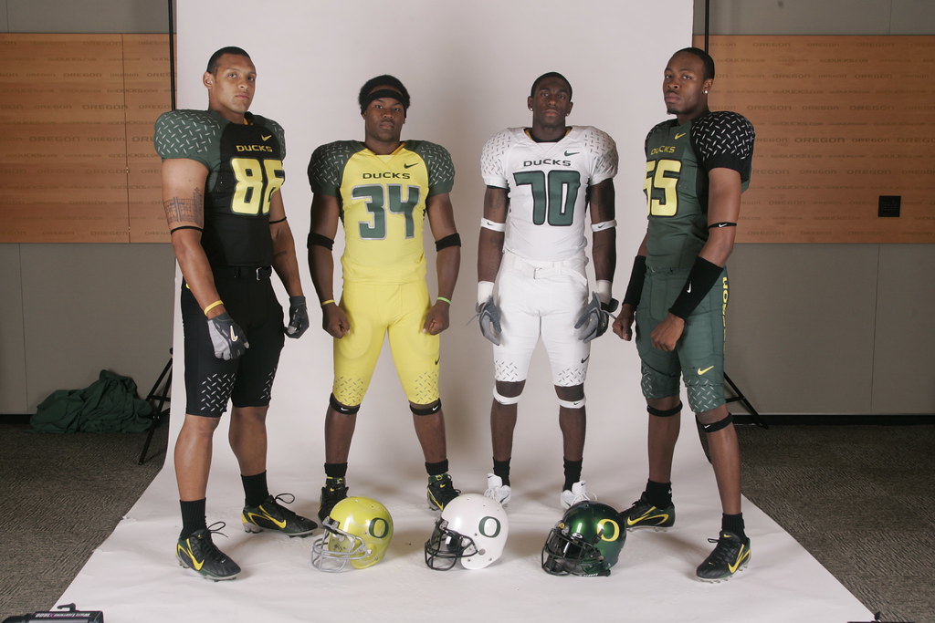
Ours has to be in the top ten -- red decal on red helmet & way to busy to be recognizable on TV. I hope a new helmet decal will be part of the new uniforms in '08. Here's 2 more:
Boise State -- blue decal on blue helmet, though not as illegible as ours (designed by the same graphics company that designed ours)
Pittsburgh -- especially compared to the classic "PITT"
Boise State -- blue decal on blue helmet, though not as illegible as ours (designed by the same graphics company that designed ours)
Pittsburgh -- especially compared to the classic "PITT"
My vote for the worst? UAB's helmet. Just an awful, awful color scheme and design. Did Bishop Don Magic Juan go to UAB?

The simpler, the better for me. I like Notre Dame's and Penn State's a lot. With Texas, Louisville and Alabama closing out the top 5. I like Louisville's white helmets.
Bottom of the list would be Syracuse, and maybe Tennessee. I'm just not a fan of the orange and white.
Bottom of the list would be Syracuse, and maybe Tennessee. I'm just not a fan of the orange and white.
I know I should not vote for a big 12 school, but Texas has the best. Simple and unique. I guess I am just into the classics.
One's I don't like:
Oregon State - too busy with the black beaver on the black helmet
Kansas - dreary plain navy blue with white KU -- boring
Penn State -- sorry but not enough here. too plain for my tastes
One's I do :
Florida State - gold with the badass feathered spear
K-State - silver with purple cat profile
Ohio State -- really neat when covered in Buckeye stickers
I always thought Ohio State's helmets were ugly. They look high-schoolish with all the stickers or something. I'll agree on Oregon State. When you have a sweet mascot like that, just a generic outline of a beaver gnawing on some wood would be cool. Kind of like another state school I can't quite think of that has a cool nickname but can't come up with a simple design for it...
Kind of like another state school I can't quite think of that has a cool nickname but can't come up with a simple design for it...
Iowa Pukeyes?
I like...
1. Washington State
2. Colorado
3. Florida State
4. Michigan
I don't like...
1. Oregon State
2. Boise State
3. Iowa (force of habit, black and gold makes me vomit)
4. Southern Miss
1. Washington State
2. Colorado
3. Florida State
4. Michigan
I don't like...
1. Oregon State
2. Boise State
3. Iowa (force of habit, black and gold makes me vomit)
4. Southern Miss
Worst-
Boise St., for the same reasons some don't like ISUs logo/helmet
LSU, it does have an old school feel to it, but it looks like the
trainer just taped the letters " L S U " on the helmet before the
game.
North Carolina- Just for color alone. Baby blue in football
doesn't work. Why don't they throw some pink in their too.
Wash St.- Although I do like their colors, that WS symbol
morphed into a cougar is just too much.
Best-
K-State: Have to agree w/ Zdorr, the purple power cat on the
silver helmet is cool.
Arizona St.: I just think the little sun devil symbol is funny. Plus
they punked Neb. in '96 and ended that reign of terror NE had
going in the mid 90s
Michigan: although I don't know what the heck it symbolizes, it's
simple, traditional, and unique.
Worst-
Michigan: although I don't know what the heck it symbolizes, it's
simple, traditional, and unique.
The maize stripes represent where the old leather helmets pads were, the blue is where it was open. So it is a throwback to the old skool leather helmet design. Pretty much all old college teams had black or brown leather helmets so at one point michigan painted the top yellow which gave it the "winged" look.
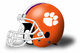
not a big fan of clemson's - fluorescent purple on fluorescent orange - not a great combination...
worst "N" on plain white helmet..........mmm must be the fuskers
While I do not like it either, at least there is tradition behind it. I hate schools that change their logo every few years (like us).
The maize stripes represent where the old leather helmets pads were, the blue is where it was open. So it is a throwback to the old skool leather helmet design. Pretty much all old college teams had black or brown leather helmets so at one point michigan painted the top yellow which gave it the "winged" look.
thanks brianhos.
Michigan: although I don't know what the heck it symbolizes, it's simple, traditional, and unique.
Michigan helmet story for those interested...
Michigan's Winged Helmet
While I do not like it either, at least there is tradition behind it. I hate schools that change their logo every few years (like us).
we haven't changed our logo in 12 years!!! if you look at the helmet project (or the wallpaper that I created recently), our current logo is the most "stable" helmet logo we've ever had!!! it's the folks that keep complaining about how our current logo lacks no tradition that don't realize, in all actuality, it's the most traditional logo our football team's ever seen...