
No forums found...
Site Related
Iowa State
College Sports
General - Non ISU
CF Archive
Install the app
Any doubters on the new I State logo?
- Thread starter ketelmeister
- Start date
No forums found...
Site Related
Iowa State
College Sports
General - Non ISU
CF Archive
You are using an out of date browser. It may not display this or other websites correctly.
You should upgrade or use an alternative browser.
You should upgrade or use an alternative browser.
I used to hate it, and now I don't so much. As was said earlier in the thread, I think the red helmets look awful with the logo on it, but other than that I don't have any complaints.
I probably won't buy any clothing or anything with it, it's just not a logo I like. I figure the bookstore and t-galaxy, along with Tailgate will continue making a lot of apparel I like. Scheel's is always loaded with their stuff.
I probably won't buy any clothing or anything with it, it's just not a logo I like. I figure the bookstore and t-galaxy, along with Tailgate will continue making a lot of apparel I like. Scheel's is always loaded with their stuff.
I still think our old logo was one of the more unique in the nation. I loved it. Although I do like the simplicity of the new one...
I wish it was more simple! More of a flat look instead of the "3-D" look to it...I wish is was one shade of cardinal and one shade of gold.
That said I do like it a lot...just wish is wasn't so "modern" looking.
It hasn't "grown" on me either - it doesn't distinguish us. I have purchased some stuff, because it is the official logo of my school, but I have also bought a lot of the "walking Cy" old school apparel. I predict the "I-State" will not even last as long as the last one. New AD comes in, new coaches, new marketing staff...
I am not a fan of the new logo at all. Maybe it will grow on me, but I've seen lots of shirts in stores and can't bring myself to purchase something I don't like. Not to be a pessimist, that's just my opinion.
Maybe if we win 9 or 10 games and it's plastered all over the place, maybe I'd like it more.:biggrin:
now you know how I have felt for the last 13 years. I have not bought anything with tazmanian cy on it and am very glad to see it retired / marginalized.
I wish it was more simple! More of a flat look instead of the "3-D" look to it...I wish is was one shade of cardinal and one shade of gold.
That said I do like it a lot...just wish is wasn't so "modern" looking.
well, as one of their "official" alternates they do have a flat appearing one shade gold, one shade cardinal version. see official website.
well, as one of their "official" alternates they do have a flat appearing one shade gold, one shade cardinal version. see official website.
I did see that...but that is not the one we see on official publications often...or one that we will see branded on uniforms or clothing for the public.
Again, I like the look...I just wish is wasn't as "3-D" as it appears to be...
Actually...I kind of think just using the word "STATE" might not have been so bad...it would have attracted a lot of attention (possibly via confusion)!
I was a little skeptical, but after hearing JP explain why this is necessary, I'm fine with it now. I still have some concern that we will get confused with Illinois St., Indiana St., and Idaho St., but if we can make a name for ourselves, it won't be a problem. Look at Nebraska's N, it's theoretically possible to have it confused with Nevada, yet no one does because everone know's it's Nebraska.
I do have to say I hate the new logo on cyclones.com. It's too big.
I do have to say I hate the new logo on cyclones.com. It's too big.
I was a little skeptical, but after hearing JP explain why this is necessary, I'm fine with it now. I still have some concern that we will get confused with Illinois St., Indiana St., and Idaho St., but if we can make a name for ourselves, it won't be a problem. Look at Nebraska's N, it's theoretically possible to have it confused with Nevada, yet no one does because everone know's it's Nebraska.
I do have to say I hate the new logo on cyclones.com. It's too big.
I actually had the opportunity to chat with the graphic designer at ISU that did the new logo. He talked about how I-State had to claimed by ISU. No one else has claimed it. He gave examples of Michigan State just using "State" on some of their stuff and how people can still identify that it is MSU because they "claimed" that identity. ISU needs to claim I-State and I don't believe there will be confusion with the other I state institutions. He also pointed out that when it comes to football, most of the other I State schools aren't even 1A schools. There were some other interesting discussions about what Chizik wanted, etc but I don't feel like typing more.
I personally like the new logo. At the spring game, I saw a guy wearing a red sweatshirt with the new logo but the red in the sweatshirt was the same red we used to have with the logo being the darker red. That looked pretty bad.

I did see that...but that is not the one we see on official publications often...or one that we will see branded on uniforms or clothing for the public.
Again, I like the look...I just wish is wasn't as "3-D" as it appears to be...
Actually...I kind of think just using the word "STATE" might not have been so bad...it would have attracted a lot of attention (possibly via confusion)!
I have seen the two toned flat one described above on shirts in Ames...can't remember where though. Mall? Hy-Vee?

I miss the old logo. The I State does little to distinguish us nationally from Illinois State, Idaho State, Indiana State, etc.... not exactly the company we should be keeping.
That is exactly how I feel about it. I can't stand the new logo, the old ones were all much better.
I miss the old logo. The I State does little to distinguish us nationally from Illinois State, Idaho State, Indiana State, etc.... not exactly the company we should be keeping.
That is exactly how I feel about it. I can't stand the new logo, the old ones were all much better.
We distinguish ourselves by winning.
Take another example: OSU. Is it Ohio? Oklahoma? Oregon?
I'm willing to be that most people outside of the Big 12 and Pac 10 associate OSU with Ohio State, and that's because Ohio State wins.
Illinois State, Idaho State, and Indiana State are not BCS schools. Iowa State is.
If we win, nobody will have any trouble figuring what I State stands for.
I have seen the two toned flat one described above on shirts in Ames...can't remember where though. Mall? Hy-Vee?
Cool...I will be on the lookout for it! Thanks!
Good or bad, at least the new logo should cut down on the crap the old logo created. Just in this thread alone I've seen reference to:
Tazmanian Cy
Whirlybird
Bird in a Blender
Not to mention my wife's concoction, the Thunderchickens.
(She'll never let that one go, she's a Husker grad...)
Tazmanian Cy
Whirlybird
Bird in a Blender
Not to mention my wife's concoction, the Thunderchickens.
(She'll never let that one go, she's a Husker grad...)
There were some other interesting discussions about what Chizik wanted, etc but I don't feel like typing more.
Why would you tease us like that?

The other info was cool though, thanks
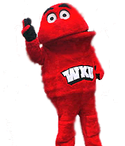
Just be glad we aren't aren't this

Hilltoppers? Not seeing the connection.
Also their mascot.

That reminds me of a Sesame Street character. I kind of like it. (not for us)