Do any teams not match the shoulder numbers with the main numbers? It doesn't look right to me.

No forums found...
Site Related
Iowa State
College Sports
General - Non ISU
CF Archive
Install the app
New Uniforms Revealed
- Thread starter CyTwins
- Start date
No forums found...
Site Related
Iowa State
College Sports
General - Non ISU
CF Archive
You are using an out of date browser. It may not display this or other websites correctly.
You should upgrade or use an alternative browser.
You should upgrade or use an alternative browser.
I'm not saying looking like the Chiefs would be a bad thing, there's certainly other schools who stole their jerseys from the NFL. I was just saying when I first saw the white numbers with yellow outlines I instantly thought of the Chiefs. Personally I really like the Chiefs look and I think it would give us a cleaner look than we currently have.I will get to that (making the shoulder # the same as main #). But I don't think it will look as good. I am going with the alternating color on the #'s because I like it.
Just look at the post following yours, white #'s = too much KCChief vibe. What one likes, another does not. That's the way it is.
The white main # cardinal jersey is now my favorite (with the gold side #'s). If I made the entire jersey with white #'s I know I personally would not like it as well, too much white, not enough cardinal. That is my reasoning anyway. And same goes for the gold main #, white side #'s, in reverse. View attachment 73163 View attachment 73164
I really like that! Now just need the numbers on the shoulder white too, and make the white stripe on pants a bit thicker too IMO.
I acquiesce...Do any teams not match the shoulder numbers with the main numbers? It doesn't look right to me.

Shoulder and main #'s are same, white w/ gold trim. I also widened the white stripe in the pant about as much as I am comfortable with (or what I think might win the powers that be without overdoing it).
Last edited:
No you are absolutely right, I don't think any teams do that.Do any teams not match the shoulder numbers with the main numbers? It doesn't look right to me.
I took that into consideration for sure. Yes it is a little different but why not push the envelope some? While it is unusual, I like the look of it and it seems to balance well with the other mods in this set. It is definitely not crazy radical. I also like to press new ideas. Some are pretty good, some not so much.
")
I still like this one better (today that is), white main #, gold side # with white trim. Wider white trim on the pant stripe (thanks @clonedude!).

Last edited:
I really like that! Now just need the numbers on the shoulder white too, and make the white stripe on pants a bit thicker too IMO.
You guys are right. Matching numbers is best. Plus the pant stripe gives the added gold that it needs.Do any teams not match the shoulder numbers with the main numbers? It doesn't look right to me.
That's why I like this board. Criticism is sometimes hard, but in the end it is best. Two (or more) heads are better than one.
 Thanks for your input.
Last edited:
You guys are right. Matching numbers is best. Plus the pant stripe gives the added gold that it needs.
That's why I like this board. Criticism is sometimes hard, but in the end it is best. Two (or more) heads are better than one. View attachment 73248 Thanks for your input.
Either way, I think it's obvious we need some white in the home jerseys
And modified gold number, added more white trim (and dark red/black trim) to bottom of numbers... This should be easy to do (as opposed to stitched numbers) as they design these #'s on computer (CAD/Photoshop) then print them off in stickers and iron them on. All #'s same color.
Either way, we need more white (and a little more dark red, gold and black trim) in the Home unis, which is what I'm trying to do. So far with these mods they look so much better IMO.

Either way, we need more white (and a little more dark red, gold and black trim) in the Home unis, which is what I'm trying to do. So far with these mods they look so much better IMO.
Just replace Auburn’s colors with oursYou guys are right. Matching numbers is best. Plus the pant stripe gives the added gold that it needs.
That's why I like this board. Criticism is sometimes hard, but in the end it is best. Two (or more) heads are better than one. View attachment 73248 Thanks for your input.
Attachments
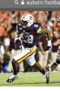
Last request (Maybe), can we see the Auburn template with cardinal and gold?
White helmet cardinal and gold stripes orrnado logo
Cardinal jersey gold (or) white number yellow and white stripes I state logo
White pants cardinal and gold stripes
Just replace Auburn’s colors with ours


Post um!I made two other white pant and helmet stripes. They are inverse of above. If anyone wants to see them let me know.
This combination is the BEST EVER!!!
I have really come around to that logo. BUT i still do prefer the cy-nado, personallyThis combination is the BEST EVER!!!
Love it. This mockup is better than the Auburn template.For the w/c/w, white numbers, I like this also.
View attachment 73493
These with the orrnado and a large gold stripe with two small cardinal stripes on the helmet.
I still want to see us where the combination below that tnoah drew up a while back.
White helmet with regular cardinal and gold I-State logo, and black facemask. Black jersey, and white pants.
And then have the players wear cardinal shoes and gloves/wristbands. I think this has a chance to look really sweet.

White helmet with regular cardinal and gold I-State logo, and black facemask. Black jersey, and white pants.
And then have the players wear cardinal shoes and gloves/wristbands. I think this has a chance to look really sweet.
New Year = New Insight.
Last year, I bitched about the alternate uniforms - being a traditionalist (I grew up as an Alabama fan). HOWEVER, after going to all the games last year for the first time since 1994, I really enjoyed all of the combinations! The ONLY issue I have is that I would like a little cardinal and gold to be somewhere on the helmets. For example, the white helmets with the gold and white "I State" look sharp with the charcoal and black uniforms. Coming around though! Takes a little time for us oldies to get with the modern program!
Last year, I bitched about the alternate uniforms - being a traditionalist (I grew up as an Alabama fan). HOWEVER, after going to all the games last year for the first time since 1994, I really enjoyed all of the combinations! The ONLY issue I have is that I would like a little cardinal and gold to be somewhere on the helmets. For example, the white helmets with the gold and white "I State" look sharp with the charcoal and black uniforms. Coming around though! Takes a little time for us oldies to get with the modern program!
Love this! I can live with the black jerseys since the helmet is still white with cardinal and gold!I still want to see us where the combination below that tnoah drew up a while back.
White helmet with regular cardinal and gold I-State logo, and black facemask. Black jersey, and white pants.
And then have the players wear cardinal shoes and gloves/wristbands. I think this has a chance to look really sweet.