This is the one that should have been used. Make it gold and make it span over the whole helmet. It's perfect. If you want to modernize the look just a little, fine, but it doesn't have to look like something from clip art.


No forums found...
Site Related
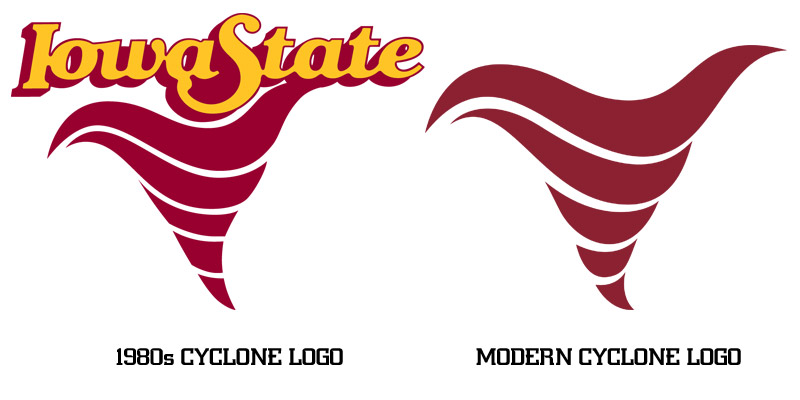
Iowa State
College Sports
General - Non ISU
CF Archive
Install the app
Stupid logo hate thread
- Thread starter weR138
- Start date
No forums found...
Site Related
Iowa State
College Sports
General - Non ISU
CF Archive
You are using an out of date browser. It may not display this or other websites correctly.
You should upgrade or use an alternative browser.
You should upgrade or use an alternative browser.

Not that you need further piling-on but some of the EMAW's rooting for ISU last night commented on the fugly unies and down-the-drain logo. I'm sure they won't be repeated.
Why is it so hard for them to put your modern Cyclone logo on the helmet. Yellow logo on red helmet / red logo on white helmet. Done. No other changes needed. It's so easy!Any of these...


Pollard likes controversy and stirring things up. He probably is in favor of it. Hoping to sell more merchandiseI expect a letter of apology to the fans. Maybe appeal to the good Lord for forgiveness too.
But seriously someone in the AD has to be on Twitter and seeing how badly our school is being mocked. This logo is a disaster.
This is really simple, and I don't know why ISU makes it so much harder than it needs to be.
The I-State logo is and should be our primary logo. A slightly updated version of the old Tornado logo should be our secondary logo. There was no need for a new cyclone logo, we already have one. For additional logos we can use the updated Bird-in-a-Blender and/or Walking Cy.
Instead, we have whatever that was last night and this abomination.
Not only was the logo itself bad, but red on red certainly doesn't work.
Try this, or an inverted version with red background and yellow logo.

Try this, or an inverted version with red background and yellow logo.
Sadly I don't know a damn thing about graphic design. All I know is that it looks like the Oregon State decal... Which looks like garbage.Yeah...you, me, and virtually everyone who knows anything about graphic design. There's a god damned college of design on the campus and they came up with that. Garbage.
Attachments

Pollard likes controversy and stirring things up. He probably is in favor of it. Hoping to sell more merchandise
If he wants controversy then put Cy giving the finger in the lids. That's controversial and would move product.
I can **** in a bucket and it looks better than the helmet from last night

Not only was the logo itself bad, but red on red certainly doesn't work.
Try this, or an inversed version with red background and yellow logo.
I'm just shaking my head at how easy of a decision this should have been for the decision makers. This is simple, but perfect.
Well pollard fked up. Cus I would buy new gear with the old tornado on it and I'm sure many more would. I'm not gonna wear something where people say wtf is that?Pollard likes controversy and stirring things up. He probably is in favor of it. Hoping to sell more merchandise
Not only was the logo itself bad, but red on red certainly doesn't work.
Try this, or an inversed version with red background and yellow logo.
For anyone wondering, this is my bad photoshop work. I reversed the tip so that it can appear to be moving "forward" with whatever direction the player is facing on both sides of the helmet.

Not that you need further piling-on but some of the EMAW's rooting for ISU last night commented on the fugly unies and down-the-drain logo. I'm sure they won't be repeated.
Unfortunately, the new craptastic logo is here to stay for the foreseeable future. The best thing we can do as fans is to reject it. Don't buy it; if someone buys it for you return it.
We paid these guys to create that ****, wow....
Look better?
You don't have much talent but I'd order one of those in every color.
Working on a piece about this logo where I analyze it and the overall branding direction.
I will say this--it is huge that Iowa State finally allowed certain elements within the university to add a Cyclone nickname logo back to the branding package. This cannot be understated. All progress in this direction is positive.
With that said, look at this image below and vote in the Twitter poll so I can incorporate it in the story.

POLL HERE:
I will say this--it is huge that Iowa State finally allowed certain elements within the university to add a Cyclone nickname logo back to the branding package. This cannot be understated. All progress in this direction is positive.
With that said, look at this image below and vote in the Twitter poll so I can incorporate it in the story.
POLL HERE:
After looking at their website, I question our marketing/athletic department even more. Looks like they put out a lot of garbage.
Any of these...
I'm not a walking Cy guy, but I think they'd be cool as an alternate on one helmet kind of like what OkSU does with their cowboy.
I expect a letter of apology to the fans. Maybe appeal to the good Lord for forgiveness too.
But seriously someone in the AD has to be on Twitter and seeing how badly our school is being mocked. This logo is a disaster.
I agree! Who vets this stuff! Is this one person's opinion and the trigger gets pulled??? It looked worse on TV than it did on Twitter! Gawd damn it was/is awful! And then to put it with the gray pants???? It's like a 4 year old dressing themselves in the morning!