Iowa State Uniform Discussions

SolarGarlic

Well-Known Member
Jan 18, 2016
5,736
8,583
113
View attachment 128600
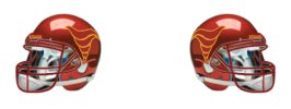
This is the gold we should use. I don’t like the 49ers because they are more tan than gold. These are the best versions of gold.
It's closer to my preferred shade, but I don't love the metallic look. These will always be the standard in my book when it comes to ISU yellow/gold. Specifically, the helmet color.

1714670538391.png
 

Jer

Opinionated
Feb 28, 2006
22,827
21,295
10,030
Do the Chiefs look Ronald Mcdonaldish? Do Chiefs fans talk about that all of the time or is just our little brother syndrome that makes us do that?
I think you have to look at the Chiefs and ISU as separate scenarios to a degree. The Chiefs are as big of a brand in America as McDonald's so the brain doesn't look for parallels/comparisons. While I personally don't usually think of McDonald's with our colors, I understand how some could.
 

Cloned4Life

Well-Known Member
SuperFanatic
SuperFanatic T2
Mar 5, 2006
2,512
1,695
113
Ankeny
As much as it would be nice to have stripes on pants, here’s the problem: it affects the ability to mix and match, especially with the black jersey. We don’t strictly do “blackout” with the black jersey; we sometimes do B/B/W or even W/B/W. If you put stripes on the white pants (and they seem to be the default pants) you either have to double up on white pants or eliminate potential combos from the black jersey.
I am not following here.

Since the initial 2018 redesign, we actually do have separate white pants for each matching 'top'. We are already "doubling up". Notice in the games where we have went W/B/W, the pants clearly have a separate/distinct color-less logo patch (here). So it actually does not change anything nor affect our combination options if we choose to add stripes. We would still need separate white pants for 2 different scenarios:
A) Cardinal/Gold stripes with colorized logo patch if we wear a Cardinal or White top, and
B) Black/White stripes with b/w logo patch

Not adding stripes to me feels like a cheap out, i.e. maybe it saves us money by having Nike give us the plain-ass white practice pants instead of ones that actually match the top.
 
  • Like
Reactions: cyclones500

Klubber

Well-Known Member
SuperFanatic
SuperFanatic T2
Apr 11, 2006
1,453
1,509
113
Aurora, IL
Our colors should be what the shoulder stripes are in the photo above…. perfect!

We needed to go a shade darker on the cardinal and gold from the previous uniforms…. and instead it looks like we went a shade brighter and now look like McDonald’s again. And the jersey is now a lot brighter cardinal than the helmets.
IDK if that's the case or it's just the lighting.

In some of the pics, the cardinal & gold on the new unis looks like the same shade as previous.

In the Rocco pics, the cardinal seems lighter. So, I'm thinking it's the lighting. Overall I like these new ones
 

t-noah

Well-Known Member
Feb 2, 2007
17,070
10,835
113
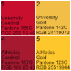
Our official "gold" is ****ing ugly - I'm not sure why y'all still complaining about the "gold" used on the uniforms, which I would call "athletic gold"

I can understand if someone wanted to use gold similar to the 49ers, but surely no one thinks our official "gold" is better than "athletic gold", right?
It can be confusing, colors, shades. Someone correct me if I am wrong, but I believe our 'athletic gold' is what is used in our ISU team uniforms. It is the shade of gold many of us just call yellow and is considered too bright by many. Our 'university gold' is a slightly darker, more mellow shade of gold, and is used for marketing, administrative purposes (I'm not really sure where they use it entirely). It is still pretty "yellow" but I like it better than our 'athletic gold', to be honest.

I don't think our 'university gold' is ever used with our team unis. "Ever" might be stretching it, who knows.

Our 'university gold and cardinal' (quite bright, the university cardinal) and our 'athletic gold and cardinal are all part of our "official" sanctioned colors. They are just used differently.
 
  • Like
Reactions: SolarGarlic

t-noah

Well-Known Member
Feb 2, 2007
17,070
10,835
113
I've always wondered what KC would look like if they had an alternate pair of gold/yellow pants.
Haha. Interesting.

For some reason, I don't particularly care about the Chiefs uniforms, even though I am a fan. If it ain't broke...

Iowa State uniforms keep me busy enough. :D
 

t-noah

Well-Known Member
Feb 2, 2007
17,070
10,835
113
Just curious, did I miss it or was this original tweet still teasing an option we haven't seen yet?


Good question. My guess the missing 4th option there, is the new gold pants (only depicted with the white jersey so far). I suppose it could be the black and white, w/b/w set also?
 

t-noah

Well-Known Member
Feb 2, 2007
17,070
10,835
113
I am not following here.

Since the initial 2018 redesign, we actually do have separate white pants for each matching 'top'. We are already "doubling up". Notice in the games where we have went W/B/W, the pants clearly have a separate/distinct color-less logo patch (here). So it actually does not change anything nor affect our combination options if we choose to add stripes. We would still need separate white pants for 2 different scenarios:
A) Cardinal/Gold stripes with colorized logo patch if we wear a Cardinal or White top, and
B) Black/White stripes with b/w logo patch
Only 1 white pant would be needed if we had detachable, Lego-like logo, swoosh and pant stripe. The tech folks need to get on this. :D
 
  • Haha
Reactions: Cloned4Life

t-noah

Well-Known Member
Feb 2, 2007
17,070
10,835
113
i say we go to the opposite extreme...make mcdonalds colors look dark by comparison. View attachment 128599
Serious Ames?

I can see us having a gold/yellow pant with the single pant stripe. but please, hard NO Thanks on going back to a brighter cardinal/ cherry red! Wrong direction.

Could you re-do this one with our current cardinal pantone (or, at least last years, if they just changed it)?
 

t-noah

Well-Known Member
Feb 2, 2007
17,070
10,835
113
Yes, the 186 C, and the 142 C Pantones being our 'university' cardinal and gold colors. They are not (usually) found on the ISU athletic uniforms.

For that, they use the other official cardinal and gold, the 'athletic' ones, designated on this page as, "Cyclone Cardinal (Alternate), Pantone 187 C; and "Cyclone Gold", Pantone 123 C
ISU COLORS 4-2022 1 #1-4 with Descriptors (add).png The RGB can sometimes vary slightly, so Pantone # is more accurate. The bottom 2 colors here, are what ISU uses for their Athletic Team Uniforms.
 
  • Like
Reactions: 1TwistedCyclone

Latest posts

Help Support Us

Become a patron