It was easily my #4 choice.Baylor jerseys were EXTREMELY underappreciated. Must have been a bunch of old farts that voted.

No forums found...
Site Related
Iowa State
College Sports
General - Non ISU
CF Archive
Install the app
Survey to rank the 2016 uniform combinations
- Thread starter Sigmapolis
- Start date
No forums found...
Site Related
Iowa State
College Sports
General - Non ISU
CF Archive
You are using an out of date browser. It may not display this or other websites correctly.
You should upgrade or use an alternative browser.
You should upgrade or use an alternative browser.
So for next year, here are my combination picks/choices. This is assuming we get the gold and grey helmets, stripes on all helmets, and white accent, keeping the current shoulder stripe design. In no particular order of preference, 7 Homes games first,


 (whoops, 8 here, make one an alternate), and 5 Away games (next post...)
(whoops, 8 here, make one an alternate), and 5 Away games (next post...)
Last edited:


Are we sure that we are keeping the same design as previous years and just mixing and matching colors? I was under the impression that the mixing and matching this season was just a way to change things up while not being able to get completely new unis due to the Nike timeframe. I'd like to see us use some different designs.
Nope, it's all just a guessing game at this point. We'll know when they want to tell/show us. My feeling is that they might keep the same shoulder stripe design, and just add white accent. Just a guess after they purchased the new gray uniform. I would imagine they will want to use them for atleast another year, but I don't know how that works really. So just speculation that they might want to match everthing, but that's not necessarily true either. Not sure what they will do with the helmets or stripes either.Are we sure that we are keeping the same design as previous years and just mixing and matching colors? I was under the impression that the mixing and matching this season was just a way to change things up while not being able to get completely new unis due to the Nike timeframe. I'd like to see us use some different designs.
I wouldn't mind a completely new design either. We shall see.
I agree, yellow unis could really look sharp and set us apart, looks even better w/ a bit of gold accent (and white of course). Like these...?I'm probably in the minority, but I really wish we could get a good gold uniform. Think about how many teams wear gold quite a bit: Minnesota, GT, NDSU? It could really set us a part in the Big12 and nation if we had good ones.
I'll be the first to admit that gold uniforms are so easy to mess up vs make look good. That's my big fear of them.


In the past 8 years, when we broke them out a time or two (the r/y/y), they were horrible, didn't work at all, stripes were wrong, no white accent, etc.
Imagine a Home game one week w/ all gold above, the next w/ all red!

Serious question. What is so attractive about the grey? It seems like a very unusual color, to say the least, for a school that has always worn cardinal, gold, and white. I find it to be dingy and dark, but I'm admittedly an old fart. I'm really curious why some of you seemed to like it so much. The players certainly seemed to like it. Is it just because it is different? Or is there another trend that I'm unaware of?

I think it's just a neutral alternate. I guess the alternative is just to change the cardinal and gold combos. Or to just keep either a r/r/y or a y/r/y Home, and one color set on the Road. It is clear that Coach Campbell likes to mix it up, and as you said, the players like the variation. Personally, I do too, but not all agree.Serious question. What is so attractive about the grey? It seems like a very unusual color, to say the least, for a school that has always worn cardinal, gold, and white. I find it to be dingy and dark, but I'm admittedly an old fart. I'm really curious why some of you seemed to like it so much. The players certainly seemed to like it. Is it just because it is different? Or is there another trend that I'm unaware of?
Maybe part of it is change. We all want the improvement on the field change.
Serious question. What is so attractive about the grey? It seems like a very unusual color, to say the least, for a school that has always worn cardinal, gold, and white. I find it to be dingy and dark, but I'm admittedly an old fart. I'm really curious why some of you seemed to like it so much. The players certainly seemed to like it. Is it just because it is different? Or is there another trend that I'm unaware of?
I'm still under 30, and I am with you.
It is just the new hip "with it" color after the black thing kind of burned itself out a few years ago in design circles. Black really is not an option for an ISU, too, given the association of the color (with our own secondary gold color, too) with our largest in-state rival.
I could post you dozens of these...


...so we're just jumping on that particular "trend," in typical, after-the-fact and after-it-stopped-being-cool Iowa State fashion. I fully believe this era in football uniforms will be regarded as the 1970s and 1980s in baseball and the 1990s in basketball before everybody comes to their collective senses and goes back to traditional looks. College football is, if not anything, about tradition and school pride. We'll remember that at some point.
We came up with the after-the-fact "gray storm clouds" nonsense at some point, too, even though that is just justifying being trendy. It was the same thing the New York Mets did, who pridefully chose blue (for the Dodgers) and orange (for the Giants, both departed NL franchises from New York) as their colors upon their creation. Twenty years later, however, they "remember" black as one of their colors, for the "shadows" in the urban canyons of New York, and added black to make some seriously ugly uniforms to look at for everybody...

And then they remember how stupid that was, and went back...
Plenty of other teams, professional and college, have done stuff like this. I imagine we're just in a low point of football uniform design at this point.
And yes, yes, I am a traditionalist, but the gray elements did not rank highly in the poll. I like the white elements, though. I liked the Iowa look and, with some white elements on the home jersey (also helps differentiate us from USC), I think the white helmet looks at home could be really good. We're just not quite there yet in our overall set design.
Interesting. "gray storm clouds" is something I hadn't thought about. I thought our gray color looked a little sick and greenish, but now that you mention it, perhaps it makes sense as a sick storm cloud color. All of a sudden, I'm liking the gray uniforms a little more because it actually might tie into the Cyclones!
Last edited:
I'm still under 30, and I am with you.
It is just the new hip "with it" color after the black thing kind of burned itself out a few years ago in design circles. Black really is not an option for an ISU, too, given the association of the color (with our own secondary gold color, too) with our largest in-state rival.
I could post you dozens of these...
View attachment 45571
...so we're just jumping on that particular "trend," in typical, after-the-fact and after-it-stopped-being-cool Iowa State fashion. I fully believe this era in football uniforms will be regarded as the 1970s and 1980s in baseball and the 1990s in basketball before everybody comes to their collective senses and goes back to traditional looks. College football is, if not anything, about tradition and school pride. We'll remember that at some point.
We came up with the after-the-fact "gray storm clouds" nonsense at some point, too, even though that is just justifying being trendy. It was the same thing the New York Mets did, who pridefully chose blue (for the Dodgers) and orange (for the Giants, both departed NL franchises from New York) as their colors upon their creation. Twenty years later, however, they "remember" black as one of their colors, for the "shadows" in the urban canyons of New York, and added black to make some seriously ugly uniforms to look at for everybody...
View attachment 45572
And then they remember how stupid that was, and went back...

Plenty of other teams, professional and college, have done stuff like this. I imagine we're just in a low point of football uniform design at this point.
And yes, yes, I am a traditionalist, but the gray elements did not rank highly in the poll. I like the white elements, though. I liked the Iowa look and, with some white elements on the home jersey (also helps differentiate us from USC), I think the white helmet looks at home could be really good. We're just not quite there yet in our overall set design.
As with most things uniform design/coloration, it is all about the shade. If you went more with a silver (closer to that Wyoming uni, but even lighter)...that'd look pretty slick.
As with most things uniform design/coloration, it is all about the shade. If you went more with a silver (closer to that Wyoming uni, but even lighter)...that'd look pretty slick.
Or you lose the "storm" thing going on that @Cycsk seemed to enjoy.
Or you get an "unwashed jerseys" kind of thing going on.
I'd just rather we'd stick with cardinal, gold, and white.
The three look great together. There's a reason people like our current road set more than our current home set. We underdid the white in the home set last time around.
I do not agree that the occasional gray or off color will go out of style, necessarily. It's not really like we are changing our school colors, and will look back in 10-20 years, and say, "Man look at those awful gray uniforms we wore all the time back then". Cardinal and gold is still it and we still wear that and show that proudly. Maybe it's more like, "You know, I just don't want to wear the same 1-2 colors of shirts and pants every day". And I'm 59 so I don't buy into the sterotype that only the younger like change, or in this case the 'gray', from time to time.I'm still under 30, and I am with you.
It is just the new hip "with it" color after the black thing kind of burned itself out a few years ago in design circles. Black really is not an option for an ISU, too, given the association of the color (with our own secondary gold color, too) with our largest in-state rival.
I could post you dozens of these...
View attachment 45571
...so we're just jumping on that particular "trend," in typical, after-the-fact and after-it-stopped-being-cool Iowa State fashion. I fully believe this era in football uniforms will be regarded as the 1970s and 1980s in baseball and the 1990s in basketball before everybody comes to their collective senses and goes back to traditional looks. College football is, if not anything, about tradition and school pride. We'll remember that at some point.
We came up with the after-the-fact "gray storm clouds" nonsense at some point, too, even though that is just justifying being trendy. It was the same thing the New York Mets did, who pridefully chose blue (for the Dodgers) and orange (for the Giants, both departed NL franchises from New York) as their colors upon their creation. Twenty years later, however, they "remember" black as one of their colors, for the "shadows" in the urban canyons of New York, and added black to make some seriously ugly uniforms to look at for everybody...
View attachment 45572
And then they remember how stupid that was, and went back...
Plenty of other teams, professional and college, have done stuff like this. I imagine we're just in a low point of football uniform design at this point.
And yes, yes, I am a traditionalist, but the gray elements did not rank highly in the poll. I like the white elements, though. I liked the Iowa look and, with some white elements on the home jersey (also helps differentiate us from USC), I think the white helmet looks at home could be really good. We're just not quite there yet in our overall set design.
We'll see what they come up with. Of course they could way overdo it also, but I don't think they will.
Or you lose the "storm" thing going on that @Cycsk seemed to enjoy.
Or you get an "unwashed jerseys" kind of thing going on.
I'd just rather we'd stick with cardinal, gold, and white.
The three look great together. There's a reason people like our current road set more than our current home set. We underdid the white in the home set last time around.
I tend to agree with you.
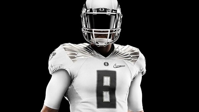
However, what tends to bring out some of these neutral uniform colors and make them really pop is shade design, and not monotonous blocks of neutral color. Take Oregon's white/gray/silver look. That design has a lot of depth because of the complimentary variation in neutrals. Add some minimal cardinal and gold to that...you have a new all-white with a gray storm cloud "silver lining".
It's not really like we . . . will look back in 10-20 years, and say, "Man look at those awful gray uniforms we wore all the time back then".
This is exactly what I thought during the season. I'm old and I have memories like that related to the clothes we wore in the 70s. I thought we would look back and ask ourselves why we wore such an ugly gray/green color so much during this season.
Won't argue w/ you, but a big reason also, that the Home set generally was less appealing, was that it looked incomplete and mismatched. Next year, when they add the proper white accent (hopefully), that won't be a problem. The Away unis this year, won't change THAT much next year, especially the all-white (no change at all, unless of course they change the design).Or you lose the "storm" thing going on that @Cycsk seemed to enjoy.
Or you get an "unwashed jerseys" kind of thing going on.
I'd just rather we'd stick with cardinal, gold, and white.
The three look great together. There's a reason people like our current road set more than our current home set. We underdid the white in the home set last time around.
I agree w/ this. Again that may be some of the appeal to the new white helmet. One, it's white, duh; two, the stripe on the helmet; three, the shade of the yellow stripe on the helmet, it being a different 'shade' of yellow (gold). This is why I tried to shade the trim around the letter in gold, not yellow. It is subtle but it does make a difference, and the eye can see it. It is a start. In terms of just the color yellow, two shades could be there, yellow (our primary) and gold as minor secondary. Subtle shading of the other base colors could be done also. It just depends on what they want.I tend to agree with you.
However, what tends to bring out some of these neutral uniform colors and make them really pop is shade design, and not monotonous blocks of neutral color. Take Oregon's white/gray/silver look. That design has a lot of depth because of the complimentary variation in neutrals. Add some minimal cardinal and gold to that...you have a new all-white with a gray storm cloud "silver lining".
I understand. Even though you still might not like it too much next year, I'll bet it will look better, as things should match better.This is exactly what I thought during the season. I'm old and I have memories like that related to the clothes we wore in the 70s. I thought we would look back and ask ourselves why we wore such an ugly gray/green color so much during this season.
As far as the whole 'Storm' thing, that is what made me modify the Cyclone swirl/tornado. I would love to see it incorporated in some minor way, perhaps as a decal or secondary pant/sleeve logo, in the color of gray (w/ yellow and ligher gray shade for depth). It could also be cardinal/gold.

I'm expecting a new jersey design entirely for next year. They'll encorporate the Jack Trice stripes somehow and then add yellow/gray helmets and alternative helmet logos.