Iowa State Uniform Discussions

t-noah

Well-Known Member
Feb 2, 2007
17,031
10,806
113
I think like others pointed out it is because of the flatness of the uni vs the glossiness of the helmet etc. One way this could be adjusted is to make the helmets in flat paint as some have, instead of glossy, but that may make them difficult to keep looking good. Shutt has a series of flat colored helmets, here is one in "cardinal". View attachment 99335

We did the matte cardinal helmets a while ago (this is from 2014). But the beveled "I-State" having to be a glossy sticker spoils the look. If we could do the stencil logo on matte I think it would look better, take the Commanders new helmets as a reference.

View attachment 99338
View attachment 99340
I'm a big fan of unis, but. We should take a vote. As if it would matter. LOL.
Helmet: Matte, semi-gloss, or gloss? I think what we have now is probably close to a semi-gloss?

I'm just not a fan of the matte helmet. Perhaps the 'horrible' job we did with it in 2014 (the 2nd pic) is why I feel that way, in part. The bleached cardinal color is way off. And yes, the logo decal does not fit.

Now the matte in pic 1 looks better, as the color is darker and a little more true than pic 2. The Commander helmet does look pretty sharp. But I'm not sure it is a matte or a semi-gloss. Perhaps in between? I need to see more pics.

Generally (I think?) I like the semi-gloss helmets the best. I like a little shine to them, but maybe not too much (like a gloss).
 

2speedy1

Well-Known Member
Jan 4, 2014
5,176
5,917
113
We did the matte cardinal helmets a while ago (this is from 2014). But the beveled "I-State" having to be a glossy sticker spoils the look. If we could do the stencil logo on matte I think it would look better, take the Commanders new helmets as a reference.

View attachment 99338
View attachment 99340
yeah I am not sold on the matte/flat look, I just shared that as a option. And a particular reason the helmets and unis look so different, similar to the way the chrome cardinal helmets look so different in different light. I think it can be done right and look good when it is done right but can also look terrible if done wrong.
 
Last edited:

2speedy1

Well-Known Member
Jan 4, 2014
5,176
5,917
113
I hate to break it to you, but the 49's used ISU colors when they established their colors. Don't think we ever had yellow until earl.
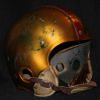
This is the earliest helmet I can find, from the Cyclones in color but, it is at least from the 1947-51 seasons. Notice it is not the "tan gold" but a deep yellow gold. Also note this is only 1-3 years after the 49ers began, depending on what you consider their first year. 49ers were established in '44 (the year my parents were born) and played first season in '46.

Also we had "yellow" helmets from 1939-46, and "winged yellow" helmets (Michigan style) in 1933-34.

The first Metallic Gold helmets ISU had were used from 1937-38, and the picture below was the next. But I cant find a color photo of the 37-38 version.

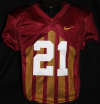
Also the obvious "yellow" uniforms pointed out here as well from at least as far back as the Trice years in the early '20s.

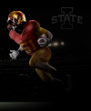
I would hope if we were to ever go back to a true metallic gold or chrome gold it would be similar to this or similar to what we used for the Trice throwbacks, not a tan gold.

1654132931927.png
1654133107275.png
 
  • Like
Reactions: cycophagus

GoldCy

Well-Known Member
Jul 11, 2016
985
684
93
This is the earliest helmet I can find, from the Cyclones in color but, it is at least from the 1947-51 seasons. Notice it is not the "tan gold" but a deep yellow gold. Also note this is only 1-3 years after the 49ers began, depending on what you consider their first year. 49ers were established in '44 (the year my parents were born) and played first season in '46.

Also we had "yellow" helmets from 1939-46, and "winged yellow" helmets (Michigan style) in 1933-34.

The first Metallic Gold helmets ISU had were used from 1937-38, and the picture below was the next. But I cant find a color photo of the 37-38 version.

Also the obvious "yellow" uniforms pointed out here as well from at least as far back as the Trice years in the early '20s.

I would hope if we were to ever go back to a true metallic gold or chrome gold it would be similar to this or similar to what we used for the Trice throwbacks, not a tan gold.

View attachment 99349
View attachment 99350
To give a little insight, the helmets were painted with locally available paint applied in the equipment room. I doubt they were too worried about matching any color code. Today any paint color can be formulated to match anything.
The 49 gold was adopted in 1964.
September 21, 1963, ISU played Cal.
SF called ISU and inquired about the colors our uniforms were.
Any more questions
 
  • Dumb
Reactions: besserheimerphat

2speedy1

Well-Known Member
Jan 4, 2014
5,176
5,917
113
To give a little insight, the helmets were painted with locally available paint applied in the equipment room. I doubt they were too worried about matching any color code. Today any paint color can be formulated to match anything.
The 49 gold was adopted in 1964.
September 21, 1963, ISU played Cal.
SF called ISU and inquired about the colors our uniforms were.
Any more questions
Those are some moving goal posts ya got there.

None of that fits anything you said in previous posts. But ok. Tan gold still sucks.
 

RezClone

Well-Known Member
Mar 2, 2013
3,449
5,382
113
Pine Ridge Indian Reservation, SD
The idea of thinking that changing our logo will cost us future success is a prime example of the loser mentality we had before Matt Campbell come along. (Campbell coined a nice term for these kind of programs)

It’s why I hated it when we wore the black unis for every big game due to fearing bad luck in normal uniforms. That doesn’t signify a confident program. I hope we’re past that now.
I didn't say we will lose more. This has nothing to do with superstition. To your point, it actually stands to reason that MC should field a generally improving on-field product regardless of what we wear, even if ISU changes its logo every year.

I'm saying we wouldn't be nearly as recognizable, at least initially, if we pull the old switcheroo with our logo mid-tenure. We've had a lot of reluctant eyeballs on us the last couple years who have recently begrudgingly acknowleged that we are anywhere from solid to good despite previously believing and often even hoping otherwise. And unfortunately, we weren't wearing Walking Cy or the Criner-era Twister while doing it.

It's true you have to be good in order to be respected, but it's equally true that your brand must first be recognized in order to be respected.

Do I think ISTATE is the best logo ever? No. Do I think we could have done better at the time? Yup.
Do I think ISTATE is recognizable and associated with quality football? Yes it is!

The sad truth is that before Campbell, when ISU was recognized, it was as a bad program. The even sadder truth is that many people barely knew Iowa State existed at all and didn't care.
 
  • Like
Reactions: besserheimerphat

cykadelic2

Well-Known Member
Jun 10, 2006
3,180
1,154
113
I would hope if we were to ever go back to a true metallic gold or chrome gold it would be similar to this or similar to what we used for the Trice throwbacks, not a tan gold.


View attachment 99350
If there ever is a complete reboot of the school colors, it would be a no brainer IMO to use the Trice throwbacks as the base template (colors, not design). But you are talking thousands of dollars to make that type of change when you consider the changes that would also need to be made relative to signage, murals, etc.
 
  • Agree
Reactions: 2speedy1

FeedBreece

Well-Known Member
Dec 30, 2020
1,798
3,224
113
27
I didn't say we will lose more. This has nothing to do with superstition. To your point, it actually stands to reason that MC should field a generally improving on-field product regardless of what we wear, even if ISU changes its logo every year.

I'm saying we wouldn't be nearly as recognizable, at least initially, if we pull the old switcheroo with our logo mid-tenure. We've had a lot of reluctant eyeballs on us the last couple years who have recently begrudgingly acknowleged that we are anywhere from solid to good despite previously believing and often even hoping otherwise. And unfortunately, we weren't wearing Walking Cy or the Criner-era Twister while doing it.

It's true you have to be good in order to be respected, but it's equally true that your brand must first be recognized in order to be respected.

Do I think ISTATE is the best logo ever? No. Do I think we could have done better at the time? Yup.
Do I think ISTATE is recognizable and associated with quality football? Yes it is!

The sad truth is that before Campbell, when ISU was recognized, it was as a bad program. The even sadder truth is that many people barely knew Iowa State existed at all and didn't care.
Part of that issue was having a uniform that literally looked like USC. We didn’t have an identity. We have one now, I just don’t think changing our logo would be to our detriment at this point. The change doesn’t exactly have be one that makes us unrecognizable suddenly.

Just don’t make it look too much like Louisville if we would go back to using the bird.
 
  • Like
Reactions: RezClone

1238576073jb

Well-Known Member
Jul 4, 2021
470
651
93
We did the matte cardinal helmets a while ago (this is from 2014). But the beveled "I-State" having to be a glossy sticker spoils the look. If we could do the stencil logo on matte I think it would look better, take the Commanders new helmets as a reference.

View attachment 99338
View attachment 99340
Just to be clear, & I've mentioned it before in re: to Minnesota's helmets - the ISU helmets at the top are "matte", but the Washington (& Minnesota's) helmets are "satin" - satin finish is probably going to be your best shot to match the colors more to the jersey & I would agree with those who believe these are the best - I absolutely LOVE Minnesota's maroon helmets
 

2speedy1

Well-Known Member
Jan 4, 2014
5,176
5,917
113
If there ever is a complete reboot of the school colors, it would be a no brainer IMO to use the Trice throwbacks as the base template (colors, not design). But you are talking thousands of dollars to make that type of change when you consider the changes that would also need to be made relative to signage, murals, etc.
At this point it would probably have to be an "Alternate Gold." I agree it would not be a great idea, nor really feasible for anything more than an alternate color scheme.
 

BMWallace

Well-Known Member
SuperFanatic
Sep 11, 2011
1,325
2,387
113
Chicago, IL
Part of that issue was having a uniform that literally looked like USC. We didn’t have an identity. We have one now, I just don’t think changing our logo would be to our detriment at this point. The change doesn’t exactly have be one that makes us unrecognizable suddenly.

Just don’t make it look too much like Louisville if we would go back to using the bird.
Unfortunately, that's what the bugle-nado was supposed to be. I believe the goal was to adopt a new logo and shift the "I-State" to more of a secondary. But the bugle just isn't a great logo. The two cardinal tones are too similar and it doesn't read well from a distance, especially on a helmet.
 

CYCLNST8

Well-Known Member
Jul 19, 2008
10,909
12,407
113
Urbandale
www.gimikk.com
Unfortunately, that's what the bugle-nado was supposed to be. I believe the goal was to adopt a new logo and shift the "I-State" to more of a secondary. But the bugle just isn't a great logo. The two cardinal tones are too similar and it doesn't read well from a distance, especially on a helmet.

There's a reason it's only been on the helmet ONCE. May the bugle die a fiery death along with tertiary blue. [puke]
 

BMWallace

Well-Known Member
SuperFanatic
Sep 11, 2011
1,325
2,387
113
Chicago, IL
Just to be clear, & I've mentioned it before in re: to Minnesota's helmets - the ISU helmets at the top are "matte", but the Washington (& Minnesota's) helmets are "satin" - satin finish is probably going to be your best shot to match the colors more to the jersey & I would agree with those who believe these are the best - I absolutely LOVE Minnesota's maroon helmets
I just stumbled on this tweet about BYU's new helmets that illustrates the satin finish vs gloss finish. A Cardinal lid with the satin finish could look really good. With the caveat that we use the 2-color or stencil logo.


BMWallace

Well-Known Member
SuperFanatic
Sep 11, 2011
1,325
2,387
113
Chicago, IL
There's a reason it's only been on the helmet ONCE. May the bugle die a fiery death along with tertiary blue. [puke]
To be fair, it is really hard to pull off a good logo for a storm system. Tulsa uses storm warning flags, Miami doesn't even try to represent a hurricane (other than this hurricane/ibis hybrid thing), the Carolina Hurricanes use the weather map symbol for a hurricane. The Seattle Storm and OKC Thunder lean into lightning imagery.

The only other Cyclones in sports that I can find are a minor league hockey team in Cincinnati, and a minor league baseball team in Brooklyn that is named after a Coney Island rollercoaster called the Cyclone.

Honestly, the Orr-era tornado is still one of the best representations of an actual cyclone out there. It just needs a bit of updating like the Kagavi version to make it a bit more modern.
 

CloneFanInKC

Well-Known Member
SuperFanatic
SuperFanatic T2
Jul 26, 2021
1,477
1,682
113
This is the earliest helmet I can find, from the Cyclones in color but, it is at least from the 1947-51 seasons. Notice it is not the "tan gold" but a deep yellow gold. Also note this is only 1-3 years after the 49ers began, depending on what you consider their first year. 49ers were established in '44 (the year my parents were born) and played first season in '46.

Also we had "yellow" helmets from 1939-46, and "winged yellow" helmets (Michigan style) in 1933-34.

The first Metallic Gold helmets ISU had were used from 1937-38, and the picture below was the next. But I cant find a color photo of the 37-38 version.

Also the obvious "yellow" uniforms pointed out here as well from at least as far back as the Trice years in the early '20s.

I would hope if we were to ever go back to a true metallic gold or chrome gold it would be similar to this or similar to what we used for the Trice throwbacks, not a tan gold.

View attachment 99349
View attachment 99350
Everything about this post is cool. Thank you
 
  • Like
Reactions: 2speedy1