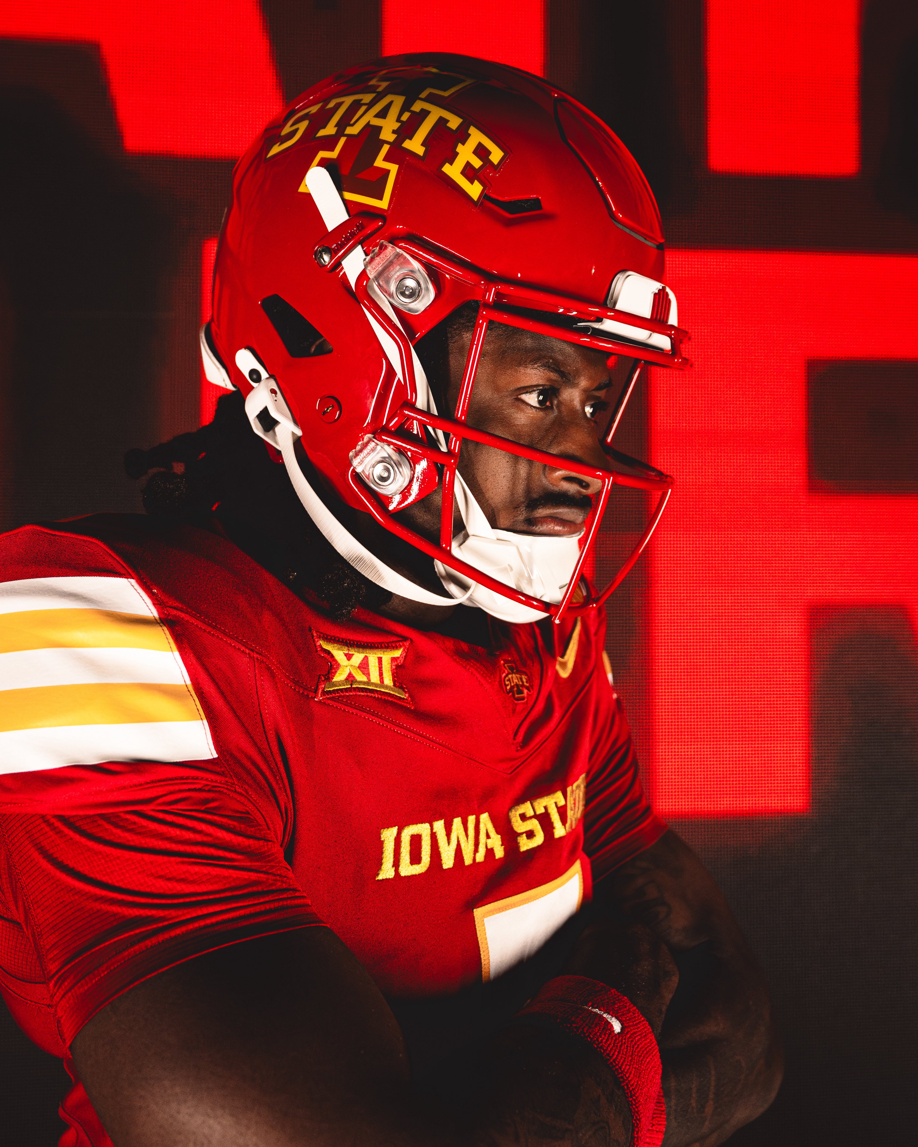
Noticed that. They’re perfect.it took ~30 years, but they finally got the cardinal on the helmet to match the cardinal on the jersey.

No forums found...
Site Related
Iowa State
College Sports
General - Non ISU
CF Archive
Install the app
Iowa State Uniform Discussions (update: new basketball unis)
- Thread starter CyTwins
- Start date
No forums found...
Site Related
Iowa State
College Sports
General - Non ISU
CF Archive
You are using an out of date browser. It may not display this or other websites correctly.
You should upgrade or use an alternative browser.
You should upgrade or use an alternative browser.
CFers right now:it took ~30 years, but they finally got the cardinal on the helmet to match the cardinal on the jersey.


Are the lids actually new? I just assumed it was the sticker and face mask configuration.it took ~30 years, but they finally got the cardinal on the helmet to match the cardinal on the jersey.
No it is the same color/shade of Cardinal. Having the stripe makes all the difference. Different accenting colors "trick" our eyes a bit. The same reason why folks last year (like myself initially) thought the jerseys were way more 'red than they used to be, when in fact the shade had not changed.Are the lids actually new? I just assumed it was the sticker and face mask configuration.
And as others have stated - these 'Cyclones' script helmets are our best ever. Please God never ear the version with the I-State bevel'd logo on it. Goodness that still looks bad, even with the silly white chin strap.
Can’t believe Jett wants to wear the BORING Alabama helmet and not our absolute BEAUTY Cyclones script cardinal helmet 
For sure, we've always needed white to make our colors work better imo. Glad we're finally realizing that lol. Just wish they did something with the pants but oh well.No it is the same color/shade of Cardinal. Having the stripe makes all the difference. Different accenting colors "trick" our eyes a bit. The same reason why folks last year (like myself initially) thought the jerseys were way more 'red than they used to be, when in fact the shade had not changed.
And as others have stated - these 'Cyclones' script helmets are our best ever. Please God never ear the version with the I-State bevel'd logo on it. Goodness that still looks bad, even with the silly white chin strap.
Now they need to do the orrnado and I will arrive if you know what I mean.
Can we please get the script logo on a hat without the stupid F'ing vintage logo on the side?
Are the lids actually new? I just assumed it was the sticker and face mask configuration.
No it is the same color/shade of Cardinal. Having the stripe makes all the difference. Different accenting colors "trick" our eyes a bit. The same reason why folks last year (like myself initially) thought the jerseys were way more 'red than they used to be, when in fact the shade had not changed.
And as others have stated - these 'Cyclones' script helmets are our best ever. Please God never ear the version with the I-State bevel'd logo on it. Goodness that still looks bad, even with the silly white chin strap.
I don't think so - in the same tweet other pictures that were ignored because "not Cyclone script" they also showed the cardinal helmet with the I-State logo and it too looked perfect in ways it hasn't in years past.
EDIT: and the Tweet itself says "new red lids" - they changed the entire helmet itself


I like the Cardinal helmet "Cyclone" edition, with the stripe. Nice! The I-STATE stays, which is fine, cardinal helmet, no stripe, with some variety in the logo now.
Going with the white facemask, cardinal helmet, cardinal jersey, white pant (c/c/w), was a no-brainer. They could have done this the past several years but just didn't. I'm glad they are keeping the red facemask with the cardinal helmet also. Again, some subtle variety that is easily changed over. I wonder what combo they will deploy the cardinal facemask with?
Even the white chinstrap, scripted "Cyclone" cardinal helmet with red facemask (with or w/o helmet stripe) would look just fine in a c/c/w combo, due to the added white in the helmet (chinstrap, front & rear bumpers, optional stripe).
There could be some nice combinations. I'll have to see 'em to believe 'em, as I think we have been a bit too black-centric. Only so many games to go around.
Last edited:
I agree, the white helmet stripe w/ white strap ties the unit much better if white pants are used. But I'd like them to go "all the way" and just add the same stripe organization on the white pants (in this case, cardinal center stripe with gold trims), then it would be complete. No-stripe pants still look "mismatched."I like the Cardinal helmet "Cyclone" edition, with the stripe. Nice! The I-STATE stays, which is fine, cardinal helmet, no stripe, with some variety in the logo now.
Going with the white facemask, cardinal helmet, cardinal jersey, white pant (c/c/w), was a no-brainer. They could have done this the past several years but just didn't. I'm glad they are keeping the red facemask with the cardinal helmet also. Again, some subtle variety that is easily changed over. I wonder what combo they will deploy the cardinal facemask with?
Even the white chinstrap, scripted "Cyclone" cardinal helmet with red facemask (with or w/o helmet stripe) would look just fine in a c/c/w combo, due to the added white in the helmet (chinstrap, front & rear bumpers, optional stripe).
There could be some nice combinations. I'll have to see 'em to believe 'em, as I think we have been a bit too black-centric. Only so many games to go around.
Also agree too black-centric. When only alt was the full black, and used once or twice, that's OK, now there are almost as many black combos as any of the other cardinal/white sets.
In some of my mocks (that I haven't finished) I had images of either a helmet stripe or a pant stripe, and I could easily include both. I kept the stripe off the cardinal pant and off the black pant and helmet.
I may get beck to it one of these days. For now, I am pleased with what they are doing. The black helmet single stripe is nice. Let's see if they keep that. The white helmet single stripe is OK, but as you said, a cardinal and gold one would be better.
This looks like a slow reveal. There may be other changes from last year, stripes, etc. And they haven't revealed the pants yet. My guess is they keep pants the same, though. That would be a bigger and more expensive change vs. helmet stripe, decals and bumpers.
Seeing the cardinal helmet with the gold "CYCLONES" script with white outlines is nice...
But that just makes me think how a gold helmet with cardinal "CYCLONES" and white trim...
...would melt everybody's face off.
Yeah yeah yeah it's associated with the bad 80s teams but we've probably never looked better.

But that just makes me think how a gold helmet with cardinal "CYCLONES" and white trim...
...would melt everybody's face off.
Yeah yeah yeah it's associated with the bad 80s teams but we've probably never looked better.
Everyone said, the Cyclone script was associated with the bad 80s, when we brought it out last year, and look we had the most wins in history. The whole but but we were bad then argument is dumb, pretty much every logo we have ever had has been through some bad years, even the current I-State logo.Seeing the cardinal helmet with the gold "CYCLONES" script with white outlines is nice...
But that just makes me think how a gold helmet with cardinal "CYCLONES" and white trim...
...would melt everybody's face off.
Yeah yeah yeah it's associated with the bad 80s teams but we've probably never looked better.
View attachment 151851
Tho
Those unis sucked and it wasn’t due to the program sucking then.Seeing the cardinal helmet with the gold "CYCLONES" script with white outlines is nice...
But that just makes me think how a gold helmet with cardinal "CYCLONES" and white trim...
...would melt everybody's face off.
Yeah yeah yeah it's associated with the bad 80s teams but we've probably never looked better.
View attachment 151851
Elements of that design don’t work well as a unit and some design is dated, but if done well it could merge into the script helmet revival alongside current format.Tho
Those unis sucked and it wasn’t due to the program sucking then.
Those unis were fantastic. Absolutely fantastic.Tho
Those unis sucked and it wasn’t due to the program sucking then.