No forums found...
Site Related
Iowa State
College Sports
General - Non ISU
CF Archive
Install the app
Iowa State Uniform Discussions
- Thread starter CyTwins
- Start date
No forums found...
Site Related
Iowa State
College Sports
General - Non ISU
CF Archive
You are using an out of date browser. It may not display this or other websites correctly.
You should upgrade or use an alternative browser.
You should upgrade or use an alternative browser.
Did you come in here just to whine about whiners?It's truly amazing at the number of whiners on CF.
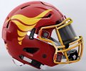
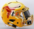
That gold-ish helmet is sweet!
I still think it looks cool, but you're right, gold is the more logical choiceAnybody notice the 'white font' nameplate on the cardinal jersey? I think that's a miss. It should be gold. They have gold 'Iowa State' on the front, and white names on the back? Really?
These are a significant downgrade. We finally had good uniforms even if they could use some tweaks but we went back to absolute crap.
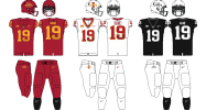

Seriously compare the two. We went from something moderately unique to something super standard. Aside from that the execution was just bad. They didn’t solve the issues with the existing set and made some pretty baffling decisions.
Hopefully it is just the images but it appears they have gone back to ketchup and mustard colors. The stripes on the red uniforms are downright bad. They also didn’t even fix the biggest issue which was the lack of cardinal or gold on the black uniforms.
Why... these scream Mountain West team. WTF. The Purdy Era uniforms were the best we've ever had..
I wouldn't call them a significant downgrade. But they're a noticeable step away from unique and towards generic.These are a significant downgrade. We finally had good uniforms even if they could use some tweaks but we went back to absolute crap.
View attachment 128573
View attachment 128574
Seriously compare the two. We went from something moderately unique to something super standard. Aside from that the execution was just bad. They didn’t solve the issues with the existing set and made some pretty baffling decisions.
Hopefully it is just the images but it appears they have gone back to ketchup and mustard colors. The stripes on the red uniforms are downright bad. They also didn’t even fix the biggest issue which was the lack of cardinal or gold on the black uniforms.
Agree on the shades of red and yellow but disagree on bringing color into the black unis... those are so clean as is.
However, my biggest complaints:
1) the shoulder stripes on the cardinal jersey
2) lack of a "collar"
3) shades of cardinal and gold
Ultimately, I think they're fine. They look more professional than the old ones, but that's the trade off with giving up some of the unique details. Oh well, we only need to cheer for this laundry for 5-6 years anyways.
They're fine..I like some aspects better than the old ones. The shoulder stripes looked better when it was just the jersey reveal. With the plain pants they look kind of weird. Doesn't really matter though. They will do the job!
I wouldn't call them a significant downgrade. But they're a noticeable step away from unique and towards generic.
Agree on the shades of red and yellow but disagree on bringing color into the black unis... those are so clean as is.
However, my biggest complaints:
1) the shoulder stripes on the cardinal jersey
2) lack of a "collar"
3) shades of cardinal and gold
Ultimately, I think they're fine. They look more professional than the old ones, but that's the trade off with giving up some of the unique details. Oh well, we only need to cheer for this laundry for 5-6 years anyways.
 You don’t need a ton of color on the black uniforms but just something like these old ones for basketball. It needs something to tie into our normal uniform colors.
They aren’t that bad if you take out the red ones but those are going to be really bad. If you fixed the colors and the stripes on the red ones they would be ok. As they are they are bad.
That’s light gray. Almost the opposite of black. You absolutely cannot - ever - in any way, shape and/or form ever, ever, ever have “yellow” next to or near “black” on an Iowa State uniform. Ever. Light gray, dark gray, that’s different. Pure black - ONLY white is acceptable (and Cardinal too, but doesn’t make a ton of sense).View attachment 128578 You don’t need a ton of color on the black uniforms but just something like these old ones for basketball. It needs something to tie into our normal uniform colors.
They aren’t that bad if you take out the red ones but those are going to be really bad. If you fixed the colors and the stripes on the red ones they would be ok. As they are they are bad.
The w/b/w combo is by far the best of this new batch. The home and away ones are underwhelming. I’m very concerned that the front jersey numbers are stretched/elongated, like Nike did in their ~2014 iteration back at that time. It’s insane to me how that’s even remotely acceptable. Our “Iowa State” font is solid, it’s unique to us for the most part. It’s not too much to ask that it not be f*cked with. Noel’s #13 just looks “off”. Hope it’s just the angle.
The "black cannot touch yellow" rule simply isn't true.That’s light gray. Almost the opposite of black. You absolutely cannot - ever - in any way, shape and/or form ever, ever, ever have “yellow” next to or near “black” on an Iowa State uniform. Ever. Light gray, dark gray, that’s different. Pure black - ONLY white is acceptable (and Cardinal too, but doesn’t make a ton of sense).
The w/b/w combo is by far the best of this new batch. The home and away ones are underwhelming. I’m very concerned that the front jersey numbers are stretched/elongated, like Nike did in their ~2014 iteration back at that time. It’s insane to me how that’s even remotely acceptable. Our “Iowa State” font is solid, it’s unique to us for the most part. It’s not too much to ask that it not be f*cked with. Noel’s #13 just looks “off”. Hope it’s just the angle.

I don't think we'll get 4 helmets in the near future (unless we are Oregon). Helmets are pretty expensive and each one has to be custom fitted.
We would have to get rid of the black helmet (not doing with this coach)(and I like the black unis), to add gold. Or go to 4 helmets.
Or get rid of the white helmet w/ black logo and have a gold helmet instead.
This is the perfect image for how well something like that would look. Who freaking cares about TOE.The "black cannot touch yellow" rule simply isn't true. View attachment 128580
It looks bad on a uniform. Never, ever should those 2 colors be touching on a jersey that we put on.The "black cannot touch yellow" rule simply isn't true. View attachment 128580
I know the process - but on the actual uniforms it causes it to stand out even more since the shoulder pad fabric is basically matte.Heat pressed. Welcome to modernity.
shut ur yapperGuys walking around in baggy cargo shorts apparently have strong opinions on uniforms.
i have a pair i wear around the farm during the summer
its great being able to put nails, screws, whatever else in those pockets


