*New Uniform Thread*

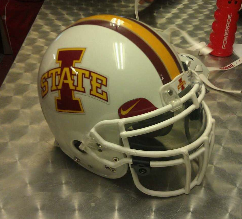
Haha. I swear you can see right into the soul of Cyclone fans. The white helmets have been our white whale for a long time.

Really?? As in you've been calling for white helmets?

As someone with no skin in the game....I think white helmets with the cardinal I or a cardinal tornado would be "dope" as the kids are saying nowadays...
 
And I think that was the "retro/classic look" that inspired the current design. It's a well-designed package. They could've refined the I-State logo to work well on that gold helmet — better contrast of logo to helmet compared to red-on-red, modernized the jersey numerals we have now (I still think that was a nice design choice) and let-fly.

It'd be a connection with a rare successful period (nostalgia!), the gold isn't too yellow, the cardinal isn't too bright-red or maroon.

Plenty of good suggestions for basics/alts in this thread (with exception of black-inclusion — please, no), but we could have done a LOT worse than mimicking these.

This exactly. I think that the font that they use across the board for all athletics is quite strong. Update these uniforms with I State logo and the "Cyclone" font and you've got a winner. Heck for a home uni you just need gold-white-gold shoulder stripes and white with gold numbers.
 
Can someone resurrect one of the white helmets threads? I can't find one. I know they're out there. [/xfiles]
 
BEHOLD: THE ALL WHITE IN ALL ITS GLORY [choir of angels singing]

6103651350_87227d8e12_o.png

scaled_php.jpg
 
I still say these are the best uniforms we've ever worn. Hell for branding sake we could wear them home and away. Also with the influx of alternate uniforms these days, I wonder if finding a cool throwback will be the new "hip" thing and we could be on top of it.

attachment.php

Hands down my favorite as well. Put an updated I-State logo on these and this is my vote.
 
BEHOLD: THE ALL WHITE IN ALL ITS GLORY [choir of angels singing]

6103651350_87227d8e12_o.png

scaled_php.jpg

Hell yes....count me in for this being our road unis. There were a lot of mock-ups for home unis that were kick *** as well. I really hope Campbell somehow manages to see these. We really need our own identity uniform-wise so we don't have to hear how we look like USC. New coach, new stadium, new unis.....a new era. I can guarantee you, I'll be excited for next year unlike the lack of excitement I unfortunately had for this season.
 
I posted this in a different thread but maybe we should form the "Cyclone Gridiron Uniform Club" who's mission is to raise money to purchase alternate uniforms for the ISU football team with the goal of having a different combination for each game in a season.
 
I like the overall idea to incorporate Grey into out uni's... There are only so many color combinations for schools. A lot of tradition based universities have moved past the keeping the main colors (example-TA&M). Plus it gets us out of the McDonald's joke a little more...
 
I like the overall idea to incorporate Grey into out uni's... There are only so many color combinations for schools. A lot of tradition based universities have moved past the keeping the main colors (example-TA&M). Plus it gets us out of the McDonald's joke a little more...

Exactly. Plus, we dont have much tradition to preserve in our uni's anyways. Create something that an 18 year old is excited about wearing, and the 80 year old donor stuck in the non-existent "good old days" can deal with it.
 
VERY NICE!! Put the I-State on the helmet and you are in business. . I like the stripe going down the pant with the white in the middle of the pant and the helmet striping. Numbers and trim are perfect also IMO. This is where the trice stripes could be on the jersey in the front in cardinal (yes- cardinal) and it would look like a much cleaner pattern( but similar to what the back of the basketball jerseys look like. If that makes sense. Well Done!!

No, no "I-State" on the helmets please. Give me the old school Cyclone logo with no font (updated if you like) on the helmet and I don't give a crap what the rest of the uniforms look like. Put it on a cardinal helmet, gold helmet, white helmet, whatever. Just use that awesome tornado/cyclone logo.
 
Can someone do me a solid and photoshop Kyven to be wearing a Gray Singlet with Red striping? Similar to the helmet below

5115dc5f9ebda.preview-620.jpg

CVFsqPdUkAA57RU.jpg
 
No, no "I-State" on the helmets please. Give me the old school Cyclone logo with no font (updated if you like) on the helmet and I don't give a crap what the rest of the uniforms look like. Put it on a cardinal helmet, gold helmet, white helmet, whatever. Just use that awesome tornado/cyclone logo.

Check out my sig if you haven't already. I hope we mix it up on occasion. I think a stenciled block I-STATE looks best on a "metallic/chrome" if we ever use them.
 
I understand that people like the old cyclone logo. It's a cool mark. But this cannot be said enough: It is not an Iowa State athletics logo anymore. It's not used on any official Iowa state gear anymore, and it's not coming back. One of JP's biggest things was creating the visual identity we have now. If people think there's actually a chance of any old logo being used on our football helmets (outside of a one-game throwback uni), they are sadly mistaken. I have no doubt athletics dept. employees read threads like this and may potentially even use the mock-ups made here. Might as well use the logos that actually have a chance to be used.

Seems now would be the perfect time to revise our SECONDARY logos. I wouldn't rule anything out- do you know Iowa State's marketing department personally or are you just guessing like the rest of us?
 
  • Like
Reactions: t-noah
I understand that people like the old cyclone logo. It's a cool mark. But this cannot be said enough: It is not an Iowa State athletics logo anymore. It's not used on any official Iowa state gear anymore, and it's not coming back. One of JP's biggest things was creating the visual identity we have now. If people think there's actually a chance of any old logo being used on our football helmets (outside of a one-game throwback uni), they are sadly mistaken. I have no doubt athletics dept. employees read threads like this and may potentially even use the mock-ups made here. Might as well use the logos that actually have a chance to be used.
Our marketing department is awful. Eliminating the logos was extremely dumb then and is still dumb. Nobody is saying that they should be used a ton, but we have some good logos when updated.

The primary should without a doubt be the I-State logo.
We should then have three secondary logos that we use relatively commonly.
-The bird in a blender without blue
-The current secondary logo
-The cyclone logo without the lettering.

Those four logos are really good.

I want us to look at what Missouri and Oklahoma State have done. I think they have the best uniforms in the country.
 
  • Like
Reactions: t-noah

Help Support Us

Become a patron