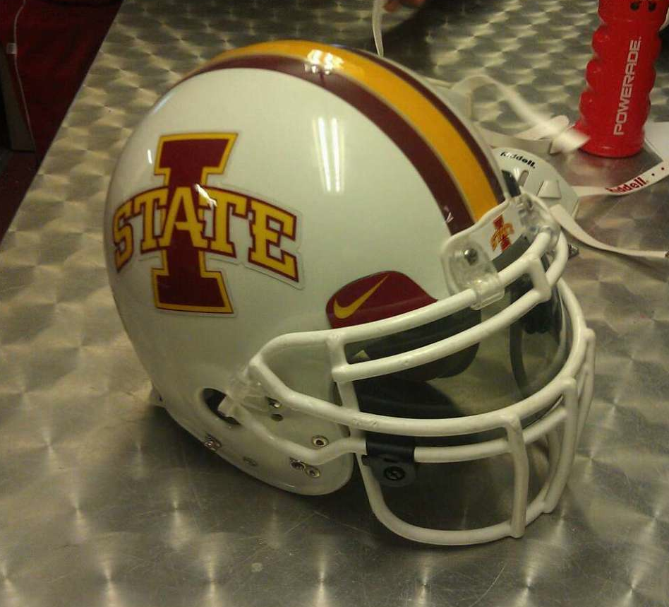
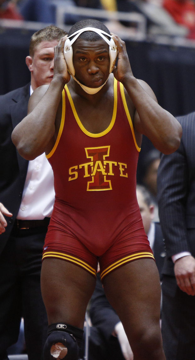
I understand that people like the old cyclone logo. It's a cool mark. But this cannot be said enough: It is not an Iowa State athletics logo anymore. It's not used on any official Iowa state gear anymore, and it's not coming back. One of JP's biggest things was creating the visual identity we have now. If people think there's actually a chance of any old logo being used on our football helmets (outside of a one-game throwback uni), they are sadly mistaken. I have no doubt athletics dept. employees read threads like this and may potentially even use the mock-ups made here. Might as well use the logos that actually have a chance to be used.
Our marketing department is awful. Eliminating the logos was extremely dumb then and is still dumb. Nobody is saying that they should be used a ton, but we have some good logos when updated.
The primary should without a doubt be the I-State logo.
We should then have three secondary logos that we use relatively commonly.
-The bird in a blender without blue
-The current secondary logo
-The cyclone logo without the lettering.
Those four logos are really good.
I want us to look at what Missouri and Oklahoma State have done. I think they have the best uniforms in the country.


