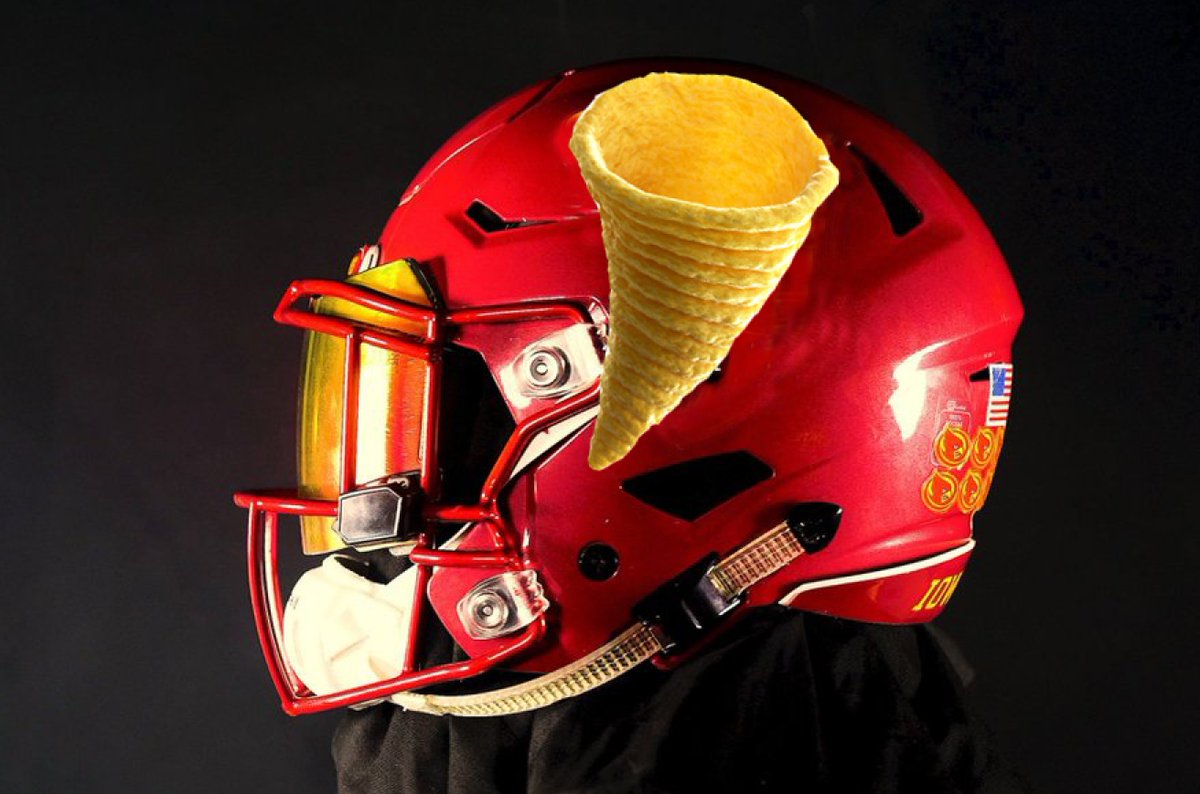
*New Uniform Thread*

KnappShack

Well-Known Member
May 26, 2008
23,900
32,265
113
Parts Unknown
While I'm not a huge fan of it yet I think it could look better on a White or black helmet..keep in mind this is a secondary logo..with I State being primary and Walking Cy is still an alternate as well.

People see that logo on helmet and they will think Cyclones..it is our nickname after all..

I was thinking a really disturbing BM
 

CYber_saber

Well-Known Member
Mar 2, 2017
1,127
1,468
113
I feel like I might change my mind when I see it out on the field, but my initial reaction is "meh"
<blockquote class="twitter-video" data-lang="en"><p lang="und" dir="ltr"> <a href="https://twitter.com/hashtag/BeatTexas?src=hash&amp;ref_src=twsrc^tfw">#BeatTexas</a> <a href="https://t.co/vgNbsap7FX">pic.twitter.com/vgNbsap7FX</a></p>&mdash; Cyclone Football (@CycloneFB) <a href="">September 28, 2017</a></blockquote>
<script async src="//platform.twitter.com/widgets.js" charset="utf-8"></script>
 

clonehenge

Well-Known Member
Apr 14, 2006
1,685
1,676
113
Some of you complain about Cyclone logos the way Nebraskans complain about license plates. Give it a chance to see how it looks. Remember how everyone trashed the "I-State" logo because it effectively meant taking Cy off the helmet? Where are we now...?

Remember, folks......secondary logo.

Just because it's secondary doesn't mean it has to look like doo-doo...literally.
 

CYber_saber

Well-Known Member
Mar 2, 2017
1,127
1,468
113
DK19RUpUEAYlvo8.jpg
 

k123

Well-Known Member
Sep 14, 2011
1,143
1,033
113
Iowa
Looks a little better in this actual video - but should have just updated the existing twister from the archives.

The players all look sharp in their suits though!

 
  • Agree
Reactions: psychlone99

Sigmapolis

Minister of Economy
SuperFanatic
SuperFanatic T2
Aug 10, 2011
26,952
41,667
113
Waukee
LIKES:

-- bringing some representation of the twister back

-- finally having a secondary "nickname" logo

-- some gold in the cardinal... not a big fan of the two-tone 80s tornado

DISLIKES:

-- everything else

I liked the idea of it, but the execution sucks.

Pairing it with the blah C-C-A combo (with a C facemask) makes it even worse.
 

UraMallas

Well-Known Member
Jan 9, 2013
7,517
5,908
113
42
I like them but don't love them. I do think they look better on because the helmet nods a bit more forward so the cyclone is at a better angle, imo.
 

Cybball37

Well-Known Member
Dec 11, 2015
876
654
93
Central Iowa
I'll stick to my earlier comments, but honestly, at this point, don't care. I just want to beat Texas. I'll be happy beating Texas with Po the teletubby on our helmets.
 

k123

Well-Known Member
Sep 14, 2011
1,143
1,033
113
Iowa
I think if there was more gold it would look better

Agree. I suppose it needs mix of red shades and gold to go on t-shirts, polos, golf towels, etc. But that kind of thinking is what got us navy blue in the dark ages!
 

Cardinal and Gold

Well-Known Member
Jul 23, 2016
1,388
1,953
113
Can't say I'm a huge fan of the new secondary logo. I personally think the twister logo from the 70's/80's was better, but I do like that they are trying to bring a new image to the program. There is always something about taking a nostalgic symbol and giving it a modern look. I still say they need to get cardinal helmets with gold face masks.