

No forums found...
Site Related
Iowa State
College Sports
General - Non ISU
CF Archive
Install the app
How to install the app on iOS
Follow along with the video below to see how to install our site as a web app on your home screen.
Note: This feature may not be available in some browsers.
Why is the Cyclones cursive logo saggy?
- Thread starter Kagavi
- Start date
No forums found...
Site Related
Iowa State
College Sports
General - Non ISU
CF Archive
You are using an out of date browser. It may not display this or other websites correctly.
You should upgrade or use an alternative browser.
You should upgrade or use an alternative browser.
I should've done this to begin with. This is basically what I'm proposing. Top is current licensed mark. Bottom is my version. Actually now that I look at it, the capital C could be improved a bit. Give it the same look as the second C with the little curl on top or just make it overall thicker. Just vibes man
EDIT: Scratch that, see post 30 that lifts the end instead of rotating
EDIT: Scratch that, see post 30 that lifts the end instead of rotating
Attachments

Last edited:


That's pretty bad, but at least it's not on the front of the hat throwing off the balance of the logo like so many of the vintage stamps. I've got a script Cyclones hat that has a stupid little vintage stamp, I got it as a gift otherwise I wouldn't have bought it. I've got a black Trice stripe hat that has the vintage stamp smaller and on the side of the hat, which is pretty inoffensive (though why does the Trice stripe logo need a vintage stamp, its not a vintage logo).omg I just saw this on the Homefield site. Gaaaaaaaahhhhhh
View attachment 156874View attachment 156875
They look the same to me. So what you are saying is nothing changes just that the entire logo needs to rotate slightly counter-clockwise to level the entire logo? Not actually changing the font or design?
Actually look at this everyone. Look at how the capital C on the straight version is thicker on top, but for some reason the curved captial C is skinny on top. Feels like this could be an elite logo with a few tweaks here and there
Definitely gotta have a thicker C if it's rotated. Let me try something else in a sec
Last edited:

Now yours looks too far turned the other way.I should've done this to begin with. This is basically what I'm proposing. Top is current licensed mark. Bottom is my version. Actually now that I look at it, the capital C could be improved a bit. Give it the same look as the second C with the little curl on top or just make it overall thicker. Just vibes man
OK, I'll allow itI should've done this to begin with. This is basically what I'm proposing. Top is current licensed mark. Bottom is my version. Actually now that I look at it, the capital C could be improved a bit. Give it the same look as the second C with the little curl on top or just make it overall thicker. Just vibes man
")
Hope this isn't weird but I still refer people to your Orrnado stuff. I actually had a conversation about it recently.
I should've done this to begin with. This is basically what I'm proposing. Top is current licensed mark. Bottom is my version. Actually now that I look at it, the capital C could be improved a bit. Give it the same look as the second C with the little curl on top or just make it overall thicker. Just vibes man
I like your version better.
I hate this helmet logo. Reminds me of Casey's "new" logo.
Ps. I was an ISU design major, that failed miserably
Ps. I was an ISU design major, that failed miserably
Hmm I actually think so too, which is why I also thought about lifting the end instead of rotating like I mentioned. With this version I used the warp tool to lift up the "...nes" to align better along the bottom, then I made the captial C bigger and some other stuff to keep the overall weight optically balanced more like the originalNow yours looks too far turned the other way.
This is the version I prefer vs the rotated one earlier in the thread.
Attachments

Last edited:
Because of BrokebackI wanna know why okie st goes curved and straight?


I agree putting a stamp on something that may or may not need it is ridiculous.
??
What is an issue is when they use other random cursive fonts on polos and charge $90. TJ and staff have been wearing a generic Microsoft Word script font Cyclones Polo on the sidelines for a couple seasons and it bothers the sh*t out of me!
Oh yeah. Def a weird choice
I wanna know why okie st goes curved and straight?
Not sure, but is it possible one is reproducing the original on a throwback uniform, while the other is with their standard uniform package? idk
I've got a black Trice stripe hat that has the vintage stamp smaller and on the side of the hat, which is pretty inoffensive (though why does the Trice stripe logo need a vintage stamp, its not a vintage logo).
Yeah it's not a vintage logo in any way. Pretty much every single cfb team had those jerseys at one point, but some schools made unique shapes out of them or incorporated letters. I have a whole folder full of them.
OK, I'll allow it
Hope this isn't weird but I still refer people to your Orrnado stuff. I actually had a conversation about it recently.
Just to be clear, I was simply the hype man for @amestoplease who was the genius with that logo. If I remember correctly he also had another updated cyclone logo idea inspired by the twister Cy version. Not sure if he ever shared it.
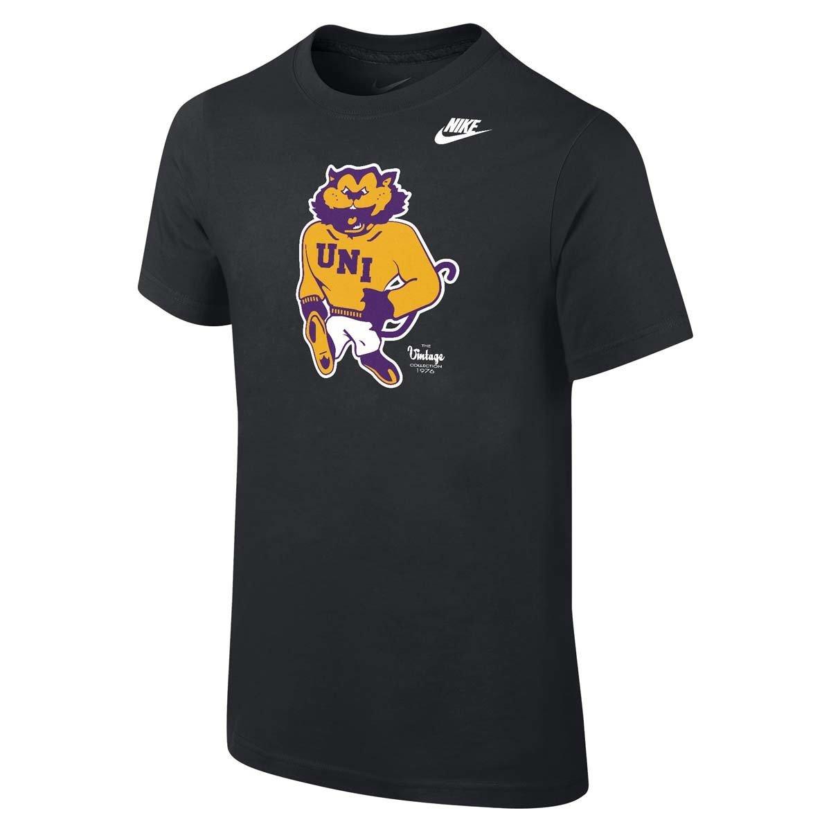
I had no idea. Went to Homefield Apparel and interestingly enough the majority of their vintage gear does NOT have a vintage stamp:

Vintage Northern Iowa Tees, Hoodies, Tanks | Homefield
At Homefield, we make the most comfortable Northern Iowa apparel you'll ever own. Inspired by vintage and retro looks, we refuse to implement cookie-cutter design. We dive deep into school history to ensure every Panthers design has meaning for fans.www.homefieldapparel.com
If you were to draw a horizontal line from the bottom of the C and Y, everything stays above it until, for some reason, that line cuts off half of the S shape. That's what makes it look off balance to me. The straight version doesn't have that issue.

Also on at the 'Dome Panther' and 'Block NI' logos. Has to be the distributer or something.
View attachment 156879
the only reason it dips a little lower is because you are using the end of the S to underline the logo. that HAS to be done.
Yeah, I think using the s like that, I think that's the correct orientation. There's a couple other options for s to underline I've seen:
Using a cursive s:
Or adding a loop to the s:

Personally, since this was the s used in the 80s, I think sticking with it is the right call. To me, there's something appealing about the s making it clearly not a typeset logo with some cursive font.
I'd also never noticed before how the "Cy" and then "clone" are somewhat distinct in the logo. Then the s has a little bit of twister imagery to it.
Tell me it's a Bye Week, without telling me it's a Bye Week.....
Was just thinking about this the other day — I don’t have my Adobe CC license active but was considering what a lower case cursive s would look like at the end.
I thought i was the only person who really noticed the vintage stamps. They drive me absolutely nuts and it ruins anything it’s on
I think you need to consider that the bottom of the C and the tail of the s are on different levels in the script. If you were to imagine the line carrying all the way to beneath the capital C, I think the alignment is fine.Hmm I actually think so too, which is why I also thought about lifting the end instead of rotating like I mentioned. With this version I used the warp tool to lift up the "...nes" to align better along the bottom, then I made the captial C bigger and some other stuff to keep the overall weight optically balanced more like the original
This is the version I prefer vs the rotated one earlier in the thread.
I took a try at that with the straight version of the logo, and kinda like how that looks, but I dont have the tools to do that with the curved version.

I can't believe that someone else had that same reaction to the question that I had...Some have Peroni’s and some don’t