Uniform yes. Helmet however? Big no. We do not need the swirly tornado or the bird in a blender back.


No forums found...
Site Related
Iowa State
College Sports
General - Non ISU
CF Archive
Install the app
How to install the app on iOS
Follow along with the video below to see how to install our site as a web app on your home screen.
Note: This feature may not be available in some browsers.
*New Uniform Thread*
- Thread starter DesertClone1
- Start date
No forums found...
Site Related
Iowa State
College Sports
General - Non ISU
CF Archive
You are using an out of date browser. It may not display this or other websites correctly.
You should upgrade or use an alternative browser.
You should upgrade or use an alternative browser.
Urban legend that the 49ers stole our identity. They were founded in the 1940s, we used it in the 1960s.
Dam facts!
Uniform yes. Helmet however? Big no. We do not need the swirly tornado or the bird in a blender back.
Yeah- what a dumb idea to use an ACTUAL CYCLONE on anything. Block letters on helmets are so unique.
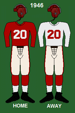
If I remember correctly didn't the 49ers steal our uniform design or vice versa? Anyway I believe that's what our uniforms are supposed to look like.
Found this animated gif, so here it is for S&G. This is really a Kagavi research thing. I don't have the attention span for it.
Last edited:
Why? We are the Iowa State CYCLONES. Why not put a cyclone on a helmet.Uniform yes. Helmet however? Big no. We do not need the swirly tornado or the bird in a blender back.
Last edited:
Why? We are the Iowa State CYCLONES. Why not put a cyclones on a helmet.
Agreed.

Yeah I can't believe people actually hate the actual cyclone logo, imho it is the nicest one we have and it would be the perfect secondary logo. Yes we weren't good with that logo, but if that rules out using that logo, well in truth we shouldn't be using any logos and make a new one.
i have friends that went to other schools and think cyclones mean hurricanes and they are confused why we have that as our team name. If we put a twister on our helmet people meant know what a cyclone really is. Cyclones is the coolest team name out there! We should in embrace it more and market that we are ******* tornado. We should still keep the I State logo as our primary logo but throw some more clock twister in there.
i have friends that went to other schools and think cyclones mean hurricanes and they are confused why we have that as our team name. If we put a twister on our helmet people meant know what a cyclone really is. Cyclones is the coolest team name out there! We should in embrace it more and market that we are ******* tornado. We should still keep the I State logo as our primary logo but throw some more clock twister in there.
Those helmets though!https://twitter.com/CycloneUniforms?ref_src=twsrc^google|twcamp^serp|twgr^author
I always enjoying looking at uniforms on this account, a lot are a bit too much though.
Both are awesome imo, but I like the cyclone on the helmet
The cyclone on the helmet looks incredible.
I think this is perfect.
"But it features a secondary logo." Yes, but a precedent of secondary logos has been clearly established, e.g. Oklahoma State's use of their 'Pistol Pete' logo.
"But the logo comes from a dark period of ISU football." Who on earth cares? Stop with the histrionics.
The logo is simple but sleek and retro. It features our underutilized nickname clearly and isn't diluted with a bird. If the university had kept with this logo it would have become our Tigerhawk.
I like the simple top but the Jack Trice version is good too. I support moving toward an "old gold." As a side note, if you remove the logo, make the helmet solid chrome gold, and get rid of the stripes on the pants it is very similar to Notre Dame's uniforms; just replacing the blue with cardinal. And coincidentally, that creates a replica of ISU's uniforms from the early 1960's.
Last edited:

I agree, I know Indiana does this with their helmets.we have so many cool logos: tornado, ****** cyclones, walking cy, cy running w/ a football, the revised tornado bird (not w/ the blue or ****** iowa state) and of course the new I State
I think we can all agree how awesome it would be to have helmets w/ the different stickers for a couple games each year.
Attachments

Yeah I can't believe people actually hate the actual cyclone logo, imho it is the nicest one we have and it would be the perfect secondary logo. Yes we weren't good with that logo, but if that rules out using that logo, well in truth we shouldn't be using any logos and make a new one.
i have friends that went to other schools and think cyclones mean hurricanes and they are confused why we have that as our team name. If we put a twister on our helmet people meant know what a cyclone really is. Cyclones is the coolest team name out there! We should in embrace it more and market that we are ******* tornado. We should still keep the I State logo as our primary logo but throw some more clock twister in there.
I love the Cyclone. I like the ****** lettering and the I State, but to me the best logos are those that are distinct in 2D, monochrome form that can be easily recognized when flashed on a tv screen for a second. The cyclone is perfect for that.
I love the Cyclone. I like the ****** lettering and the I State, but to me the best logos are those that are distinct in 2D, monochrome form that can be easily recognized when flashed on a tv screen for a second. The cyclone is perfect for that.
Why is scr*pt edited?
Why is scr*pt edited?
To prevent people from posting malicious java s c r i p t code in the website.
There are so many of these threads. And I love them all!
The amestoplease with the white jersey is great, and I wanted to re-up his similar red ones with tornado gold helmet and with stencil gold helmet. I think those would make the best gold helmets.
http://cyclonefanatic.com/forum/showthread.php?t=200378&page=26&p=4522264&viewfull=1#post4522264

http://cyclonefanatic.com/forum/showthread.php?t=200378&page=26&p=4522283&viewfull=1#post4522283

These. Please go to this gold/yellow type of helmet. And, with 2 stripes or 1 stripe down the center of the helmet too. No more cardinal helmet.
Winner winner; chicken dinner! That needs to get to the coaching staff and/or Nike. As the young whipper snappers would say in todays world, "those are sick!".
I wonder though...the stripes on the pants are similar to the Adidas stripes. Would Nike have a problem with this?

I think this is perfect.
"But it features a secondary logo." Yes, but a precedent of secondary logos has been clearly established, i.e. Oklahoma State's use of their 'Pistol Pete' logo.
"But the logo comes from a dark period of ISU football." Who on earth cares? Stop with the histrionics.
The logo is simple but sleek and retro. It features our underutilized nickname clearly and isn't diluted with a bird. If the university had kept with this logo it would have become our Tigerhawk.
I like the simple top but the Jack Trice version is good too. I support moving toward an "old gold." As a side note, if you remove the logo, make the helmet solid chrome gold, and get rid of the stripes on the pants it is very similar to Notre Dame's uniforms; just replacing the blue with cardinal. And coincidentally, that creates a replica of ISU's uniforms from the early 1960's.
VERY NICE!! Put the I-State on the helmet and you are in business. . I like the stripe going down the pant with the white in the middle of the pant and the helmet striping. Numbers and trim are perfect also IMO. This is where the trice stripes could be on the jersey in the front in cardinal (yes- cardinal) and it would look like a much cleaner pattern( but similar to what the back of the basketball jerseys look like. If that makes sense. Well Done!!
We should scrap Cardinal helmets, we should just go to gold helmets like notre dame color and white helmets.