

No forums found...
Site Related
Iowa State
College Sports
General - Non ISU
CF Archive
Install the app
How to install the app on iOS
Follow along with the video below to see how to install our site as a web app on your home screen.
Note: This feature may not be available in some browsers.
*New Uniform Thread*
- Thread starter DesertClone1
- Start date
No forums found...
Site Related
Iowa State
College Sports
General - Non ISU
CF Archive
You are using an out of date browser. It may not display this or other websites correctly.
You should upgrade or use an alternative browser.
You should upgrade or use an alternative browser.


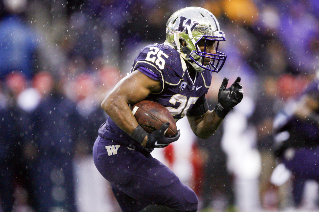
The best uniform combos are when the helmet matches the pants.
Or when the pants match the jersey.


I'm all for our own identity, but, come on, those uniforms are hideous. Seattle is tolerably bad (compared to atrocious with their old ones), Oregon is gimmicky but still awful, and Tampa s just... just... well, not down with the digital alarm clock numbers. Somebody should have put a stop to that one.
I'm firmly convinced football is going through an era not unlike what baseball did in the 1970s and 1980s and basketball did in the 1990s and 2000s. Eventually, each have come around to the clean, simple, classic, timeless looks that defined the best in the sports (nobody prefers the old Devil Rays' logo over the Yankees or the Red Sox or the new Bucs logo compared to the Packers G or the Cowboys' star).
Transitions away from this...
And back to things like this...
College football--perhaps no sport, save baseball, relying more on institutional continuity and tradition--will realize this eventually. We're just going through a little teenage rebellion right now.
I'm glad ISU has declined to join. We've a pretty conservative fan base and culture in Ames. I'm not crazy in love with the current uniforms and could see some tweaks/maybe a redesign, but something within the context of our current design system, colors, logo, and traditional football elements = good.
Great post. You hit the baseball thing spot on. I had flashbacks of the Astros and White Sox unis from the 70's and 80's. Holy eye sore batman!
I agree. The photo of the 49er helmet (which looks like one of their older versions) is bright with a white background while the Bruce era helmet looks like it was taken in dim light with a black background. Lighting can make a big difference in appearance as I'm sure you know. The photo of the 49er helmet looks much less gold than the color of their actual helmets or their gold color. I know, I've got some of their authentic gear.
Apologies to the color blind folks out there, but we have to let you know that these are VASTLY different shades:


SF's is "true" gold like Notre Dame or Florida State while our throwbacks are yellow like LSU or Green Bay.
this convo is stupid. They said we get new uniforms. They didn't say we are getting new design. We are just getting "new" versions. Updated fabric ect.
Apologies to the color blind folks out there, but we have to let you know that these are VASTLY different shades:

SF's is "true" gold like Notre Dame or Florida State while our throwbacks are yellow like LSU or Green Bay.
I've said that the niners and Bruce throwback gold wasn't as close as I thought, but NO, the Bruce throwback gold was not the same as the LSU or Packer yellow-gold. Photos can also be deceptive and color shades can also change. A Jerry Rice or Joe Montana era autographed helmet is more tan than a Colin Kaepernick signed helmet, which is more gold. I've seen them. But enough. Go ahead and nit pick with more photos if you want to.
this convo is stupid. They said we get new uniforms. They didn't say we are getting new design. We are just getting "new" versions. Updated fabric ect.
Yep. I would be shocked if the design is any different than what it has been.
I've said that the niners and Bruce throwback gold wasn't as close as I thought, but NO, the Bruce throwback gold was not the same as the LSU or Packer yellow-gold. Photos can also be deceptive and color shades can also change. A Jerry Rice or Joe Montana era autographed helmet is more tan than a Colin Kaepernick signed helmet, which is more gold. I've seen them. But enough. Go ahead and nit pick with more photos if you want to.
Thanks. Will do.


Hmm... still not seeing the similarity. :cute:
Thanks. Will do.
Hmm... still not seeing the similarity. :cute:
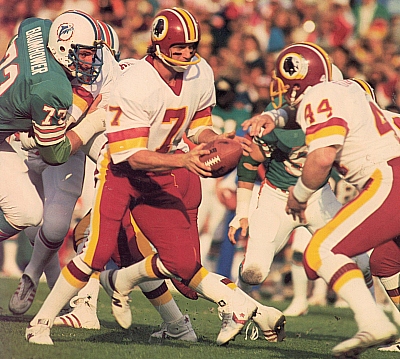
Read my last thread, I said I'd seen a Theisman era helmet and a current Kaepernick helmet, and the former is more tan and the new one more gold. Now put a Bruce era uniform next to a current Packer and LSU uni and we'll compare the golds.
Read my last thread, I said I'd seen a Theisman era helmet and a current Kaepernick helmet, and the former is more tan and the new one more gold. Now put a Bruce era uniform next to a current Packer and LSU uni and we'll compare the golds.
Kinda racist, but I agree Redskins are obviously more tan.


Hard to find 70s era Cyclone pics in color. Whaddya think? I see yellow.
Last edited:
this convo is stupid. They said we get new uniforms. They didn't say we are getting new design. We are just getting "new" versions. Updated fabric ect.
Updated fabric? Really?
I bet a "chrome" gold stencil on a metallic red helmet would look killer:
The stencil logo looks way better than the sticker logo. I just can't stand when we bevel out our "I" leave the bevel to aTm and TTU please.
(someone posted this once in the matte helmet thread for an example)
Last edited:
Kinda racist, but I agree Redskins are obviously more tan.
Hard to find 70s era Cyclone pics in color. Whaddya think? I see yellow.
Got me, but at least they both are named Joe and played at Notre Dame. How about if we agree that the Bruce era gold is somewhere between the LSU/Packer yellow and Niner gold. At least that's the way I remember it, but my memory and eyesight aint what it used to be.
Stencil would be a large undertaking for the equipment staff. As we are all aware they spend the money where it matters more, being we are at a disadvantage in that department.
The best uniform combos are when the helmet matches the pants.

This is the best Iowa State look in a long time. I am flabbergasted as to why we went away from it.
I would love to see it with the matte helmets - think that would be outstanding.
Got me, but at least they both are named Joe and played at Notre Dame. How about if we agree that the Bruce era gold is somewhere between the LSU/Packer yellow and Niner gold. At least that's the way I remember it, but my memory and eyesight aint what it used to be.
Ha ha! No worries- I was just having a little fun with ya. I would prefer a darker, more muted yellow-gold myself. I'm sick of the McDonalds comparisons.
Yay! I love these threads! Here come the haters:
"I don't care if they wear pink ballerina outfits. I just want wins."
"Can we please just stick with one look for once??"
"I think black looks really good on our uniforms."
"^Boo this man!^"
"I like gray."
"Recruits like variety. Look what it's done for Oregon."
"Recruits like winning."
"Oregon has Nike."
"White helmets!"
"Email JP."
"Why are we discussing this? It's basketball season and we're a basketball school."
"We have a football team?"
"I'm not renewing my season tickets."
"You suck, fair weather fan."
"You suck. I have kids."
"We need real gold."
"49ers suck."
"We inspired their look back in the 60s."
"That's not true."
"I love the 80s funnel."
"Can't. Criner."
"Check out these mock ups I did!"
"Sweet!"
"Terrible!"
Wait three months; start another thread. Popping some corn...
Free fortune teller.
I agree. The photo of the 49er helmet (which looks like one of their older versions) is bright with a white background while the Bruce era helmet looks like it was taken in dim light with a black background. Lighting can make a big difference in appearance as I'm sure you know. The photo of the 49er helmet looks much less gold than the color of their actual helmets or their gold color. I know, I've got some of their authentic gear.
Lol..