Agree. This is my favorite ISU logo of all time.

This is another great one.

Angry walking CY is my favorite. It would make a really cool secondary logo I think. Why couldnt we have a helmet that has the IState on one side and angry Cy on the other?


Follow along with the video below to see how to install our site as a web app on your home screen.
Note: This feature may not be available in some browsers.
Agree. This is my favorite ISU logo of all time.
This is another great one.
humility wont usually get you far on this board...being a d**k to everybody is usually the preferred way to go
humility wont usually get you far on this board...being a d**k to everybody is usually the preferred way to go
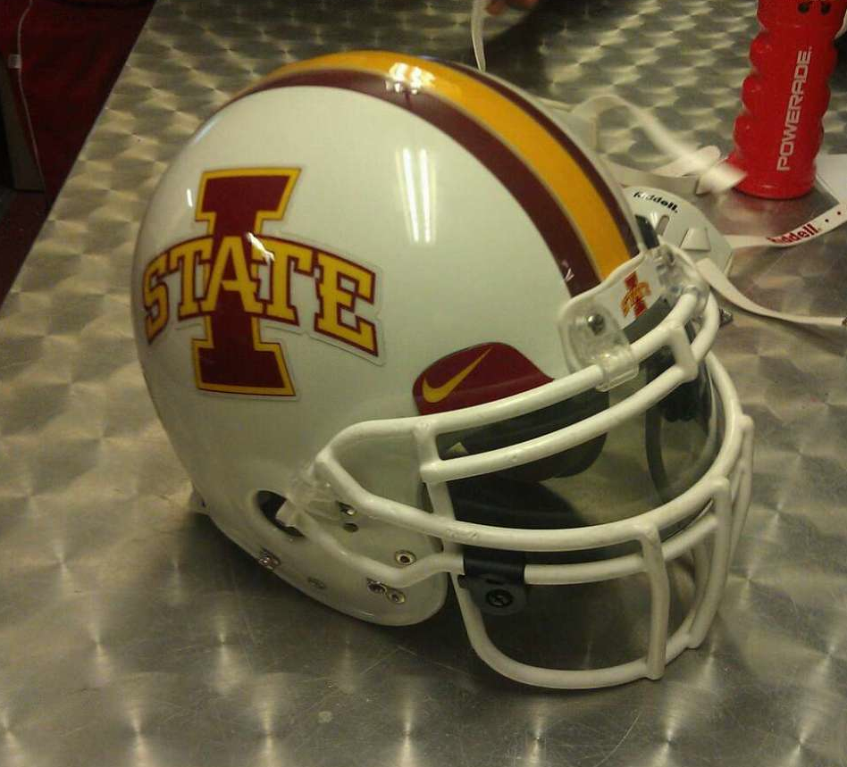
love love lovePlenty of helmet logos aren't recognizable without a closeup.
May I offer an alternative solution?:

I'd enjoy seeing a black alternate uniform. I seriously doubt it will happen but I think it would look good with cardinal and gold highlights. I couldn't care less about what Iowa fans think about it either; they don't trademark the color black any more than Texas Tech does and Baylor wears black. Just don't wear black for the Cy-Hawk game.
I couldn't care less what Hawk fans think about it either. It has nothing to do with them.
You don't send the Cyclones, our loyal sons forever true, onto the field of battle wearing the colors of EIU. Period. End of story.
BEHOLD: THE ALL WHITE IN ALL ITS GLORY [choir of angels singing]

I understand that people like the old cyclone logo. It's a cool mark. But this cannot be said enough: It is not an Iowa State athletics logo anymore. It's not used on any official Iowa state gear anymore, and it's not coming back. One of JP's biggest things was creating the visual identity we have now. If people think there's actually a chance of any old logo being used on our football helmets (outside of a one-game throwback uni), they are sadly mistaken. I have no doubt athletics dept. employees read threads like this and may potentially even use the mock-ups made here. Might as well use the logos that actually have a chance to be used.
They wouldn't let me give you any MORE rep. So 'rep' to ya here!yet you turn on an Iowa state game on ESPN or FS1 and the little lead-in graphic thing shows not one, not two, but THREE different Iowa state marks simultaneously. ISTATE, walking cy, and blender bird are all being used even though the blender marks are 'defunct.' there is a need for secondary marks and we have appropriate ones to use and it's being completely ignored by Iowa state licensing because they think the new cy oval is fine.
This is growing on me with the "storm is brewing" background. Maybe more clouds and whiter lightening for interest/contrast.Personally, I love the two-tone 'swirl' logo, and especially this new darker, two-tone yellow/gold 'swirl' logo here.
It is nothing like the old Walden-era swirl that was on the helmets then. The Swirl connotes Cyclones; that is who we are, and it is unique. I think we should embrace it, as a great secondary logo. Put and keep the 'I-State' logo on the helmets; put the 'swirl' on the sleeve, jersey, or pant, elsewhere (put the two-tone 'swirl' on the helmet for an "alternate" look every once in awhile). I think that would make a lot people happy. We have other good, past logos also; dust one or two of those off once in a while; they don't even have to be used on our uniforms. They don't have to be used alot, but why not un-retire a couple of them. They are part of our history. Take pride in it.
Agree. This is my favorite ISU logo of all time.
This is another great one.
Black always sounds good but in practice it usually disappoints.I'd enjoy seeing a black alternate uniform. I seriously doubt it will happen but I think it would look good with cardinal and gold highlights. I couldn't care less about what Iowa fans think about it either; they don't trademark the color black any more than Texas Tech does and Baylor wears black. Just don't wear black for the Cy-Hawk game.

