Anyone heard any rumblings if basketball is due some new uniforms? Feel like we've had this iteration since the 2018 season? I know the 2019 Shayok/Tyrese team wore current look.


No forums found...
Site Related
Iowa State
College Sports
General - Non ISU
CF Archive
Install the app
How to install the app on iOS
Follow along with the video below to see how to install our site as a web app on your home screen.
Note: This feature may not be available in some browsers.
Iowa State Uniform Discussions (update: new basketball unis)
- Thread starter CyTwins
- Start date
No forums found...
Site Related
Iowa State
College Sports
General - Non ISU
CF Archive
You are using an out of date browser. It may not display this or other websites correctly.
You should upgrade or use an alternative browser.
You should upgrade or use an alternative browser.
KidSilverhair
Well-Known Member
Amen. Cardinal and gold would be an awesome uniform combination. For some reason ISU says “Cardinal and gold” when what everyone sees is “red and yellow.”We've been saying this for years. Cardinal gold work great together they just need to be used correctly. We use a pale yellow for our gold, I don't care if the official color swatches they came up with in 1920 are that gold we can change it now.
Also buy into the Trice stripes more. It’s a terrific legacy that could be a real plus in branding … if it was actually featured on a uniform somewhere.
I‘m also a fan of the Orrnado.

Our Brand Marketing depart is still learning what pantones are rather than using the color picker tool from random pictures. Been a work in progress since the 1800s.This is my beef. I don’t care for the shades. The Gold certainly and possibly the Cardinal need to be darker.

i say we go to the opposite extreme...make mcdonalds colors look dark by comparison.


Our official "gold" is ****ing ugly - I'm not sure why y'all still complaining about the "gold" used on the uniforms, which I would call "athletic gold"
I can understand if someone wanted to use gold similar to the 49ers, but surely no one thinks our official "gold" is better than "athletic gold", right?
I can understand if someone wanted to use gold similar to the 49ers, but surely no one thinks our official "gold" is better than "athletic gold", right?
Shots fired. Here for it. Pew pewCmon guys. They look great!
I can't believe the amount of griping over this detail or that. After years of you all playing Project Runway in this thread, people should be pleased.
The colors are terrible, but I love the Trice Stripes - exactly how they should be done. I don't even mind the stripe down the side as it pulls it all together. But I'd like a side of fries with those colors.i say we go to the opposite extreme...make mcdonalds colors look dark by comparison.View attachment 128599
The white helmet, red jersey, white pants combo looks sharp.Cmon guys. They look great!
I can't believe the amount of griping over this detail or that. After years of you all playing Project Runway in this thread, people should be pleased.
Technically we could have green uniforms and it'd be within our primary pallete. For some reason.
Funny at the end where they talk about color combos to avoid:
"Colors associated with other public institutions, such as the one on the eastern side of the state, should not be used. Even though gold is one of Iowa State's primary colors, use of black and gold together should be avoided. Purple is not within any of Iowa State's color palettes and should never be used."
So those black helmets with the i-state logo are prohibited. But this is for the university side more than anything. The athletic department seems to do whatever they want.
Our official "gold" is ****ing ugly - I'm not sure why y'all still complaining about the "gold" used on the uniforms, which I would call "athletic gold"
I can understand if someone wanted to use gold similar to the 49ers, but surely no one thinks our official "gold" is better than "athletic gold", right?

This is the gold we should use. I don’t like the 49ers because they are more tan than gold. These are the best versions of gold.
I could actually see those as an alternate uniform. My favorite all-time is the Ames-Trice throw-backs. Current "new" uniforms are definitely a "meh." Like most on here, I like the darker shades. Ever notice teams like USC don't seem to have these problems?i say we go to the opposite extreme...make mcdonalds colors look dark by comparison.View attachment 128599

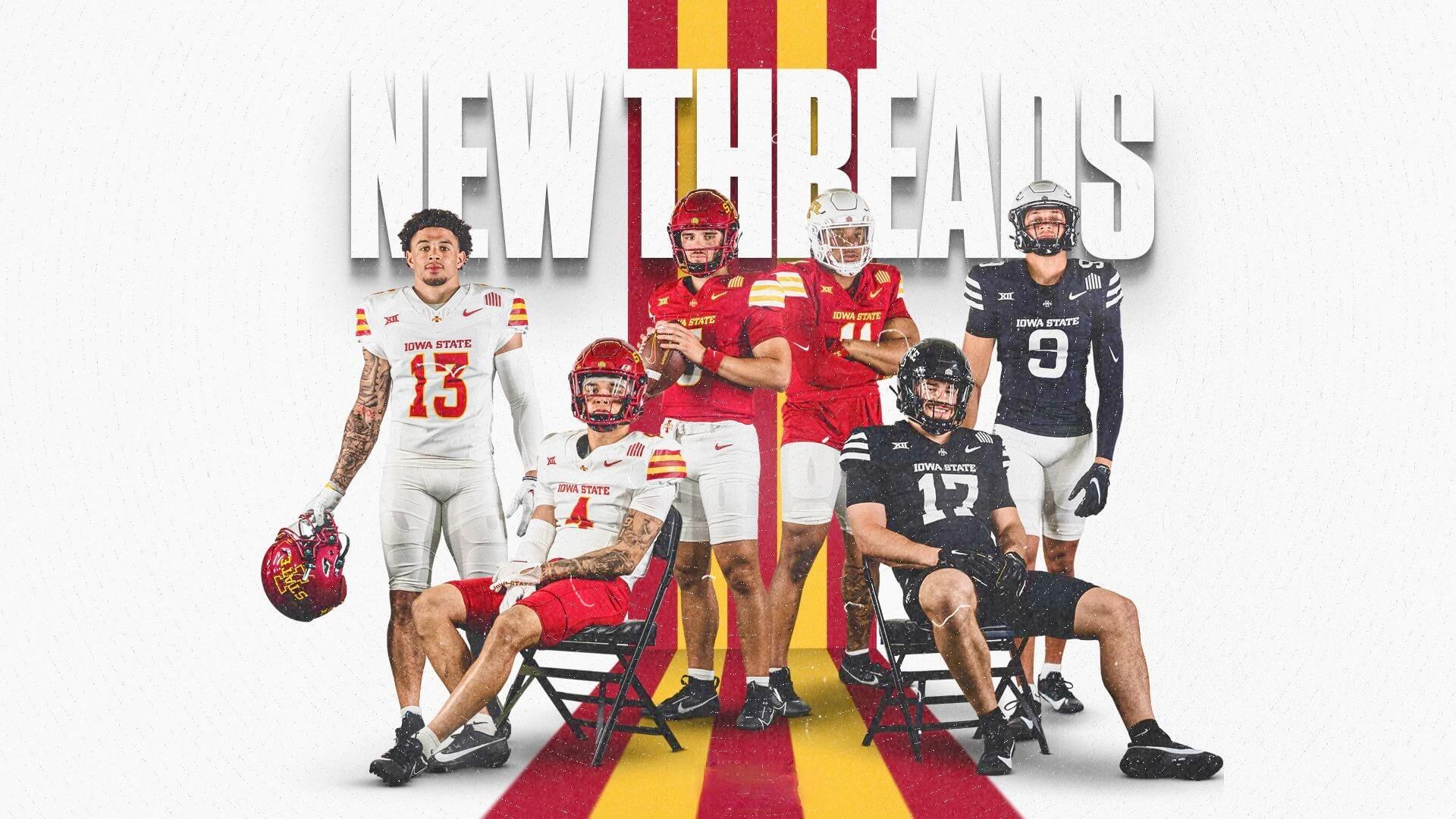
Iowa State Cyclones Release New Football Uniforms
A college football uni unveiling in May? Sure, why not!
 uni-watch.com
these colors are even more intense than mcdonalds. i mean baylor went neon several years ago so i'm sure iowa state is about ready to dip their toes in that trend, given that it's well gone by now. what gave me the idea was this shirt i recently found. in the sunlight it legitimately glows like a neon red, it's kind of baffling.The colors are terrible, but I love the Trice Stripes - exactly how they should be done. I don't even mind the stripe down the side as it pulls it all together. But I'd like a side of fries with those colors.

No question IMO that this is, by far, the best combo of Cardinal and Gold ever displayed on any ISU uni that I recall dating back to the 60s (that I've seen on color pics or vids) Would be ideal to change all ISU unis and logos to this combination but the expense in doing so would be enormous, especially in terms of signage at every ISU venue/building displaying the I-State logo and/or school colors.View attachment 128600
This is the gold we should use. I don’t like the 49ers because they are more tan than gold. These are the best versions of gold.
I don't recall seeing anyone wearing this combo. Did I miss it? Link?The white helmet, red jersey, white pants combo looks sharp.
Wrong. This is:No question IMO that this is, by far, the best combo of Cardinal and Gold ever displayed on any ISU uni that I recall dating back to the 60s.


It's in the cyclones.com photosI don't recall seeing anyone wearing this combo. Did I miss it? Link?

A New Look - Iowa State Athletics
AMES, Iowa - The Iowa State football team has released its new uniforms for the upcoming 2024 season. Here is the first look: