New Uniforms Revealed

t-noah

Well-Known Member
Feb 2, 2007
16,888
10,692
113
Love it. This mockup is better than the Auburn template.

These with the orrnado and a large gold stripe with two small cardinal stripes on the helmet.
CyUni 2022 c9 Pnt9 2 Sh2b1 ybW 42- w r w OrCy1RdfceWR WtS.png CyUni 2022 c9 Pnt9 2 Sh2b1 ybW 42- w r w OrCyRdfceRR WtS.png CyUni 2022 c9 Pnt9 2 Sh2b1 ybW 42- w r w OrCyRt WtfceRW WtS.png 
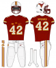
Is this pretty close? Three variations. I've got another white pant and helmet stripe (other than the old one I had) if you want o see. I like this one best (other than the one I posted a couple days ago). This one has the most yellow in the middle. Solid yellow/gold in the middle (stripe) doesn't look as good or go with other combos as well IMO. I reserve the right to change my opinion though, ha.
 
  • Like
Reactions: bgprest and Cy37

Cy37

Member
Jan 1, 2018
55
47
18
30
This is it. Not sure any other combo could beat this.
 

Attachments

  • 594B3D07-F6EC-408A-9F7D-13042625687B.png
    594B3D07-F6EC-408A-9F7D-13042625687B.png
    82.9 KB · Views: 19
  • Like
Reactions: t-noah

t-noah

Well-Known Member
Feb 2, 2007
16,888
10,692
113
I still want to see us where the combination below that tnoah drew up a while back.

White helmet with regular cardinal and gold I-State logo, and black facemask. Black jersey, and white pants.

And then have the players wear cardinal shoes and gloves/wristbands. I think this has a chance to look really sweet.

isu-unins-wbw-mod1rediandaccent-jpg.72604
Yeah I think that would look sharp. Whether or not they do it is another story. We haven't seen any mixing of all-black or blk/white yet.

It is just a matter of time that natives will become more restless though, wanting atleast some of our colors in the black combos. And it doesn't have to be much really to look good. CyUni 2022  a9 B1 15- w b w RedIStBlkfceWB BlkTxt BlkS.png CyUni 2022  a9 B1 88- w b w  OrCyRtBlkfceWB BlkTxt WhtS.png CyUni 2022  a9 B1 58- w b w  BlkfceRdStik WhtS.png CyUni 2022  a9 B1 15- w b w  BlkfceWB RdTxt WtS.png
 
  • Like
Reactions: Cy37

t-noah

Well-Known Member
Feb 2, 2007
16,888
10,692
113
I still want to see us where the combination below that tnoah drew up a while back.

White helmet with regular cardinal and gold I-State logo, and black facemask. Black jersey, and white pants.

And then have the players wear cardinal shoes and gloves/wristbands. I think this has a chance to look really sweet.

isu-unins-wbw-mod1rediandaccent-jpg.72604

New Year = New Insight.

Last year, I bitched about the alternate uniforms - being a traditionalist (I grew up as an Alabama fan). HOWEVER, after going to all the games last year for the first time since 1994, I really enjoyed all of the combinations! The ONLY issue I have is that I would like a little cardinal and gold to be somewhere on the helmets. For example, the white helmets with the gold and white "I State" look sharp with the charcoal and black uniforms. Coming around though! Takes a little time for us oldies to get with the modern program!

Love this! I can live with the black jerseys since the helmet is still white with cardinal and gold!
Good comments AlaCyclone. I think why you might have gotten a "disagree" on your first comment here is that some do not feel we should mix much if any gold with our black. And they would be mostly right. Gold doesn't look as good with the black as the cardinal does. And then there is the IOWA thing.

That is why I modified our existing C/G I-STATE logo/sticker on the white helmet (for w/b/w combo) to be mostly red or cardinal with light gold trim only. The gold STATE with red trim doesn't look quite as good.
 
  • Like
Reactions: AlaCyclone

AlaCyclone

Well-Known Member
Jun 14, 2007
4,237
4,802
113
Good comments AlaCyclone. I think why you might have gotten a "disagree" on your first comment here is that some do not feel we should mix much if any gold with our black. And they would be mostly right. Gold doesn't look as good with the black as the cardinal does. And then there is the IOWA thing.

That is why I modified our existing C/G I-STATE logo/sticker on the white helmet (for w/b/w combo) to be mostly red or cardinal with light gold trim only. The gold STATE with red trim doesn't look quite as good.
I was wondering about that? lol
 

t-noah

Well-Known Member
Feb 2, 2007
16,888
10,692
113
Fine I’ll say it, maybe without the yellow in between the orrnado lines. Final answer
Haha! I like to change my mind too. It's a mans, erh, um, perogative, right?

Seriously though are you wanting us to lose all our gold? Then we might be the Nebraska Cyclones. Ghastly! o_O
 
  • Like
Reactions: Cy37

clonedude

Well-Known Member
Apr 16, 2006
30,814
26,040
113
Yeah I think that would look sharp. Whether or not they do it is another story. We haven't seen any mixing of all-black or blk/white yet.

It is just a matter of time that natives will become more restless though, wanting atleast some of our colors in the black combos. And it doesn't have to be much really to look good. View attachment 73570 View attachment 73571 View attachment 73572 View attachment 73573

Thanks t-noah! I love the first one your post above the best. Now if the I-State logo on the V neck of the jersey and on the pants was also cardinal and gold, it would be perfect!

We have combined gold and black together many times already when we've put the cardinal and gold I-State logo on the black helmet.
 
  • Like
Reactions: t-noah

WalkingCY

Well-Known Member
Sep 26, 2008
6,847
2,464
113
Kansas City
I will get to that (making the shoulder # the same as main #). But I don't think it will look as good. I am going with the alternating color on the #'s because I like it. ;)

Just look at the post following yours, white #'s = too much KCChief vibe. What one likes, another does not. That's the way it is.

The white main # cardinal jersey is now my favorite (with the gold side #'s). If I made the entire jersey with white #'s I know I personally would not like it as well, too much white, not enough cardinal. That is my reasoning anyway. And same goes for the gold main #, white side #'s, in reverse. View attachment 73163 View attachment 73164


Just wanted to check in and state again that CCC really sucks and wish we wouldn't use it. Just a boring/bland look.

Also, BCC struggles too. Hated that we had such a huge bowl appearance with ND last year and we trotted out that ****** look.

The WCW is probably my fav home set now since we don't have GCG option. (Which is unreal as they are the two school ******* colors.)
 

SolarGarlic

Well-Known Member
Jan 18, 2016
5,665
8,458
113
I still want to see us where the combination below that tnoah drew up a while back.

White helmet with regular cardinal and gold I-State logo, and black facemask. Black jersey, and white pants.

And then have the players wear cardinal shoes and gloves/wristbands. I think this has a chance to look really sweet.

isu-unins-wbw-mod1rediandaccent-jpg.72604

These look good. I was slightly disappointed with the W/B/W look last season. It looked great in the pregame video, but it didn't translate to the field. Might've had something to do with the lackluster weather and it was a day game. But they didn't pop and looked high schoolish. The cardinal accents would help.
 

t-noah

Well-Known Member
Feb 2, 2007
16,888
10,692
113
This is it. Not sure any other combo could beat this.
When I took on your request to make a w/c/w with an Auburn-type template I originally came up with this CyUni 2022 c1 G7Pnt7 Sh1d4 rwbY 28- r r r RdfceRRB RdS.png ..because I knew that whatever I did w/ red jersey, it would have to work/match in an all-cardinal c/c/c.

I didn't care for the black in the pant stripe so I removed it, but loved the black in the shoulder... came up with this. CyUni 2022 c1 G7Pnt9 Sh1d4 rwbY 28- r r r RdfceRRB RdS.png For an all-cardinal I think think this is a great look. The shoulder stripe matches the pant. Widened the pant stripe and added more white also. I was happy with the added white which can easily be overdone other than complete redesign.

Then I re-did the white pant and helmet stripes. Eventually came up with your w/c/w with white numbers like you asked. I also redesigned the current shoulder stripe/bolt.
 
  • Like
Reactions: Cy37

t-noah

Well-Known Member
Feb 2, 2007
16,888
10,692
113
Just wanted to check in and state again that CCC really sucks and wish we wouldn't use it. Just a boring/bland look.

Also, BCC struggles too. Hated that we had such a huge bowl appearance with ND last year and we trotted out that ****** look.

The WCW is probably my fav home set now since we don't have GCG option. (Which is unreal as they are the two school ******* colors.)
At first I liked the all-cardinal. I still like it in theory but our current look is not good. CyUni 2021 c1 0  28- r r r  RED850a05YELf5ce31.png I can understand some not liking the cardinal crush altogether, especially like this.

Then we expect this base look to work with a variety of other combos. It does not, at least not nearly as well as it could.

I'm not saying my current design(s) is the way to go CyUni 2022 c1 G7Pnt9 Sh1d4 rwbY 28- r r r RdfceRRB RdS.png CyUni 2022 c1 G7Pnt9 Sh2b1 ybW 42- r r r RdfceRRB WtS.png ...but I definitely think we need to add/revert back to our '67-'82 gold. That would be a start. Then add a bit of white, black, gold accent here and there to make it all work, especially if wanting to do combos.
 
  • Like
Reactions: Cy37

Cy37

Member
Jan 1, 2018
55
47
18
30
Haha! I like to change my mind too. It's a mans, erh, um, perogative, right?

Seriously though are you wanting us to lose all our gold? Then we might be the Nebraska Cyclones. Ghastly! o_O
That’s fair I just think it would look super clean. Still want the gold on the helmet just not in between the tornado lines.

All of these are great tho.
 

t-noah

Well-Known Member
Feb 2, 2007
16,888
10,692
113
Just wanted to check in and state again that CCC really sucks and wish we wouldn't use it. Just a boring/bland look.

Also, BCC struggles too. Hated that we had such a huge bowl appearance with ND last year and we trotted out that ****** look. ....
What would you have thought if we had rolled these out vs Notre Dame? CyUni 2022 c2 G7Pnt9 Sh1d1 rwbY 28- b r r BlkfceRBB BlkS.png ISU Unis CampingWolrdBowl BCC BreeceHallMod21 1.jpg
 

t-noah

Well-Known Member
Feb 2, 2007
16,888
10,692
113
That’s fair I just think it would look super clean. Still want the gold on the helmet just not in between the tornado lines.

All of these are great tho.
I hear ya. I'll get that no gold between the tornado lines for you soon!

I was just kiddin anyway! Remember I'm pushing for the white numbered cardinal jersey also, if done right. AND a gold numbered one. We could easily do that, carry two.

Remember or consider this. If we remove even more gold from our uniforms, ie, go to white numbers only on cardinal jersey, and say we never adopt a gold option, then what? Say coach decides to keep the same bland style, no pant stripes, no accents. We would have even less gold than when we started. :(

I'd love to say that we'll do it my way, or your way, but that may never happen.